I get this question a lot: "Why do I need a focused UI component library? Can't I just use regular native forms?"
My answer is always the same. Let me show and tell OR, present before and after.
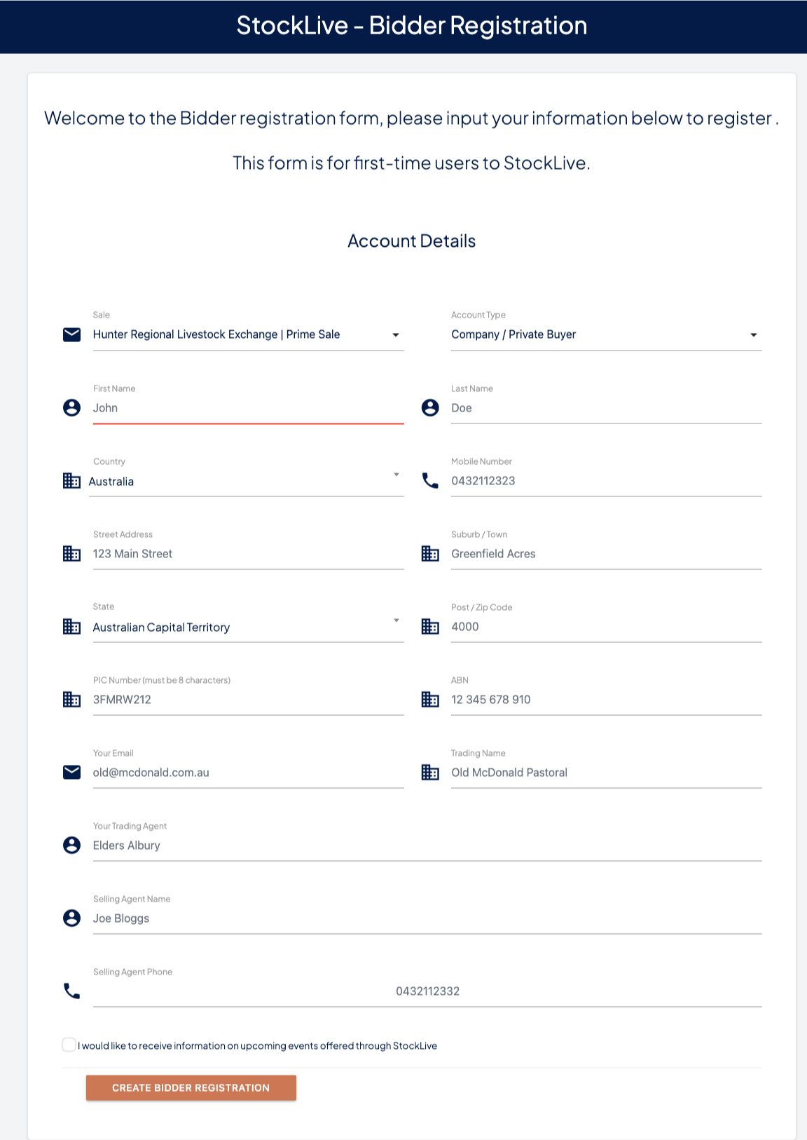
I came across this registration form from StockLive, an online livestock auction platform. You've probably seen forms like this in every industry. The goal is simple, get the user's information and get them on board quickly.
It's a single page. Eighteen fields. All visible at once. One big "Create Bidder Registration" button at the bottom.
You can see the form makes a few assumptions about the person filling it out:
Their internet connection is stable and nothing will be lost if the page reloads. They'll know exactly what every field means. They won't mind scrolling through all 18 fields to find the one they missed. They have the patience to fill everything out in one sitting. And if something goes wrong with validation, they'll happily start over again.
Sound right?
On the contrary, every one of these assumptions is wrong. I tried registering. It took me almost 5 minutes. Five minutes for a registration form, that's 300 seconds of friction between a potential bidder and their first auction.
Most of that time wasn't spent typing. It was spent dealing with phone number formatting, address validation, misleading dropdown list and postal code errors. One mistake and the form reset. Eventually I gave up trying to enter real data and just copied the placeholder values to get through. Tada.
If I a developer who builds forms for a living nearly abandoned this form, what happens to a cattle farmer in regional Australia who just wants to bid on livestock?
What's actually going wrong.
This isn't about bad intentions. The team that built this form was trying to collect necessary information. But presenting it this way creates real problems for the people using it.
- The form has eighteen fields on a single screen that overwhelms people. The moment someone sees that wall of inputs, their first instinct is to close the tab, not fill it out. Researchers call this cognitive overload. I call it losing customers before they start.
- There's no indication of progress or how far along you are or how much is left. Without that, every field feels like it might be followed by ten more. Uncertainty kills motivation.
- Sale selection sits next to personal details. Business information is mixed with agent contacts. PIC numbers live alongside email addresses. When everything is presented the same way, nothing stands out and nothing guides the user through.
- When you fill out 18 fields, hit submit, and then discover three things are wrong, what then!!. Now you're scrolling back up, hunting for red text, fixing things you thought were fine. Each error-submit cycle increases the chance someone walks away becasue errors arrive too late.
- Life interrupts. Phones ring. Browsers crash. If you lose your progress on a long form, you're probably not starting over. No. You're finding another way or another platform.
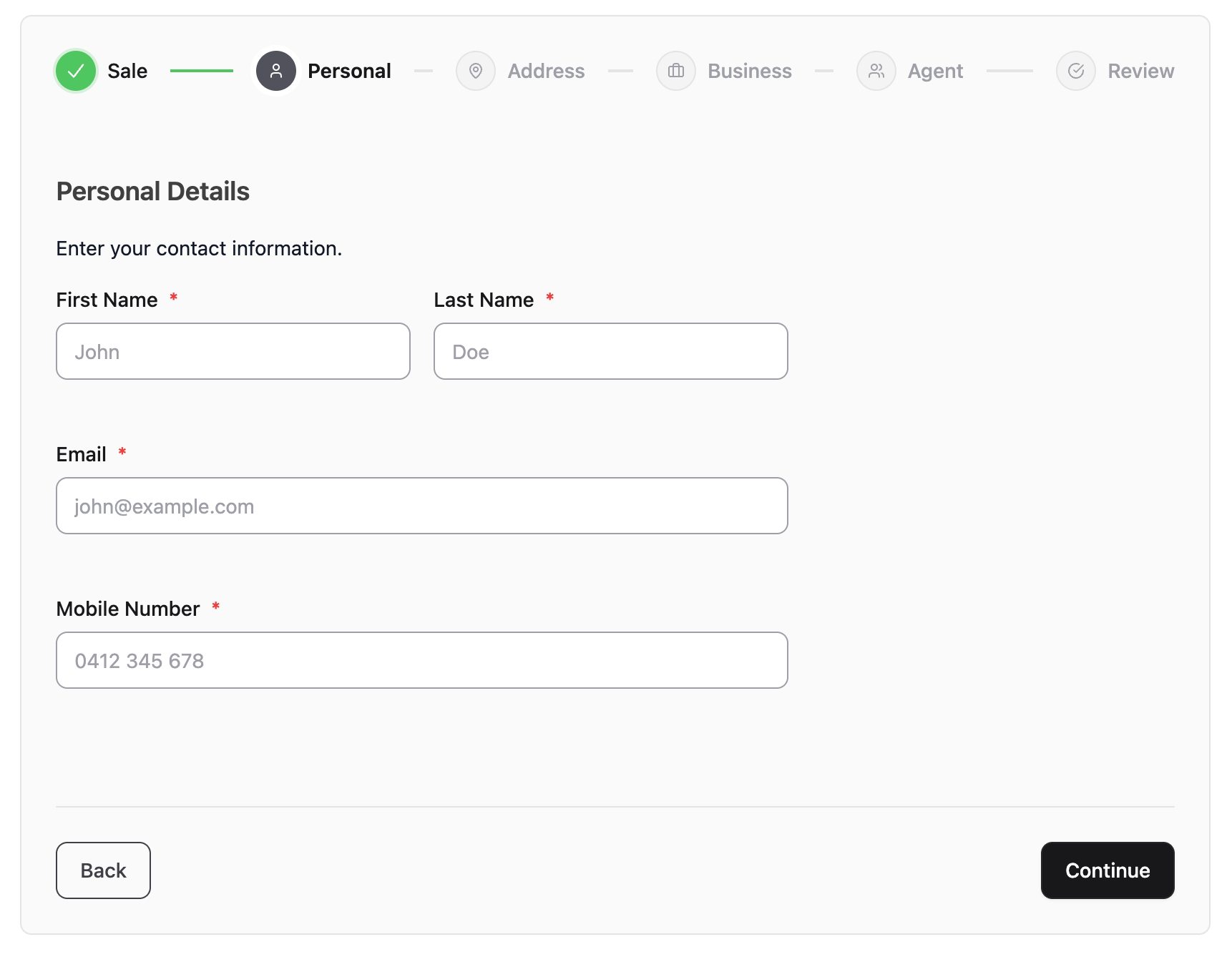
The second -small- image shows the same registration, rebuilt with RapidRails UI's Steps component. Same information collected. Same fields. Completely different experience.
Instead of 18 fields on one page, the form is broken into six clear steps: Sale, Personal, Address, Business, Agent, and Review. A progress bar at the top shows exactly where you are.
Each step shows only 2 to 4 fields. Just the fields that belong together. Personal details on one screen. Address on the next. Business information after that.
What changes for the user.
- Two or three fields at a time means the person filling out the form can actually think about what they're entering. No scrolling and no scanning. Just answer what's in front of you and move forward. This way users are focused instead of being overwhelm.
- The stepper at the top shows completed steps in green, the current step highlighted, and remaining steps ahead. This way people know exactly where they are. That certainty keeps them going.
- Made a mistake three steps back? Click that step and go straight there. No scrolling through a wall of fields. Just fix it and continue. And the data you already entered is waiting for you. Users have freedom to move around.
- Name and email belong together. Street address and postal code belong together. Trading agent and selling agent belong together. When information is grouped logically, it makes sense. When it's all jumbled on one page, it doesn't.
- The final step shows a summary of everything entered. Catch a typo in your ABN? Click back to the Business step, fix it and continue. This alone reduces support tickets from incorrect registrations.
- Progress is saved as you go. When browser crashes, phone rings, connection drops, come back and pick up where you left off because data survives interruptions.
This isn't just about prettier forms only. It is crucial for businesses. It's about what happens to your numbers. Forms with high field counts have abandonment rates above 60%. That's a lot. Breaking them into steps with progress indicators typically cuts that in half, if not more. That's not a design opinion, that's measurable.
For StockLive specifically, every abandoned registration is a bidder who didn't make it to the auction. A bidder who didn't bid. Revenue that didn't happen. Not because the product is bad, but because the door was too hard to open.
And the fix isn't complicated. It's the same form, same data, and same validation. You're just presenting it in a way that respects how people actually think and work.
Back to the original question, why this needs a component, not a hack?
You could build a multi-step form from scratch. Wire up the JavaScript to show and hide sections. Track which step is active. Handle navigation between steps. Manage state. Build the progress indicator. Make it accessible. Test it across browsers.
Or you could use a component that already does all of that.
RapidRails UI's Steps component handles the stepper navigation, progress tracking, step validation, free navigation between completed steps, and the review summary. It's built with Rails Turbo, StimulusJS and no external JavaScript libraries and it works with your existing Rails forms. It's accessible out of the box, first class citizen components.
One component that you drop it into your view and define your steps. Done.
That's what focused UI components are for. Not to impress other developers. To solve real problems for real users, consistently, without rebuilding the wheel every time.
→ See the full StockLive case study: rapidrails.cc/docs/stocklive
→ Steps component documentation: rapidrails.cc/docs/steps
——————
I'm Ahmed Nadar, a Rails developer in Toronto. I've been building web applications for over 15 years. I created RapidRails UI because Rails developers deserve native frontend components that work the way Rails works, without reaching for React or external JavaScript libraries.
If your app has forms, tables, or workflows that feel harder than they should, I'd like to help.