First published on Wordpress in April 2022.
TL;DR: It’s another long post, but essentially we’ve started minimising our intake from the grid and hence reducing our operational costs. Best day so far… £0.11 electricity imported.
TL;DR: It’s another long post, but essentially we’ve started minimising our intake from the grid and hence reducing our operational costs. Best day so far… £0.11 electricity imported.
We’ve now had 2 full months of data which seems like a good opportunity to start looking at some numbers.
But first, I just want to say that the main reason for doing the retrofit is because it’s what we choose to do with our money to get the lifestyle we want – I get asked sooo often (as do other retro-fitters) what the payback time is for all of these bits of tech. I don’t care. I know it’s important to a lot of people, but not to me. I want more clean energy in my house and I like the “self-generate -> self-use -> add to a greener grid” situation that doing this offers. The fact our operational electricity costs are lower in a time of rising consumer electricity is a bonus, but I am aware that a not-insignificant capital outlay is required to get to this point.
Also, before we get to the data, a word about how we interact with the various different components of the system.
Controlling the system (apps etc)
- Givenergy app
- The Givenergy app taps into the battery AC-coupled inverter and records the incoming generation from the solar panels, the import/export to and from the battery, and the requirement of the house. It doesn’t differentiate between the car and the hot water – these are lumped under power draw for the house. You can control different battery charge and discharge parameters which is useful for filling at cheaper tariff times.
- Myenergi app
- This requires a couple of C-clamp hardware components and a hub, but it’s probably one of the best apps out there. From this I can see what is being generated and where it’s going. I can control the charging of the car to some extent, and the dumping of excess solar energy into the Mixergy cylinder (via the immersion heater at the bottom of the tank). I can see whether the battery is charging or discharging (but not what the state of charge is), and I can see what the house is using. It also gives stats over different time periods and an estimation of greenness i.e. proportion of self-generated electric used.
- Mixergy app
- This controls the hot water immersion element that heats from the top down in the cylinder. It also allows the heat pump to be used as a heat source, which might be a more efficient use of electricity when the solar panels are not generating a lot. It can be set up to learn your water-use habits and heat to expected requirements. The most useful thing from my perspective is just being able to quickly see how much hot water there is, and at what temperature. As with the Givenergy app, it can be set up to charge the cylinder to a desired volume of hot water at any given time, such as when tariffs are cheaper.
- Salus app
- The app links to the room thermostat, which itself is linked to the heat pump. From the app you can set up a schedule and turn the heat pump on/off as required. The fun thing is that you can boost the heating as you are coming back to the house so that you have a warm home to arrive at without having used excess electricity.
- Govee app
- When the gas boiler died, I wanted to measure the temperature in the house. We also had delivery of a new kitchen in October, but it couldn’t be fitted until April due to demand on the installer, so it had to be stored in the garage. I wanted to know the temperature in the living areas of the house and the garage. I initially had illusions of building something using Raspbery Pi boards and some sensors and linking into Home Assistant. But then I found Govee and it saved a lot time and wasn’t much more expensive than building my own. Plus I knew it would work. The units are small and discreet and the app just shows the temperature and humidity for different timespans. Simple, but effective.
Temperature plots
The plot below shows all the data I have from the Govee monitors for temperatures in the living room (blue) and garage (grey). The external temperature was usually 3 – 4 C below the garage temperature. The orange horizontal line has been added to highlight 5 C and when garage temperatures (and therefore outdoor temperatures) dropped below that. You can hopefully see that the house temperature was pretty low (especially when on holiday and away at Christmas) and variable (requiring a lot of energy to get the electric heater up to 18 – 20 C) but that once the heat pump was fitted and the house had returned to a comfortable temperature the range and variability is much less.
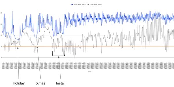
Half hourly temperatures for the living room (blue) and garage (grey) from November to April
Energy usage
Feb 2022
Here are some plots from the Givenergy web-app that (hopefully) explain the usage in our house. In February we generated a total of 356.5 kWh of which a chunk went into powering the home (including the car and the hot water) (green), some more to storage (blue) and 66 kWh back to the grid (red).
Here are some plots from the Givenergy web-app that (hopefully) explain the usage in our house. In February we generated a total of 356.5 kWh of which a chunk went into powering the home (including the car and the hot water) (green), some more to storage (blue) and 66 kWh back to the grid (red).
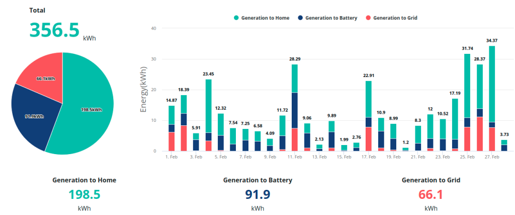
Solar panel electricity generation: Feb 2022
We imported 402.4 kWh from the grid, which is a reasonable amount. However, this was primarily during the cheaper hours on the Octopus Go tariff and was designed to enable a full battery and 70% hot water availability in the morning to allow for showering and heating of the home. That’s why the grid to battery daily values are pretty similar for each day in the month.
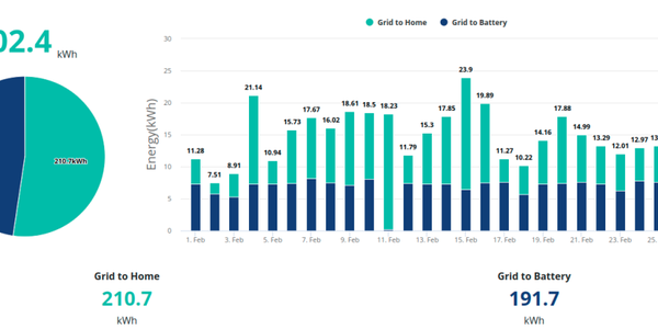
Grid usage: Feb 2022
The following plot is included for completeness and to show the breakdown of solar generation (198.5 kWh), grid (210.7 kWh) and battery (288.7 kWh) usage by the house.
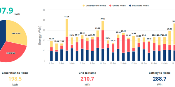
Home usage: Feb 2022
Mar 2022
The following are the same plots for March. You can see that it was a sunnier month (as expected) and the panels generated 727.3 kWh. Much more of this went back to the grid (289.7 kWh) but more was also used by the home and battery.
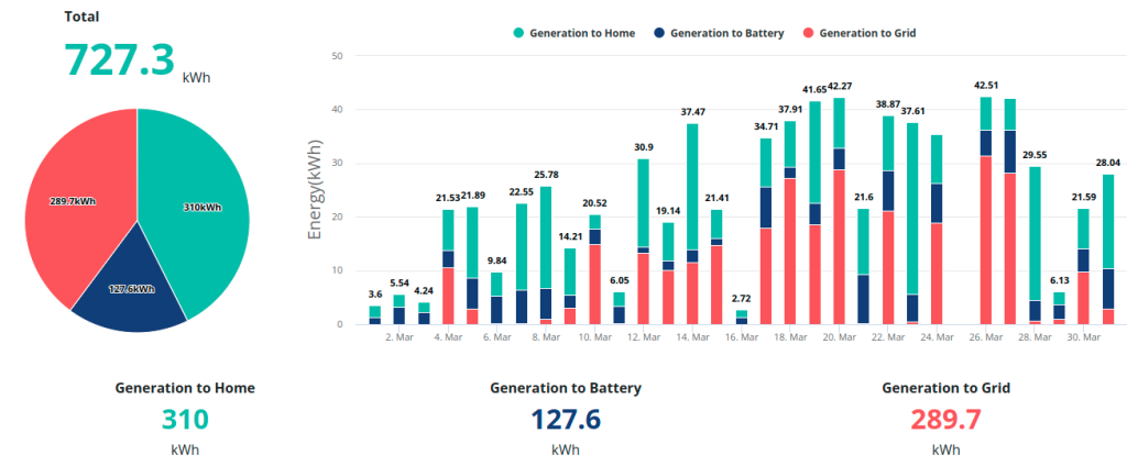
Solar panel electricity generation: Mar 2022
Looking at the grid import, you can see that 247.2 kWh were paid for – much less than in February (again, to be expected). The fact that an equivalent amount was imported as was exported to the grid from excess solar demonstrates the diurnal offset issue. Most of the import would be to refill the battery and hot water. It’s expected that as the year progresses then the import would fall further still as the heating is not required and the battery and hot water levels are maintained by the solar panel generation.
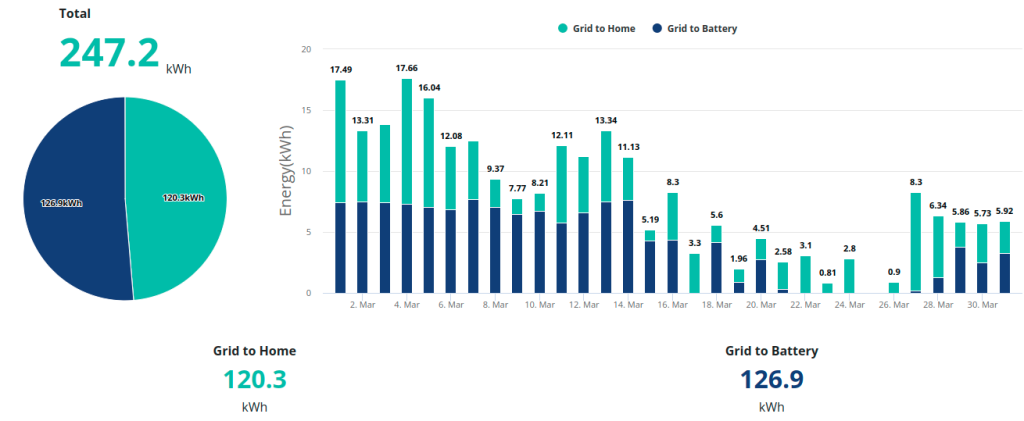
Grid usage: Mar 2022
This plot shows the home usage again, which at 677.7 kWh is comparable to the previous month, although the ratio between generated and imported is significantly different.
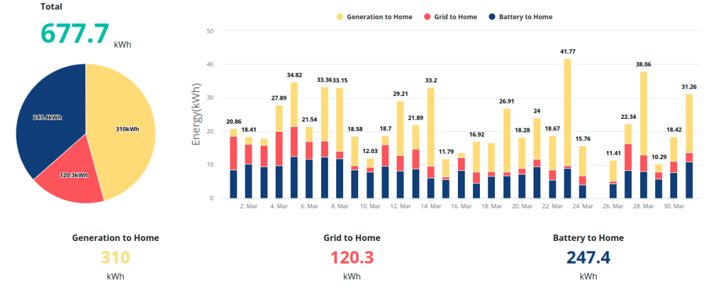
Home usage: Mar 2022
The plot below shows an almost perfect generation curve for a sunny day in March. The Fronius inverter clips generation at 5.9 kW which is a design feature, and why there is a flat peak. The change in slope between 15:00 and 16:00 is (I think) due to a switch from the two panel arrays acting together to the smaller array primarily feeding the inverter (the larger array enters shadow).
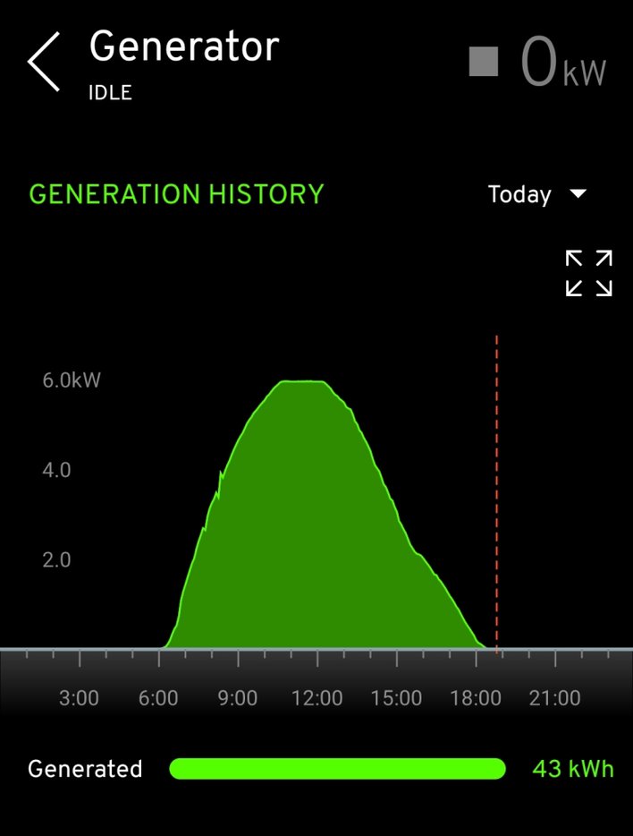
An almost perfect generation curve
Money
I know that some blogs and videos about retrofit go into all sorts of calculations about savings, payback times, modelled costs versus actual costs etc. but I’m going to keep this relatively simple. the plot below shows daily electricity usage from the grid (blue vertical bars) and daily cost (orange vertical bars) from September 2021 to April 2022. I’ve also indicated the date ranges for when we had gas central heating, no heating and the heat pump. When we went on holiday in December there was no heating and apart from the fridge almost no electricity use and that’s visible in the plot. When we returned from that break I plugged the car in to charge and forgot to set the timer so it charged at peak cost – which is also visible in the plot. Like a mug I did the same in April but thankfully the car battery wasn’t so empty! The overall message of this plot is that once the Fronius inverter was installed and a good chunk of generated electric could be used in the home, the daily price paid to the electricity provider dropped markedly, because we could take from the grid and fill the battery at the cheapest rated times.
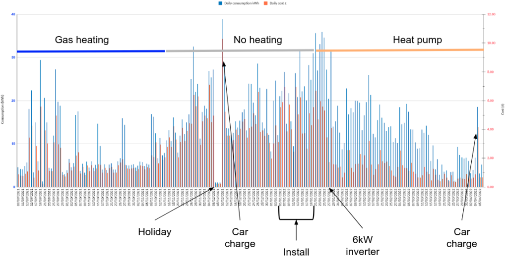
Daily imported electric from Octopus (blue) and daily cost of that electricity (orange)
The next plot shows cost (black bars) and living room temperature (blue line) for Jan – Mar and hopefully it is clear that once the inverter upgrade was installed and online, and as the days became sunnier, our electricity costs dropped substantially. By the end of March most days we were spending less than £1 on imported electricity. The higher electric cost values in January were due to having a smaller inverter and the fact the house had been cold for 2.5 months and the heat pump had some work to do. As you can see from the temperature plot, the decrease in electricity costs is unrelated to the temperature being maintained in the house.
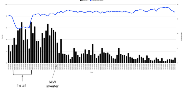
Daily cost of electricity (black bars) and living room temperature (blue line)
The cheapest day so far since the retrofit install has charged us £0.11 for our imported electricity (that’s with the standing charge removed). This was a good day! You can see in the screenshot of the Myenergi app that the solar panels were charging the battery, the car and the hot water cylinder, as well as powering the house. That’s costing us ‘none pence’ at that specific time.
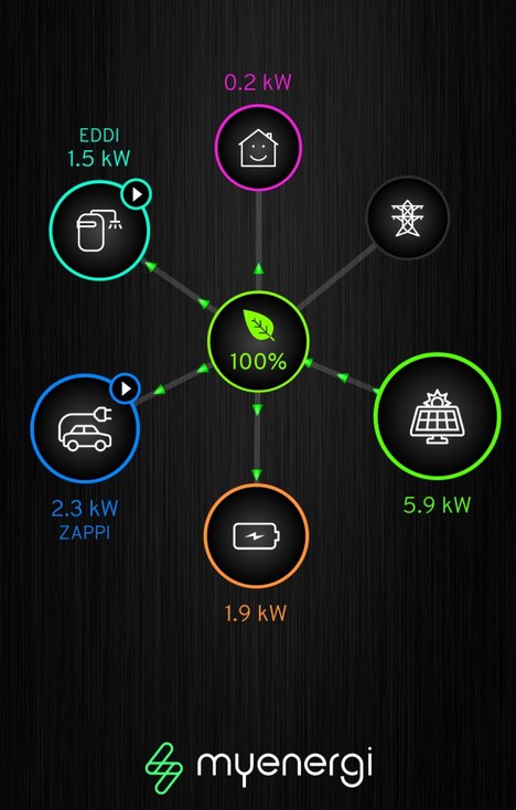
Solar panels filling the battery, car and hot water as well as powering the house
Fuelling debate?
Just for larks I thought I’d look at some (very simple) calculations for the Nissan Leaf 40 kWh we own. In March we added about 170 kWh. The majority of this was from the solar panels although some of it could have been charged during the cheap rate tariff.
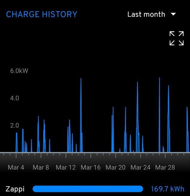
Solar (free!) energy added to the car in March
The following table shows some cost comparisons based on this 170 kWh of charging and some simplified assumptions where a single electricity source is used to ‘fuel’ all 170 kWh.
Electricity source | Cost per kWh (£) | Total cost (£)
Solar panels | 0 | 0
Home (cheap rate) | 0.04 | 6.80
Home (peak rate) | 0.27 | 45.90
BP Pulse rapid PAYG | 0.5 | 85
Solar panels | 0 | 0
Home (cheap rate) | 0.04 | 6.80
Home (peak rate) | 0.27 | 45.90
BP Pulse rapid PAYG | 0.5 | 85
I also considered using the Zap-Map cost comparison tool to look at costs for the Leaf and a Nissan Juke (I don’t know much about combustion engine cars anymore but this seems like a fair match….). But then I realised that there’s little to be gained. With unleaded petrol prices at 162p currently, charging an EV will be cheaper however you do it, but I would always charge from excess solar via the Zappi first, then on the cheap tariff and only rarely at home on the peak tariff. There would be one or two public charges for longer journeys throughout the year. Effectively my fuel is free.
Heat pump stats
The heat pump has been running for 454 hours since installation in January. It has consumed 836 kWh of electricity and supplied 2716 kWh of heat making it 325% efficient! That’s far more efficient than a traditional boiler (and this includes the week or so at the start when it was working hard to get the house back to warmth).
Summary
Another long post but hopefully some interesting numbers. Like I say, there are folks out there who really break these things down, but I want our renewable stuff to ultimately just sit there and work. My driver is to have the house running as cleanly as possible, whilst supplying us with the hot water and electricity we need to match our requirements, and without us needing to do lots of calculations or interfere with the running of the components. A unified app would be nice, but in general everything seems to be on the right track.