UPDATE: A week or so after I wrote this, HEY's leadership announced some pretty miserable "keep politics out of the workplace" policies [1]. My understanding from some little-birdies is that leadership wrote the announcement shortly after employees pointed out that some language in some internal writing was racist - and the leadership considers that an inappropriate topic for workplace discussion. I've cancelled my subscription renewal to HEY, which ends in July. If these policies are still in place come July, I'm outta here.
DHH and Fried: everything's either political, or in favor of the status quo. The status quo is overwhelmingly racist. You blew it.
HEY (I know, the capitalization, we'll get to that) has been my main mail interface since last June — which, given the endless nature of 2020, I'm gonna round up to a year. How's this thing been?
Rather than a comprehensive review of every nook and cranny, I'll talk about my biggest love/hate/tolerate bits about the service. Overall, HEY has been fantastic for me, and I'm sticking with it - and while it's far from perfect, it's moving at a fantastic velocity. I believe this service has a long, bright future ahead of it. Let's get into it!
Love: the well-paved cowpaths for email.
HEY figured out some really elegant email-management workflows that are pretty perfect. It's hard to summarize the mechanics better than HEY does on their marketing page, so I'll leave that part to them. To sum it up, though: with Fastmail, I would "get" about 30-40 emails a day. With HEY, I "get" fewer than 10. HEY saves me a ton of time by screening out junk, filing away receipts, and keeping newsletters out of my messages.
Got an email that you want to reply to later, but not right now? Tap the Reply Later button. Want to save an address from an email? Set the email aside - or highlight the text and tap "Save Clip". All of this works as-advertised, and it's been a marked improvement to my ability to reply to the people I care about, rather than having their emails languish until Email Forgiveness Day.
I've come to tolerate HEY not supporting IMAP. HEY isn't like most other email services: it's not compatible with IMAP, which means that you can't use HEY in Apple's Mail app, or connect it to other first-party or third-party email apps. This means that if you've got Gmail at work, and HEY for personal stuff, you can't have it all in one Mail app - you've got to use two separate apps. It means that if HEY doesn't support a feature you'd want (say, watchOS support) then you're out of luck.
HEY's very-much a hybrid app. It doesn't feel native, but I think it was the right choice for them. HEY being hybrid means that their small team can build features at a rapid pace, and can build clients for most-every platform (which is important, since they're not compatible with other email apps!)
The biggest pain in the hybrid implementation is in composing a new message. Writing messages is an important feature for an email client - but HEY's compose-message interface is fairly buggy and frustrating. If you want to add a link to something, it often behaves poorly. If you want to underline text, that's not an option in the palette. If you want to left-align an image, you're out of luck. I think HEY would do well to add a native compose-message screen for their iOS apps - or spend some serious time crushing bugs in the existing implementation. In the end, though, I don't often do much rich-text-formatting in emails, so this hasn't been a big drawback for me.
Love/tolerate: the branding.
I love the hand-drawn hand logo and art direction. It's cute! The art direction lends itself to big, swooping imagery in the empty-states of the interface, and I imagine it's been a really scalable design choice: it's probably pretty straightforward to whip up a dozen variations in this art style and tuck them into different parts of the app. It's good!
I've learned to tolerate that it's called "The Imbox", but it's an obnoxious typo. When somebody sees it over my shoulder, they think know it's a typo. I've stopped noticing it, but I haven't forgiven it. (Hell, even HEY's webapp doesn't know that "Imbox" isn't a typo as I write it here. It gets the red-typo-underline treatment.)
I've learned to tolerate the all-caps HEY (instead of a friendlier "Hey") - it's a stinker that the service feels like it's yelling at me. I don't keep the app on my home screen because it says "HEY". Drop the all-caps, and I think it'll make a friendlier first impression.
Hate: the navigation design.
I wish that HEY would just use a tab bar with a split-view controller. I realize that this is boring, but there's a reason that this is such a standard interface for email: it's better. Hiding menu options behind a floating button is a close-cousin to the infamous hamburger-menu.
I hate that there's an ever-present think that looks like a back-button, but isn't. It doesn't take you back - it takes you to the aforementioned Imbox. There are many times that I've wanted a back-button in HEY, tapped that button, and completely lost my place in the task at-hand.
Search is too ephemeral. If you're searching for something and it's a little buried, HEY isn't helping. Search results disappear from the screen far-too-easily, and while it remembers your search term, that's not the same thing as remembering where you were in a scrolling list of search results. I'd like to see HEY add a more-durable search-results screen, so I can have an easier time trying to find that one email that I know is there. A year in, and I still often hop back to Fastmail to search my archives, because I find their search implementation more helpful.
Hate: the design of The Feed.
I can't stand The Feed's navigation design. Like I said above, I think this would be a much better interface if it were a split-view style controller, with a compact summary of my feed, and a separate child-screen to display the contents of a selected message.
The current implementation: you see the first couple inches of each newsletter, with a "See more" button to expand the rest. You have to scroll many, many times to get to, say, the tenth newsletter in the app. The Feed's design works okay if you only subscribe to a few, quiet emails - but it breaks down really quickly once you've got much more than that.
Because The Feed relies on scroll position, and emails are long, it's tedious.
Because The Feed relies on scroll position, and has a devious back-button-that-isn't-a-back-button, I often lose my place.
Because The Feed relies on scroll position, and doesn't have a tab bar, if I need to exit The Feed to check my Imbox, I've completely lost my place.
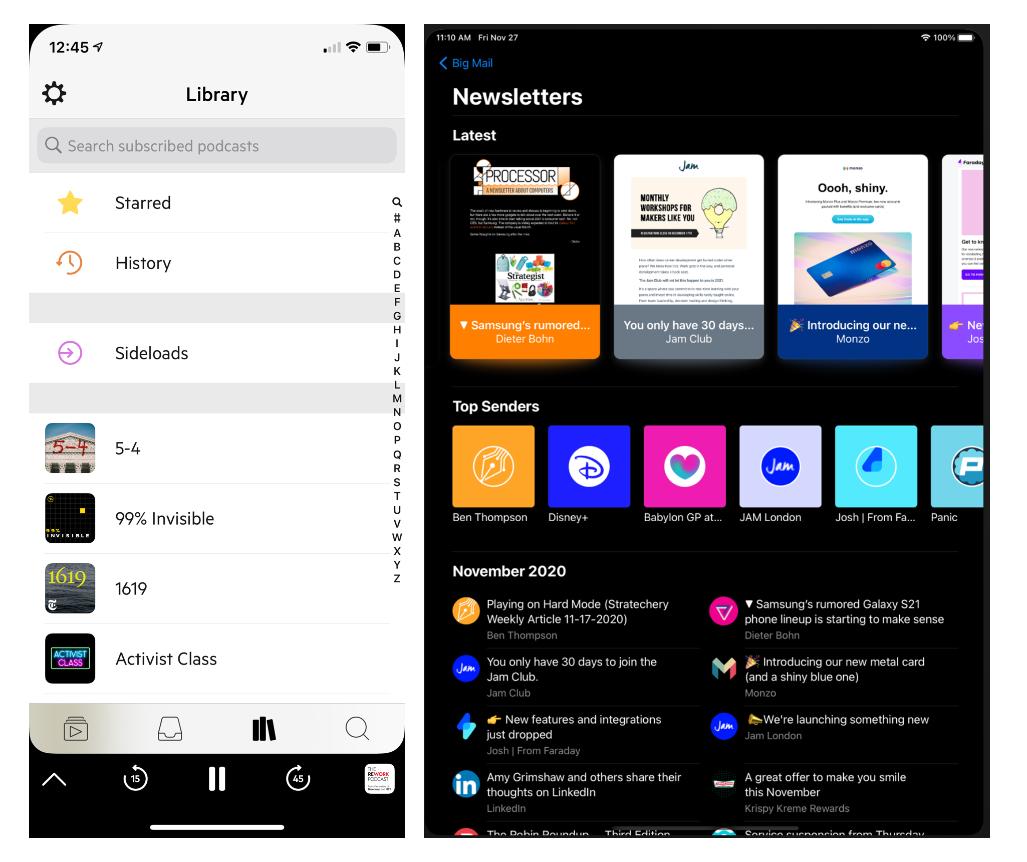
An ideal design for The Feed would allow me to find them by-author and by-chronological-date. A couple of alternatives come to mind here. First, Castro's fantastic Archives tab shows you a list of all the podcasts you follow, with a "History" option at the top to see your listening history - you could imagine something similar for email newsletters! Second, Big Mail has a gorgeous design for their iPad email client, something that I wish HEY would adopt.
Love: the long-term outlook
HEY isn't a VC-funded, here-today-gone-tomorrow service. It's clearly around for the long haul, and that feels really nice. If another email app were paddling this far out from shore, building these unique flows and features, I'd have a hard time trusting that they'd stick around long enough for it to be a system worth investing in. HEY's made it clear that they are a small, profitable team working at a sustainable pace, and I really appreciate that.
HEY has some issues, but they've got fantastic product velocity. Yes, it's a hybrid app, and feels very webby instead of native. Personally, I really appreciate the higher-order effects of the hybrid implementation: it means that HEY can roll out and improve their features fast with a small team - and they're doing exactly that! Every few weeks, some really nice touches get added to the app, and it's gotten dramatically better during this year-ish of use. I mean, this very post is written on HEY's privacy-focused blogging system, and all I have to do is compose an email in order to post something? Amazing.
I trust HEY's stewardship. They've made clear stances on privacy, and I really appreciate it. I trust them with my email, and that's really important and sensitive information!
-----
So that's it! All in all, HEY is a wonderful email service, and I appreciate how it helps me reply to the people I care about, without sifting through tons of clutter and noise to get there. I'm sticking with it - and really optimistic that they'll polish it up into something even more perfect. 😘