Admittedly I wanted to write this post sometime last week just before leaving on AL but it's been a crazy busy week. Albeit being in the summer period when things should've slowed down with deliverables, I found myself working on 3 deadlines for Friday which, of course, didn't allow sufficient time to focus on writing this post. But being honest I don't like complaining and to a certain degree I enjoyed the challenge 😛
Nevertheless, in this post I just want to share the latest bunch of interactive web maps that I have been working on in the last weeks/months and provide a glimpse of the work I do at Ricardo (although just a small one). It's been a lot of work (ngl) but certainly fruitful and I'm sure the clients are happy with the product. So today I'm just sharing these 2 web apps (unfortunately only 1 is on the public domain but I'll explain the other with a screenshot and a description).
Nevertheless, in this post I just want to share the latest bunch of interactive web maps that I have been working on in the last weeks/months and provide a glimpse of the work I do at Ricardo (although just a small one). It's been a lot of work (ngl) but certainly fruitful and I'm sure the clients are happy with the product. So today I'm just sharing these 2 web apps (unfortunately only 1 is on the public domain but I'll explain the other with a screenshot and a description).
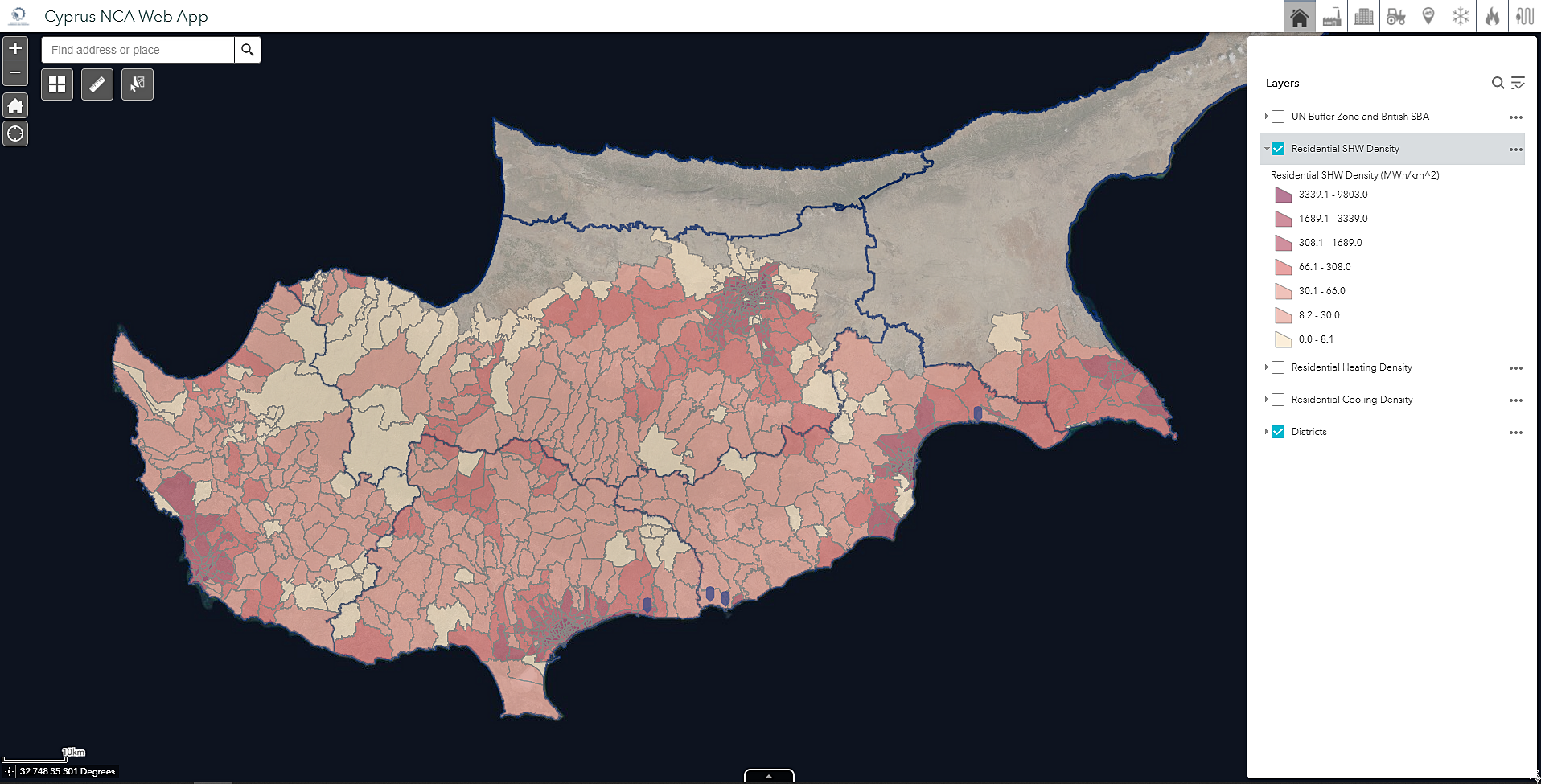
Comprehensive Assessment of the Potential for Efficient Heating and Cooling

The first one is an interactive web app developed for the Cypriot Ministry of Commerce, Energy and Industry which presents the cooling, heating and sanitary hot water consumption (MWh) for each postcode at residential, industrial, services and agricultural level. This app contains some handy features such as the ability to download a selected set of postcodes (drawing with your cursor) and view the corresponding consumption data, search for a specific address to find your postcode's consumption faster and toggling on/off layers at end-use level (cooling, heating and sanitary hot water level - 3 icons in top tight), amongst others.
The link to the ministry's article about heating-cooling and cogeneration can be accessed here. The web app can be accessed via this link.
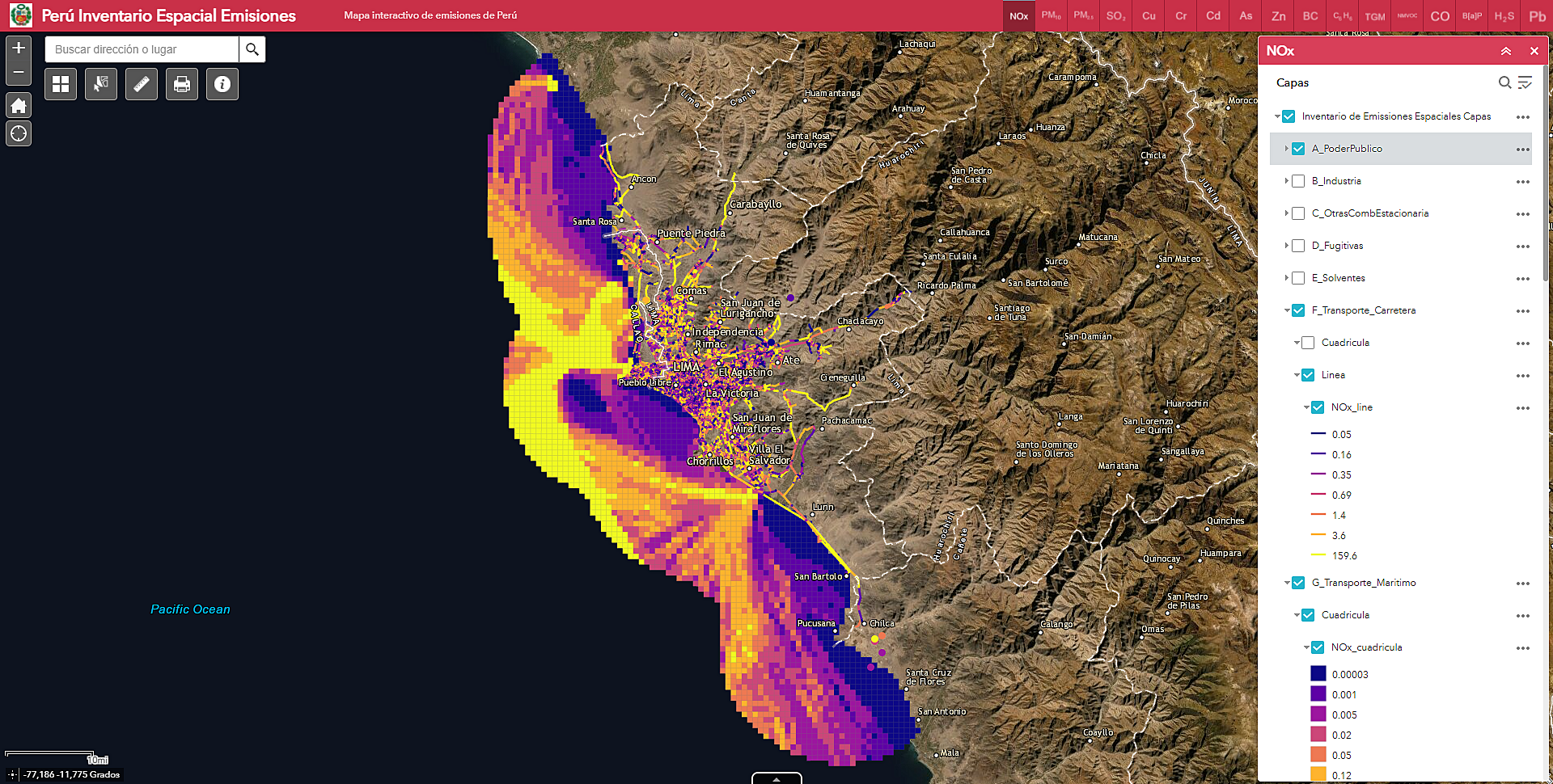
Perú Inventario Espacial Emisiones

The second app was developed with my colleagues in the inventories team and it focuses on the spatial emissions inventory for the cities of Callao and Lima in Perú. It presents emissions (usually in tonnes) at line, grid and point level (geometries) from many (GNRF) sectors such as maritime, road transport, industry and agriculture. Unfortunately, this web app isn't public so I can't disclose more than these - but if it does go public, I'll ensure to update this post with the link.
Bringing this post to a close, I realise one thing. To the end-user these apps are in essence websites with maps that they can pan/zoom in-out and enable/disable layers. However, the thing that's often neglected to be appreciated is the fact that a lot of effort goes into these 'products'. From spending hours and days on data research, back and forth comms with the client for feedback, extensive QA checks to ensure that these are up to Ricardo's standards to dealing and solving the usual 'bugs'. And yes these do take months to be developed but the client's voice and positive feedback do make everything worth it - and as my saying goes, if one image tells 1000 words, an interactive maps says a million. I hope you enjoyed reading this, and if any questions do fire up #keepmapping