Stage Manager: the future is here, it's just not evenly distributed
I hate computers. It's a recurring theme that, whenever I write about how exciting and good computers are, I feel the compulsive need to talk also about how absolutely dogshit computers are. Computers are very bad. Perversely, computers are so bad that I am somewhat of an optimist about this day and age: it feels very clear to me that most of our societal psychosis is a byproduct of a cultural age wherein we're expected to use machines that literally can't display the programs we're using on it without fucking something up.
When I reviewed the iPad Pro a year ago, I found I couldn't explain my own excitement without stating, right off the bat, that I despise "general-purpose" computers with a passion. Even as I talked about the iPad's versatility as a device, I said that it's less satisfying as a laptop than as... well, anything else. Yet as time went on, I found myself using the iPad more as a laptop than as anything else, for the simple reason that I need a laptop far more frequently than I need a notebook or a sketchpad, and have more specific devices for my more-specific computing needs. (I'll take a book or even a Kindle over a computer screen for reading, I'd rather watch movies on the big screen when I can, and... well, as for gaming, let's just say there's a whole separate thing to write about how profoundly Apple has failed to find even a single breakthrough game to appeal to its larger-than-every-console-combined iOS audience.)
I wind up using my iPad as a laptop, ironically, because I've learned I need to keep my "real" computers away from me unless I'm doing actual work. Computers make it absurdly easy to sprawl. I open my device for one thing, and while I'm there I might as well check another, and then a notification pops up that brings me back to the first thing that distracted me, and the faulty task manager in my head forgets that half of what I'm doing is a diversion from everything in my life that's not a screen. I have a neurotic aversion to web browsers, because tab management makes it all-too-easy to turn a single idle-browsing web site into a cluster of twenty different rabbitholes, each of which starts to feel like a chore I can't remember why I'm completing. Some people can't start a book or a TV show without finishing it; I have an issue closing web sites. We all have our foibles.
Worse than tabs, though, are the awful metaphor that are windows—the things which tabs were invented to try and save us from. The idea of a "desktop," with programs piling up as if they were unruly papers, is conceptually brilliant, but feels increasingly flawed in practice. You can see that in how the desktop metaphor has evolved: operating systems introduced window managers to try and keep screens orderly, then upped the ante by allowing for multiple desktops, then started playing with variations on full-screen and split-screen apps, each trying to look for a better way to let applications coexist without the clutter and madness of a system that, once you have half a dozen apps open, requires you to constantly bury two-thirds of what you have going on beneath piles of other things you've likely long-since forgotten.
When I try to impose discipline upon my electronic spaces, I often start by imposing strict rules about my desktops. I've tried to go "full-screen only" more times than I can recall—the dream of having apps demand my focus meets the reality that often I do need to jump between spaces, and even split-screen can only handle my needs so far. Some apps benefit from offering multiple windows: in fact, when I first leapt from Windows to Mac, one of the major appeals to me was how many apps were willing to offer fragmented interfaces, with multiple simple windows allowing me to create precisely the tool I needed for any given job. And the simple fact remains that computers work best when you use them fluidly: when I'm in the middle of working, I don't love to pause in between every step and force myself into a discipline that exists mostly for the moments when I'm not operating as fluidly as I want to work. There's a reason desktops as a metaphor have been so difficult to kill: even as I love the iPad for rejecting that metaphor, I find myself struggling to work with what's been left in its wake.
Which is why I've spent the last two weeks like a kid the night before Christmas, waiting for the betas of Apple's new OSes to drop so I could get my hands on their brand-new scheme to fix desktops forever.
There are two big-deal takeaways from Apple's unveiling of Stage Manager at last month's WWDC.
The flashier takeaway would have been: for the first time in its decade-and-a-half history, iPads can run apps in windows, offering a desktop-esque experience.
The more exciting takeaway, in my opinion, is: for the first time in twenty years, Apple is offering a new way for the Mac to manage all its applications.
A "stage" functions as an alternative to a window or an app. It's a collection of windows, storing a specific configuration of apps and screens that preserves their spatial relationships to one another. A stage can hold windows from multiple apps; an app's screens can be divided across multiple stages.
Almost like a desktop, you say. Well, not quite. Because stages also operate as a constraint. Nothing, in short, exists beyond your collection of stages—and nothing gets added to an existing stage unless you deliberately choose to place it there. If you open a new app, it defaults to a brand-new stage. If you open a new window of an app, it's likewise kept separate.
In other words, windows can overlap with one another to whatever extent you let them. But no such overlap exists until you decide you want it. If you use Stage Manager and refuse to mix apps together, you essentially get a series of isolated windows: sort of like full-screen apps, but with your desktop visible beneath. It's up to you to set the stage, so to speak, choosing the ways you want your apps to connect together.
In practice, this lets you be clever with how your windows flow over one another, creating configurations that easily let you see what you need to see regardless of which windows are in front of which. This lets you arrange apps you want to monitor, for instance, in ways that let you look at the parts of them you need to keep track of. I have a number of apps that like to notify me of things, and often would either like more information than a little red dot allows or want that information from apps that are web-only, and don't offer a Dock icon. It takes very little screen real estate for me to arrange those apps in ways that let me see everything I'm looking for at a glance—and while taking up a fraction of the screen compared to what even a widget would hypothetically allow for. It also lets me give multiple apps the majority of the screen to work with, whereas split-screen solutions only work for two apps at a time, and halve the amount of space each has to work with—not an issue on a desktop, but deeply inconvenient for laptops. (I'll note here that, for whatever reason, I cannot wrap my head around using multiple screens at a time: even when I've had the option, I found myself unable to use three screens at once in any meaningful capacity.)
More than that, using Stage Manager means that switching to one window in a stage switches you to all of those windows at once. If I keep my workspace within a single stage, switching over to any work app shows me my entire work context. That feels minor, but in practice, I find it astonishingly useful. Each of my stages serves, not a single app, but a single purpose—and that purpose is allowed to be multifaceted and complex. Rather than requiring me to juggle all five apps within that process, switching to any one of them immerses me back in the whole operation. It relieves a cognitive load that I wasn't wholly aware was there until it was gone.
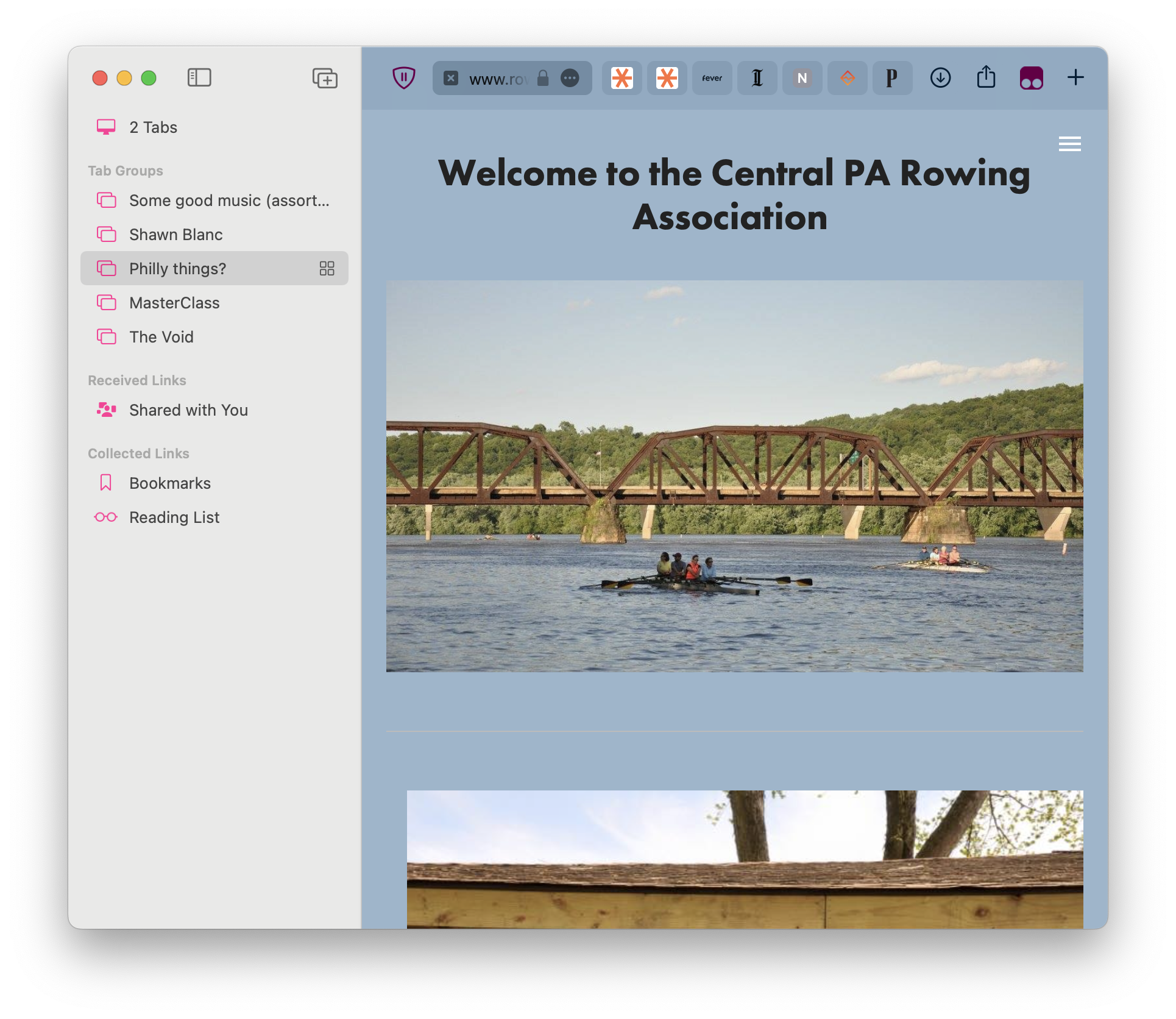
It is perhaps unsurprising that Stage Manager integrates perfectly with a number of other niche Apple software mechanics, such as Safari's excellent and underrated Tab Groups feature, but it does just the same. The ability to store separate browsing experiences in parallel, keeping each one in sync, makes it easy to create distinct spaces for distinct purposes, focusing your web browsing on your various specific needs. (It's the first time I can recall there being an advantage to intentionally creating a handful of separate Safari windows, rather than keeping your tabs bound to a single unified space.) Not only that, but the synchronization of Tab Groups means you can hypothetically open one window across multiple stages, letting you do parallel work across a single set of related pages, but providing you with a specialized workspace for tackling each. This, I'll admit, is maybe only valuable to me and me alone.
MacOS 13 offers a few delightful touches within its desktop paradigm that make Stage Manager both easier and more joyous to use. The keyboard command that historically cycles you between app windows (rather than between apps) now cycles you between the windows within a single stage. All that stage's windows, not just windows belonging to a single app. The one-app Expose command, meanwhile, reveals all the windows of a single app, regardless of which stage they're placed on—an easy way to locate a window that's been lost. The regular Expose still shows you all your windows period, though that feels less necessary than ever. And if you do use multiple desktops, Stage Manager lets you store different stages on each desktop, which allows for a degree of customization and power that I'm not remotely ready to use in interesting ways.
Visually, Stage Manager is surprisingly compact. While its skewed-sideways windows feel like might be distractingly large in screenshots, in practice they recede into the background almost instantly. It helps that the Stage Manager strip remains active even when you cover up the window visuals, and only disappears from view if you cover up the tiny icons that let you know which apps are active in which space. You can reclaim that space, though, just by placing windows over it—at which point, the strip pops open when you hover your mouse over it, and otherwise removes itself from view.
On the iPad, this gets even cleverer. You can resize apps to displace, not only the Stage Manager strip, but the dock beneath your icons. What's more, if you make a single app large enough, your iPad assumes you mean to make it full-screen—at which point, your app looks like any other iPad app, but still exists within the Stage Manager ecosphere. When you call up a full-screen app, you get a full-screen app; when you call up a stage full of smaller apps, you get a desktop configuration. Stage Manager treats full-screen apps like they're a standalone stage, in other words—and if you want to add other windows to that app, not a problem: the full-screen app downsizes a little bit, to indicate you have other apps sharing its space. Focus the full-screen app, and it gentle expands to fill the screen.
Ah, but there's a "but." Because if we're going to talk about the iPad's implementation of Stage Manager, we have to talk about just how dismal that implementation is.
The Apple-critics' stereotype of Apple (well, the one that's not "all their stuff is pricey as shit") is that Apple devices are Duplo-block versions of actual machines. They patronizingly hold your hand, telling you how things ought to work, insisting that no, no, this is the best way for things to be, you just don't understand. Maybe you're just trying to do the wrong things.
I generally don't think that critique holds up: Macs are all full-fledged Unix devices that let you muck around to your heart's content, and iOS offers a decent amount of flexibility within its formal constraints. But the iPad's version of Stage Manager—which is still in beta, and hopefully will see major revisions—is bewilderingly limited. That has nothing to do with its mechanical limitation (you can only assign four windows to a stage), and everything to do with a series of design choices that... well, baffle.
For some reason, the iPad's Stage Manager is extremely opinionated about where your windows "ought" to go. If you open a single app, it will insist on keeping that app centered. Which is a bit of a pain, because its centering ignores the existence of your dock: I tried to open the Books app, making it as large as could fit within my screen, and found that I couldn't make it too big or it wound up burying content beneath the dock. I couldn't just raise the window up an inch, because Stage Manager would drag it back down again. The only way to keep its content fully visible was to make my "book" short and wide, which was hardly a solution at all.
When multiple apps are present, Stage Manager tries to find "logical" ways to make them all fit together. I have no idea what that logic entails, but it's certainly not my logic. The screenshot I share here of three messaging apps splayed side by side took a few minutes to get working right: for some reason, my iPad kept shuffling windows up and down, occasionally throwing one drastically to the side, foiling any attempts to keep the bits of windows that communicate things visible at all times. This is exacerbated by iPadOS's choice to make your active app grow in size and shift position somewhat: aesthetically, a very pleasing choice, but pragmatically one that wrecked the care I tried to put into window display. (The final set-up you see above was a compromise: I'd have used my space far more precisely if the operating system let me, but it didn't.)
Most perplexingly of all, iPad's Stage Manager only lets you resize apps in both directions simultaneously. There's no option to extend a window up or down: you can only grow or shrink it up-and-down, both at once. You can't just stretch an app a little to the right: try it, and its left side stretches out too. This makes resizing things an absolute pain. It's especially frustrating because the "resize" icon consists of a single rounded corner on the bottom-right of a given window, a visual that suggests you'll be moving just that corner. None of this serves any conceivable purpose: it's there because it feels cute, not because it helps anybody with anything. And it's not even that cute to begin with.
On top of that, enabling Stage Manager disables the regular iPad multitasking sidebar—the one that slides in as-needed and stores its own array of apps. That's disappointing to me: that sidebar's universal availability, and the fact that it lets you keep a set of apps whose functions you only ever need as an aside to your main work, makes it extraordinarily useful. The sheer fact that it disappears when Stage Manager is enabled means I'll likely be disabling Stage Manager altogether, which makes me sad. It's funny that a feature which has me feeling better about my laptop than I've felt in a literal decade simultaneously makes my favorite device worse at being a laptop. Two steps forward, one step back.
I'm a little worried that Apple will decide to plow forward with this as their single interface metaphor, gradually dismantling what they've built up for the iPad in the process. They will almost certainly fix Stage Manager's current issues on the iPad; maybe they'll come up with a replacement for the app tray that serves its purpose even better. (And maybe they'll find a neat way to bring it to the Mac after that!) But while people have been waiting for the iPad to reach feature-parity with the Mac for ages, and while Stage Manager is an extremely exciting advancement on that front in many ways—it's worth pointing out that the iPad's windows just look and feel better than the Mac's, a benefit both of their emerging from iOS's elegant interface constraint and of these windows owing no debt to a decades-old desktop environment—this is so radical a step forward that it leaves me alarmed at what non-laptop things might get abandoned in the name of progress.
Like I said at the offset, the official story here is deceiving. The more "startling" change—the transition of the iPad towards a desktop metaphor—is probably the less-interesting shift here, and one that might not have any practical advantages for a while to come. (I rarely use my iPad and find myself yearning for more windows.) Meanwhile, the seemingly-subtler change—the way Stage Manager shifts things up on the Mac—is in fact huge, a drastic change not only in how desktops work but in what desktops are. The iPad loudly got more Maclike, but the Mac, more quietly but more potently, just got a lot more iPadlike. And as a long-time advocate of iOS as superior to MacOS in a plethora of ways, that's exciting. The future of iOS was never in doubt, but the future of MacOS just got a whole lot brighter.
Computers are about to take a major step towards being less awful on one of their most fundamental levels. It's about time.