Yesterday me and my wife designed a site for her company.
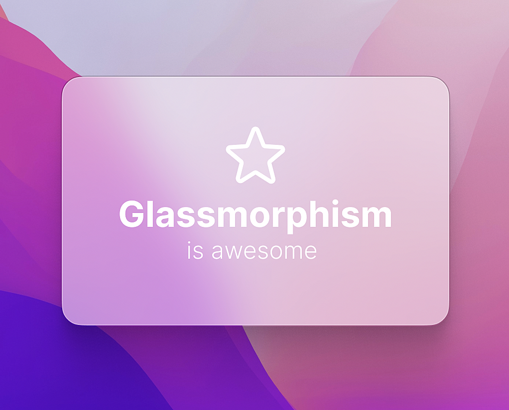
We wanted to follow the glassmorphism trend because it’s pretty fucking beautiful, I mean, look at this:
That blurred sidebar look so slick! And Apple isn’t the only one using this trend, if you just search for the term in Dribbble or Google, you’ll see how freaking satisfying is to look at those glassy panels.
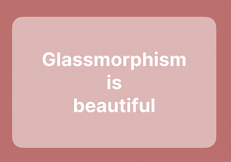
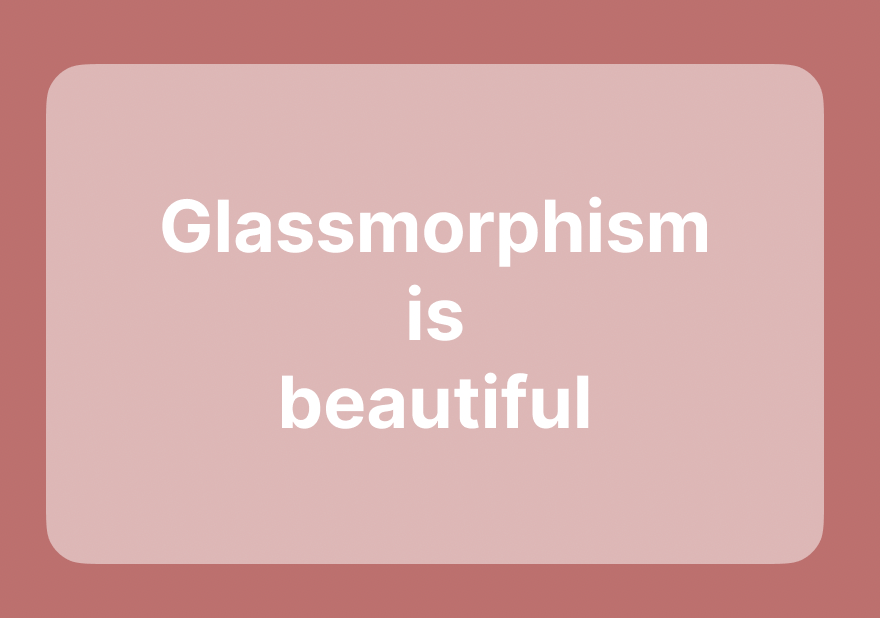
But what makes a glass panel look so good? Because if we just draw a shape and blur the background it’s not gonna look good, look:
See? It doesn’t even look like glass. The reason is that there’s a few parts missing for this small little card to look good and glass-like. The first one is having something to blur. A solid color will never look good blurred, because when you blur a solid color, nothing happens.
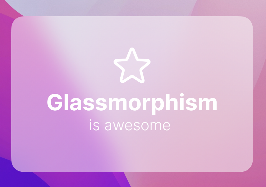
Let’s put a nice image behind it to see how it looks:
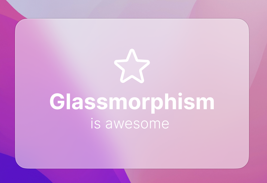
It already looks waaaaay better. The blur radius is set to 40px. Yeah I added a star icon and tweaked the typography, but the glass effect itself already looks kinda good, but it’s not done yet, still doesn’t look real enough. If you take a closer look at Apple’s example above, you’ll notice there’s a little border around the glass. There’s actually 2 borders, a black low opacity border outside and a gradient border inside going from white to transparent, diagonally. That’s because glasses reflect light differently in the borders.
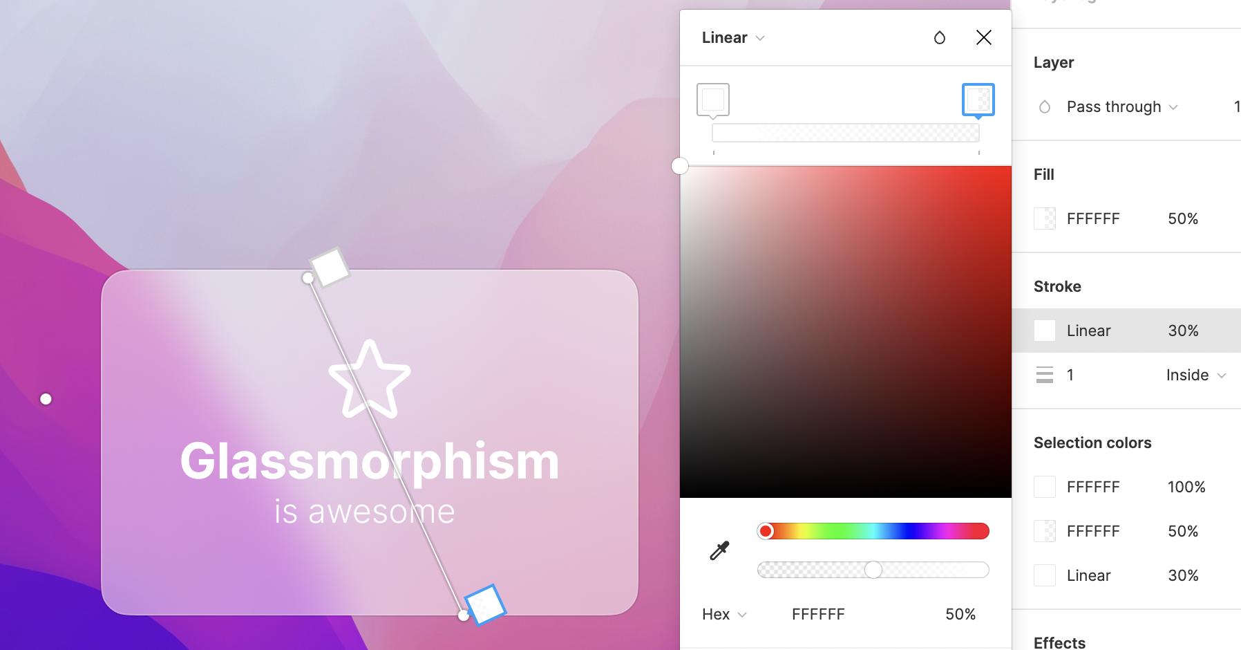
Let’s add those:
Hmmm, tasty. I added a 10% opacity black border outside and, inside, a gradient border with opacity set in 30% going from white (100% opacity in the color, not in the whole border) and 50% white in the other edge:
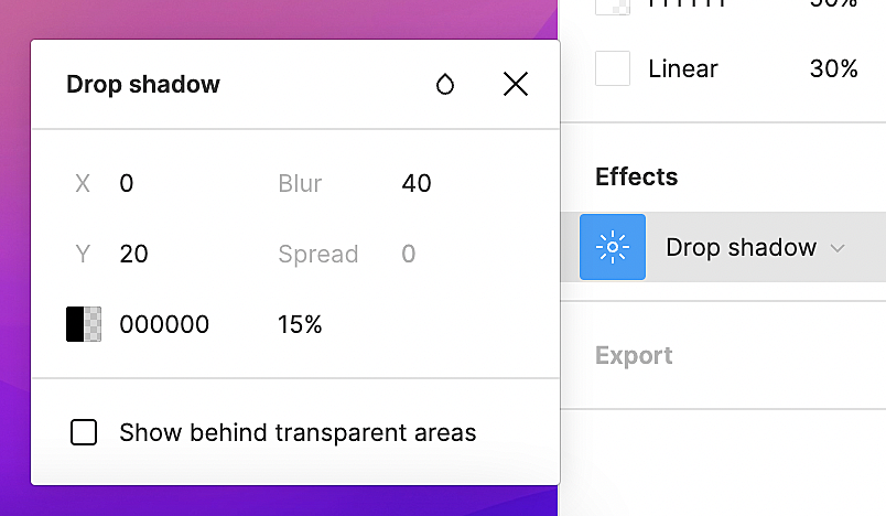
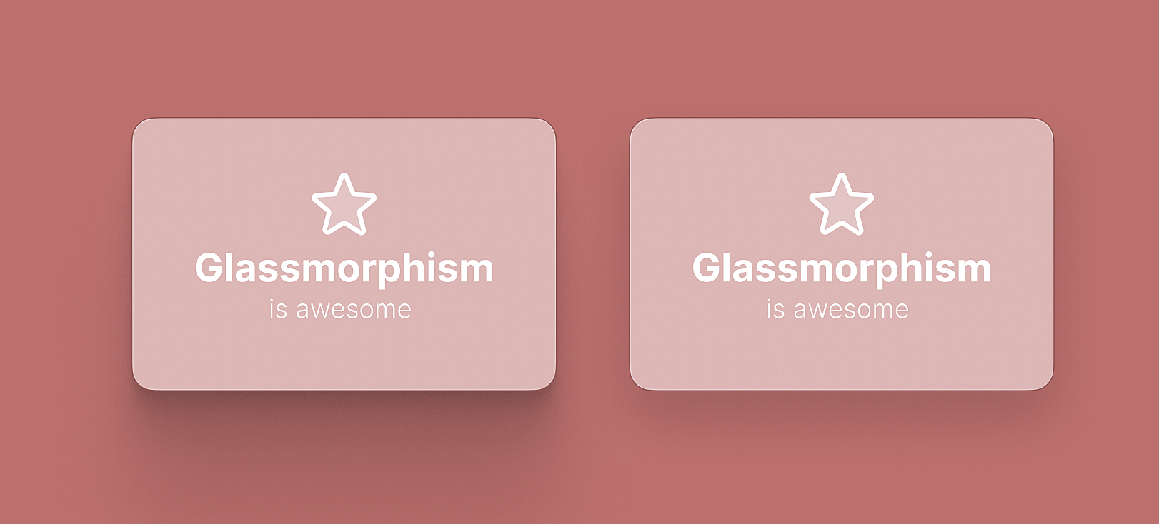
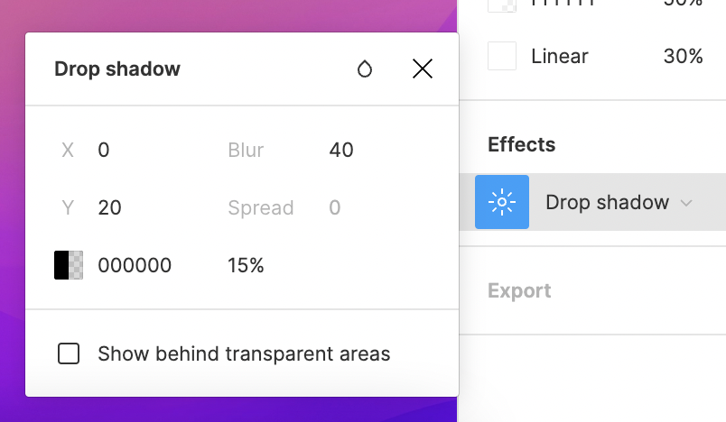
But it’s not done yet, there’s one last step missing: THE MIGHTY SHADOW. You just need to add a drop shadow in the glass to make it look like it’s raised, above the background. But you have to make sure the shadow doesn’t go behind the glass itself. Figma has a checkbox for this. Here’s my drop shadow panel:
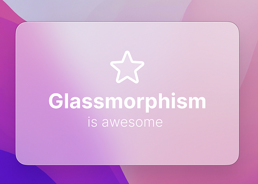
Make sure to uncheck that “Show behind transparent areas”. And here’s the final result:
It looks AWESOOOOOOOOME. Oh, I increased the black border opacity to 20% (cause it disappeared after adding the shadow) and also increased the background blur radius to 60px.
That’s it, this is how you make a good looking glass panel, but I have one last tip: smooth shadows.
You may be wondering what the hell is that, since the drop shadow effect is already smooth. Well, what if I say there’s another way to create shadows that looks way different?
Take a look:
It’s subtle, but noticeable. It's a different style, but it sure look good as well. This is not something we usually do by hand, there’s plenty of smooth shadow generators out there, but I’ll mention two of them:
It basically adds multiple shadows to create something more realistic.
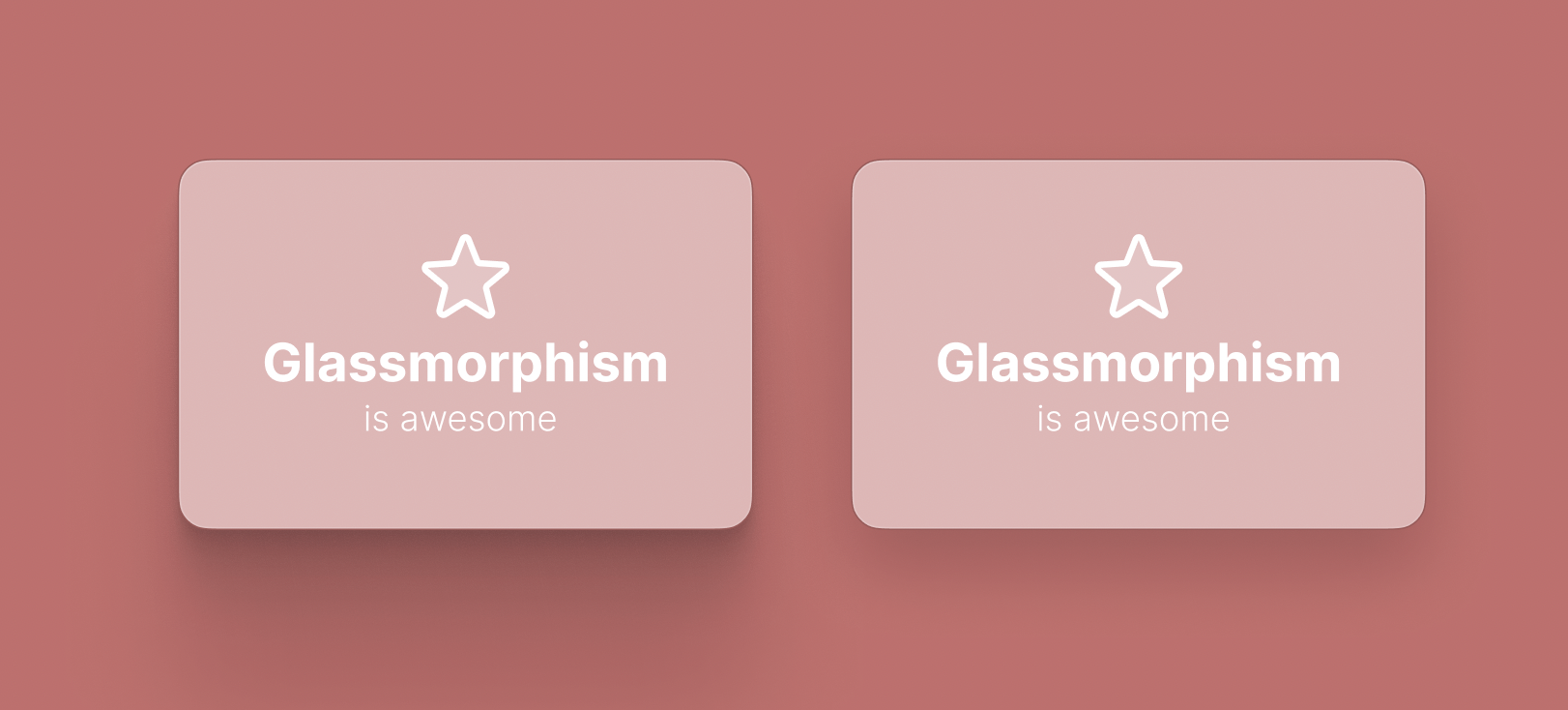
If you wanna see the difference, here’s a side-by-side:
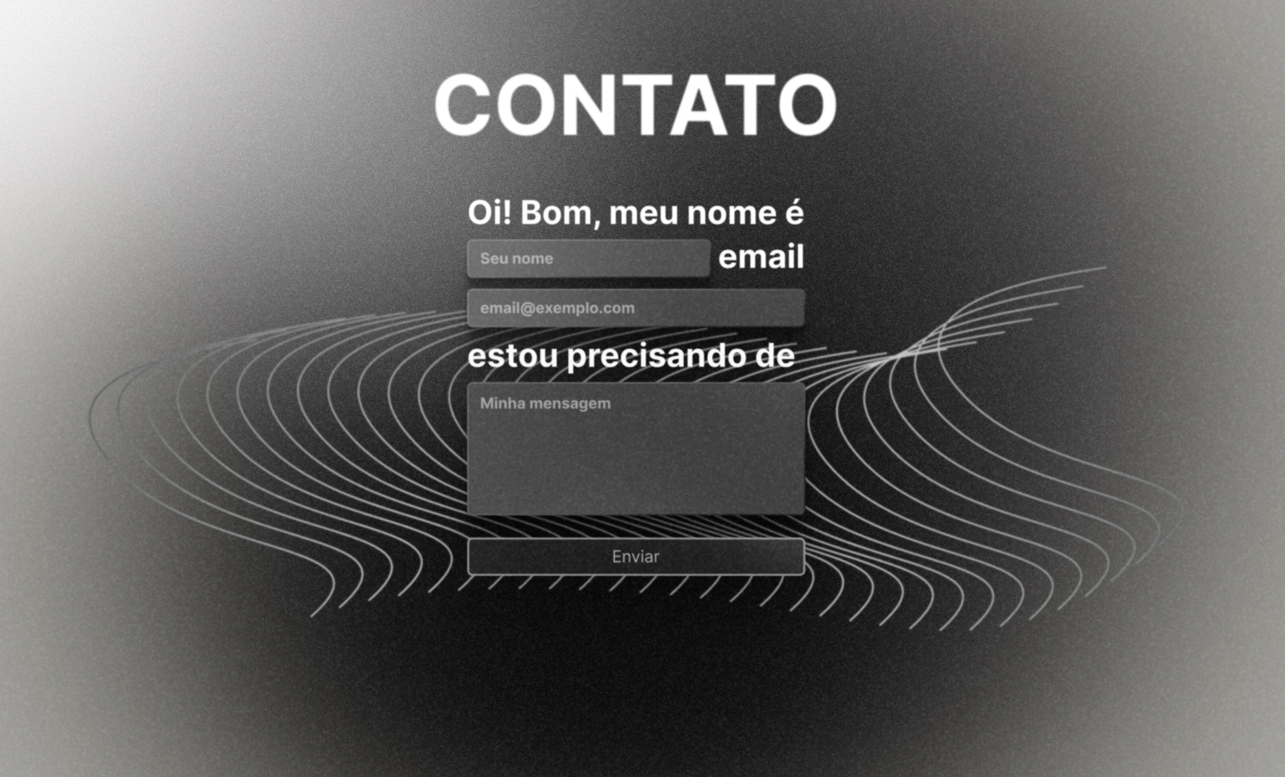
In my wife’s company’s site, we wanted it to look like something old, so we combined a bunch of shit. We created some black/white gradients for the background, created a abstract shape behind the main stuff, added grain to the whole thing, used glass panels (with smooth shadow) in the inputs and blurred everything just a little bit (the fonts included), so you feel you’re inside an old movie. Here’s the result:
To be honest, I love it. It’s pretty different and really weird, but I love how weird and interesting it is.
The font I used in all images is Inter, an open source font. You can find it in Google Fonts or in Github. It's gorgeous.
That’s it, thanks for reading!
There won't be any wallpapers today since this newsletter got long enough lol