The Applications page in Harvest Profit is built for farmers to manage all the fertilizer, seed, and more that goes on their fields. Here it is for reference.
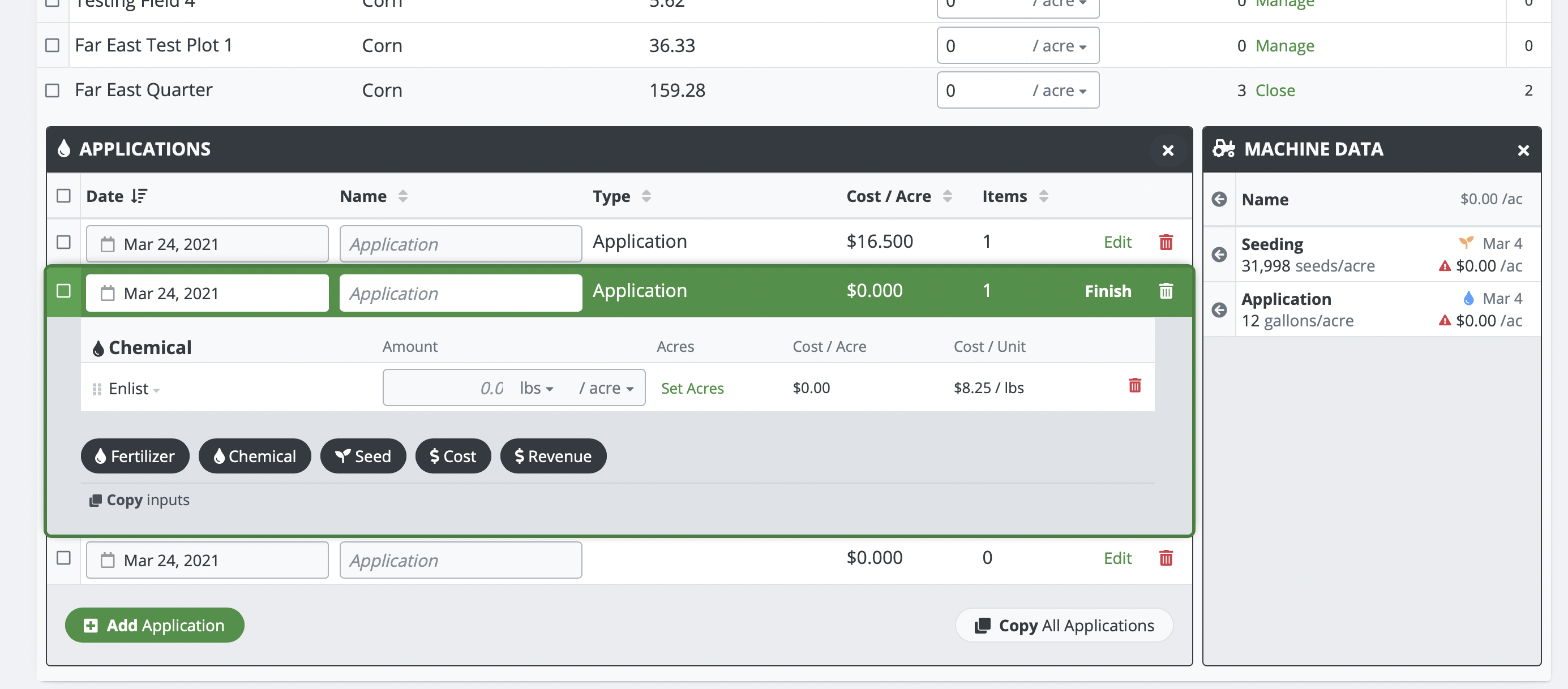
It has a table of fields that you expand to see a table of activities. Each activity can be expanded to edit the contents, which are a table of products (triple extension!). Oh and we also have a side panel with a table of 3rd party activities and products to import from. There is A LOT going on here. I had to throw out everything I knew about design and start from scratch with this one.
The overwhelming feedback on prior iterations of this page was the need to see everything. So individual "edit" pages was not an option. Modals and popups were a thought, but they don't allow for jumping between activities.
Instead I took a principal from website design. Designing Above the Fold in website design means to design for what fits on the user's screen without them needing to scroll down to see more. So I took an iPad (the smallest screen we support) and designed the page to allow for triple extension while keeping it on the screen. In fact I wanted at least a few table rows to show up under that as well.
Then the task was to make what you were editing stand out; this was a newer addition. When you go to edit an activity, it converts into a green bordered popout. This reigns in the user's focus similar to how a modal or a separate page would, but it still allows them to scroll to other fields for reference.
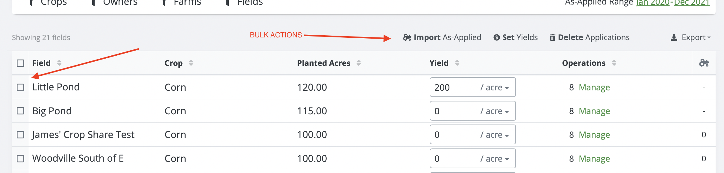
The last piece of all of this was trying to determine how best to act on all of this data. I mean sometimes theres 100+ fields in here that need 5+ activities. We had to really critically think about how to handle bulk actions. We found that asking the user to SELECT which fields they want to act on BEFORE showing them the bulk actions often was confusing. In a way it was hiding features. Our solution? We built our bulk actions to work both ways! You can click on the bulk action first which will prompt you to select which fields to act on, OR you could select the fields first.
One major benefit of this is that at all times, users know exactly what is possible with the system. They do not need to click around to find features.
Why do I point these things out? Because this page breaks all sorts of design best practices. But it is also highly optimized for its use case. Takeaway: Don't be afraid to break best practices if you know your customers well enough.