At 6 months old, my daughter's favorite toy is our Apple TV remote, followed closely by my Magic Mouse.
She will sit up, moving them about her hands with great concentration, for a good 30 minutes in the morning.
She will sit up, moving them about her hands with great concentration, for a good 30 minutes in the morning.
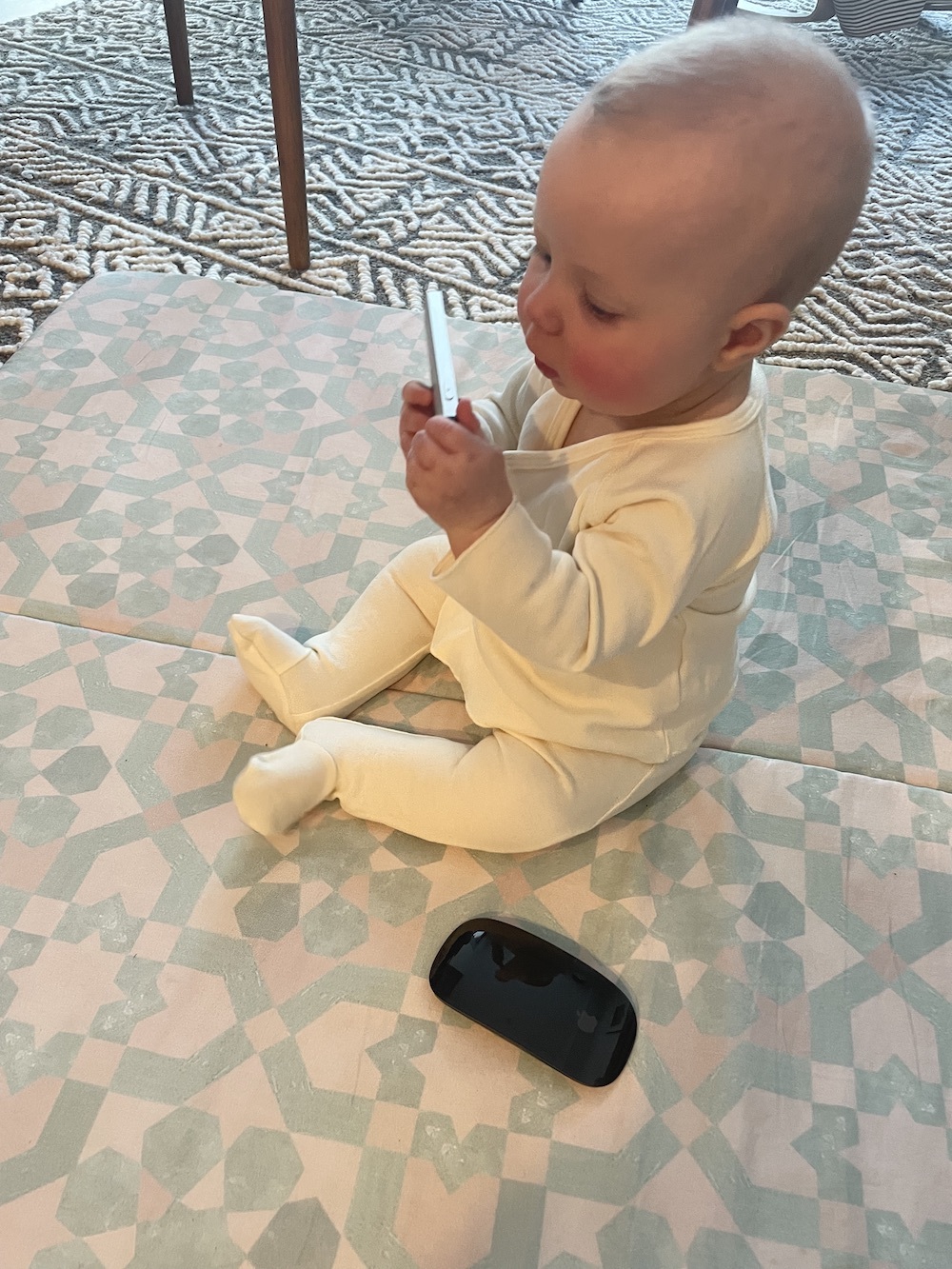
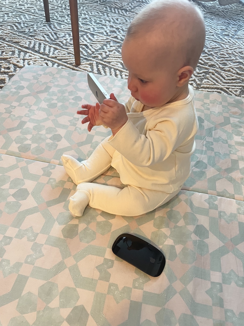
This past week I have just been embracing this, using that time to shower and make breakfast and have a coffee and feel more human. But this morning, after being gifted with a particularly easy night, I just sat and watched her play.
Those with young children know that they are the ultimate embodiment of the present moment. When they're bored or dissatisfied with something, they will let you know with 100% of their being.
The flip side of this is that when they're interested in something, they will doggedly go after it with 100% of their being.
So, what is it about the remote and mouse that she finds so captivating?
Initially I thought that she just liked them because she sees me use them. But after watching her, I’m convinced she likes them because of their good design.
Now, I’m not suggesting that my daughter is somehow a connoisseur of great design (though of course every mother likes to think her child is remarkable in some way).
But, I’m convinced that babies inherently appreciate good design. Not because they know the semantics of design, but because they are captivated by what good design entails - novel simplicity.
The Apple TV remote is a great example of this, let's compare it to our Samsung TV remote;
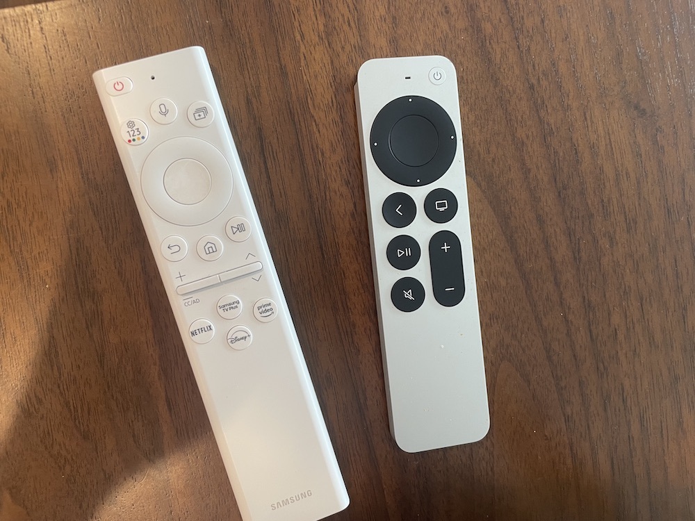
A lot of differences right off the bat, but the biggest one is the amount of buttons - the Apple remote has almost half as many.
There's only the buttons you need often, like play/pause, mute, volume, and up/down/left/right nav. You don't change your TV's settings as often as your change the volume, so why have the button?
With fewer buttons, there's more space for each of them. They're bigger and more tactile - the "back" button curves inwards slightly under your thumb, so you can feel for it without looking down.
Of course, Apple have also done their thing and made everything look sleek and fit nicely together. But, above all they've recognized that a remote should be used with your hands, not your eyes, and they've had the form follow that function. That's the novel simplicity.
When building software, true novel simplicity in how it's designed is also ideal.
You want things to feel familiar enough so that the mental models a user has can be applied, but novel enough that using it feels new and compelling. This is a hard balance to strike.
It's tempting to start designing from scratch, even moreso if you're starting a business from scratch. Going from a completely blank canvas can feel more indulgently legitimate, and certainly more novel.
But novelty simply for the sake of it is no good. You wouldn't want a remote that you had to use with two hands, just to be different.
How to strike that balance then? Until you're Apple, it's best to just start from the simple - from the known and accepted idea of how software should feel - and iterate on the design and experience from there.
We often grab a Tailwind template or component straight out of the box, and make changes as we go. Back in the day we used Bootstrap. There is nothing wrong with starting from here, while ideas are still taking shape. It's quick and allows you to get something in front of people, which is where the real iteration happens.
Over time the novelty in your design - your own brand - will come. But until then, find a baby and show them your product. Make things simple enough to use that even they can understand it.