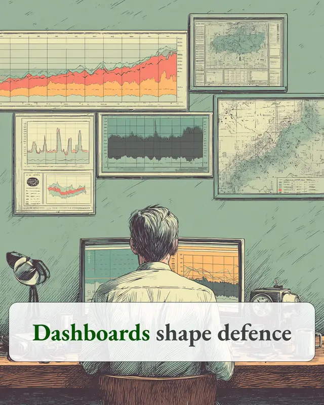
A dashboard can make a team more informed while making the room less honest.
The numbers go up on the screen. Someone starts explaining too early. Someone else goes quiet. Information intended to improve visibility can feel like a public sorting mechanism instead.
I have seen the same thing in interface reviews. A screen can be technically clear and still land as accusation. Too much red, too little context, rankings without explanation, exceptions displayed without sequence or a recovery path. The system says visibility. The room feels pressure.
That is the part I think product and leadership teams can miss. A dashboard creates a way of relating to the information it shows. When people feel watched, compared or cornered, the conversation can become about defending the number rather than understanding it.
Good dashboards do more than surface performance. They make room for context, explanation and what happens next. In Tai Chi terms, the point is to remove unnecessary bracing so information can keep moving.
When a dashboard changes the tone of a room, I do not only ask whether the data is correct. I ask what the interface is teaching people to do with it.
Originally published on 10 July 2026. Read on jamesgodwin.me.