Designers: What on Earth is going on with Shampoo bottles?
I've always been baffled by the design of shampoo and conditioner products.
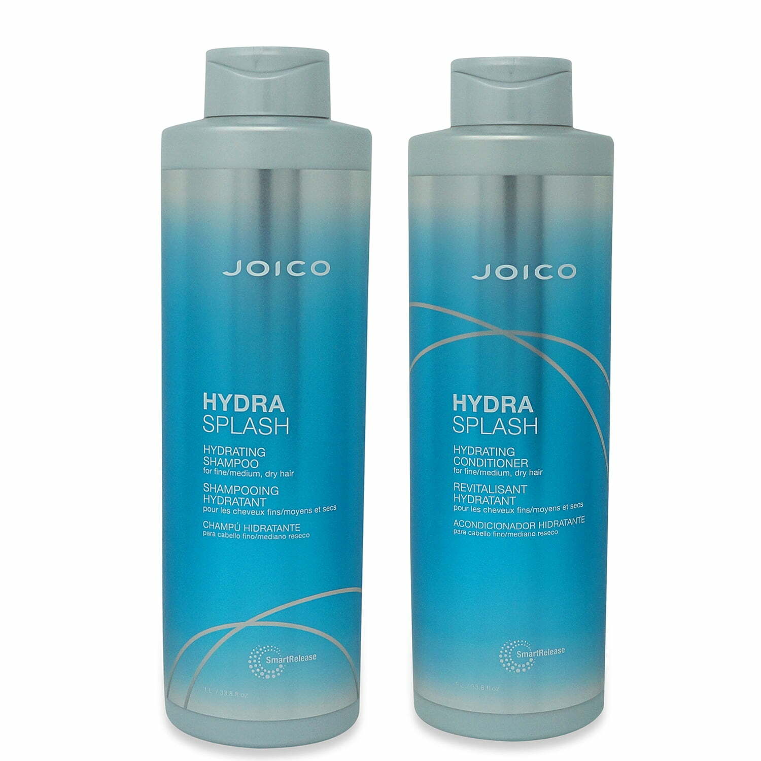
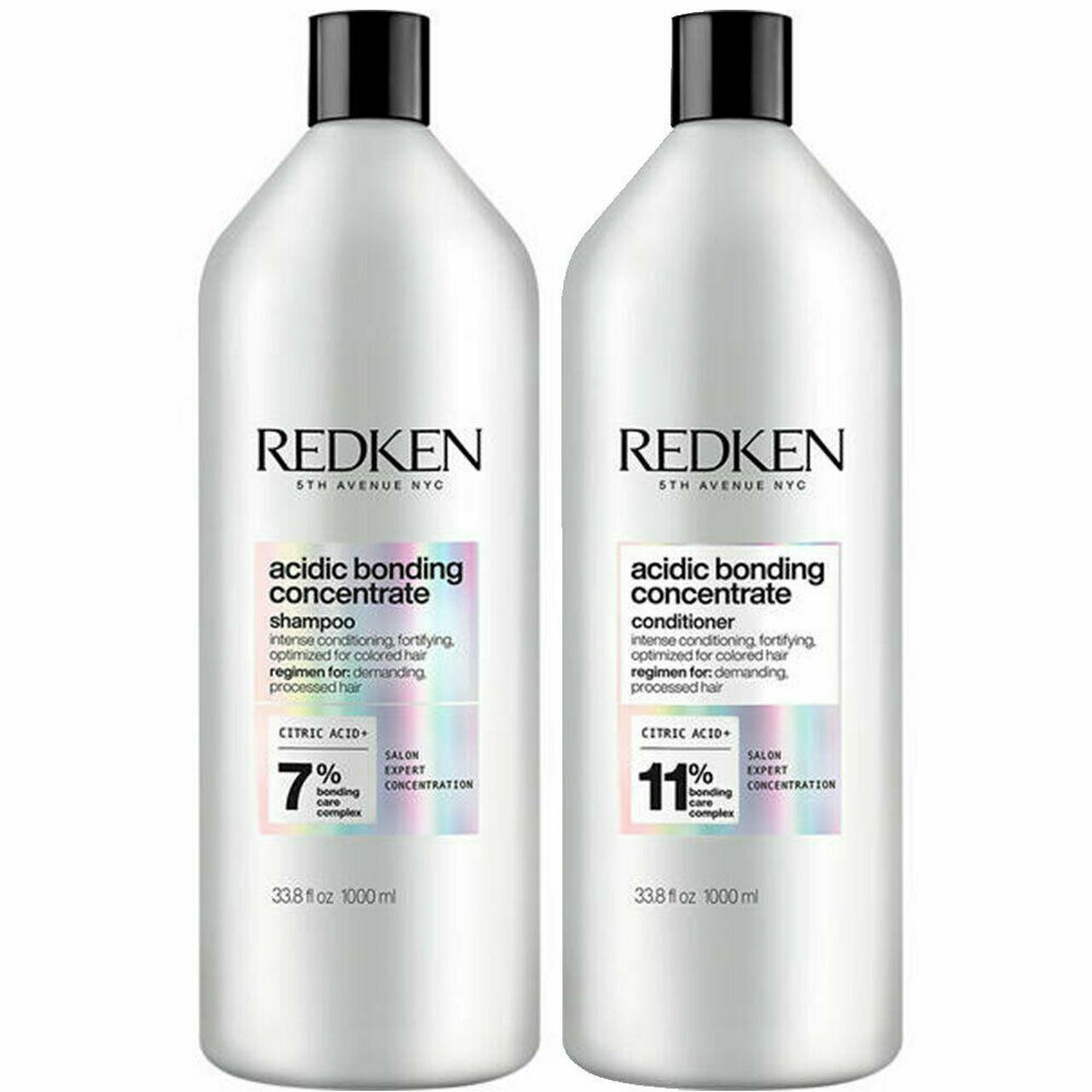
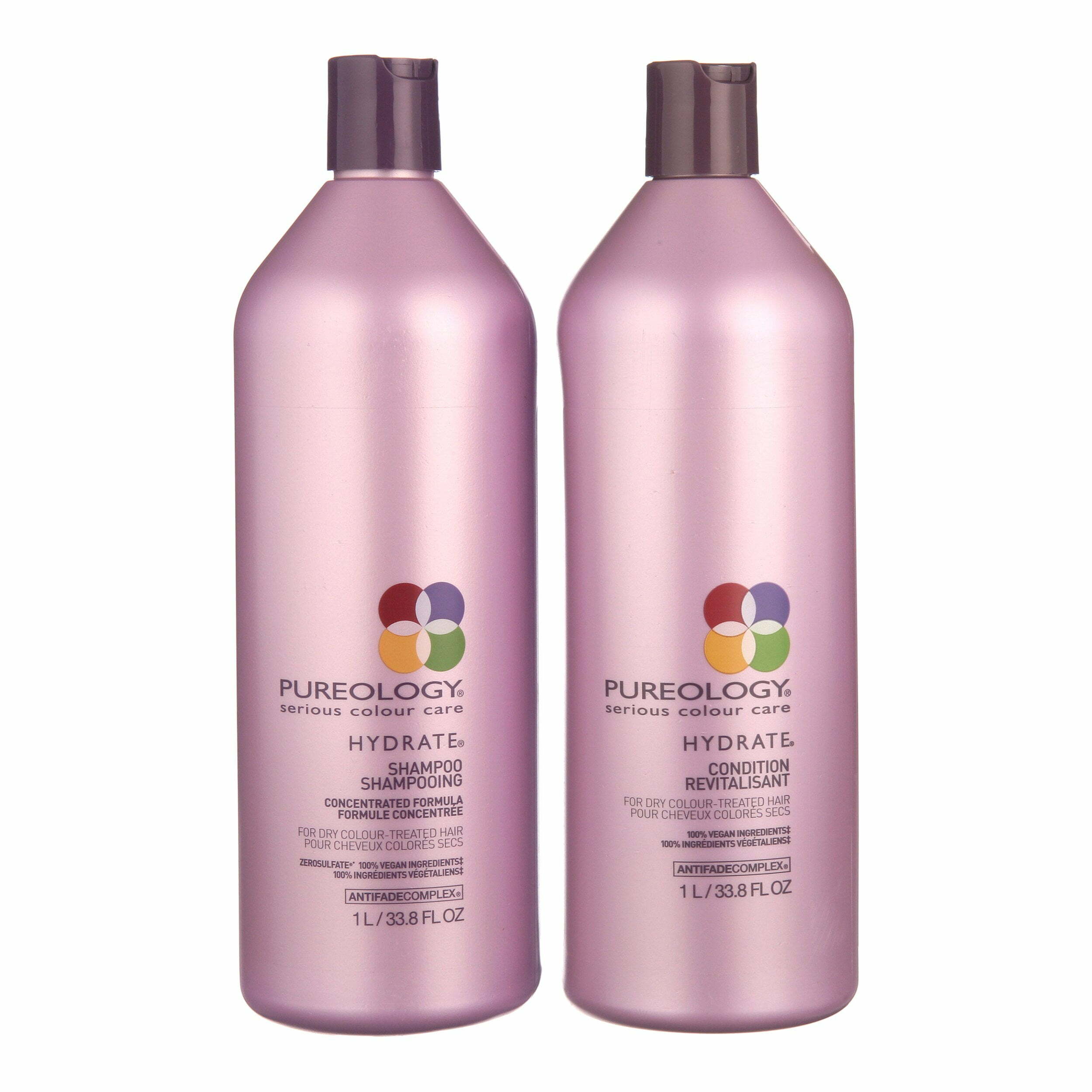
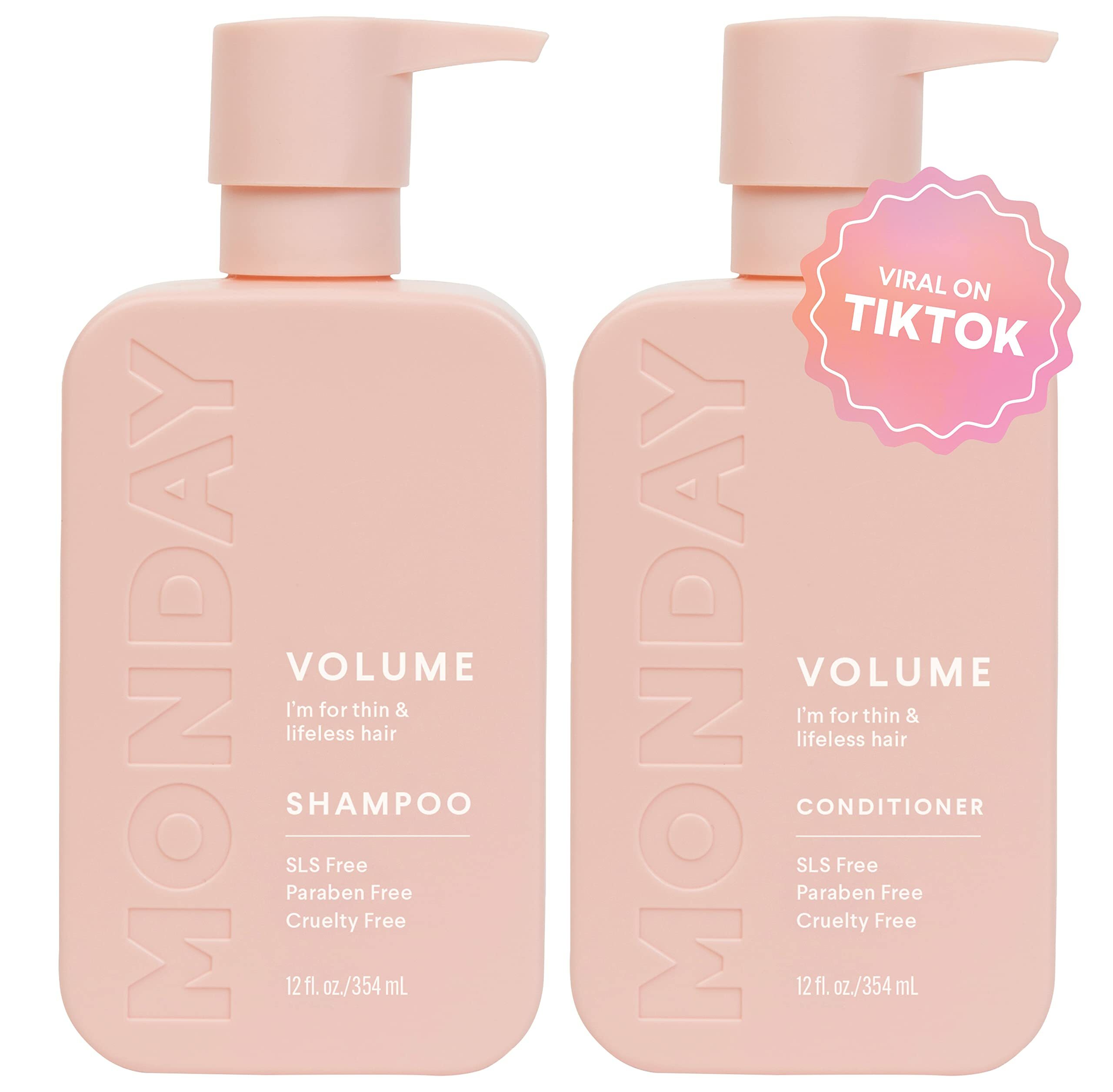
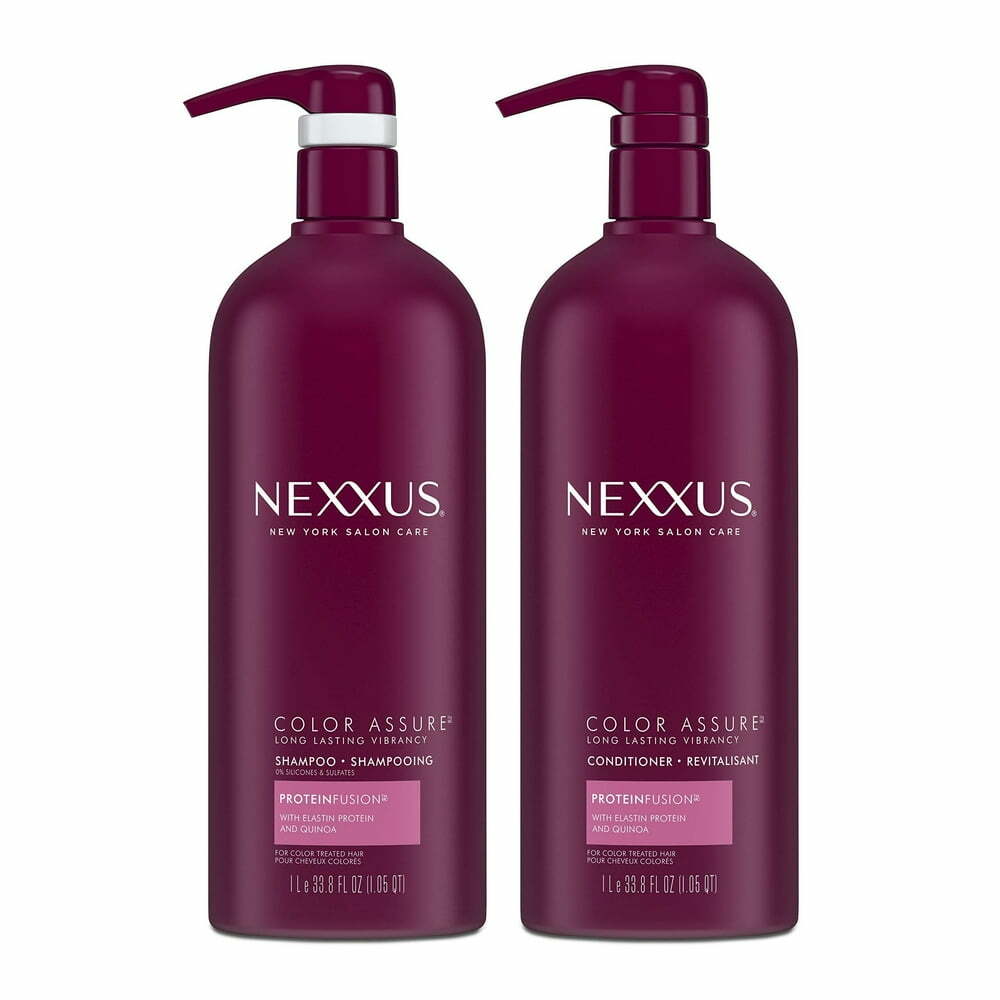
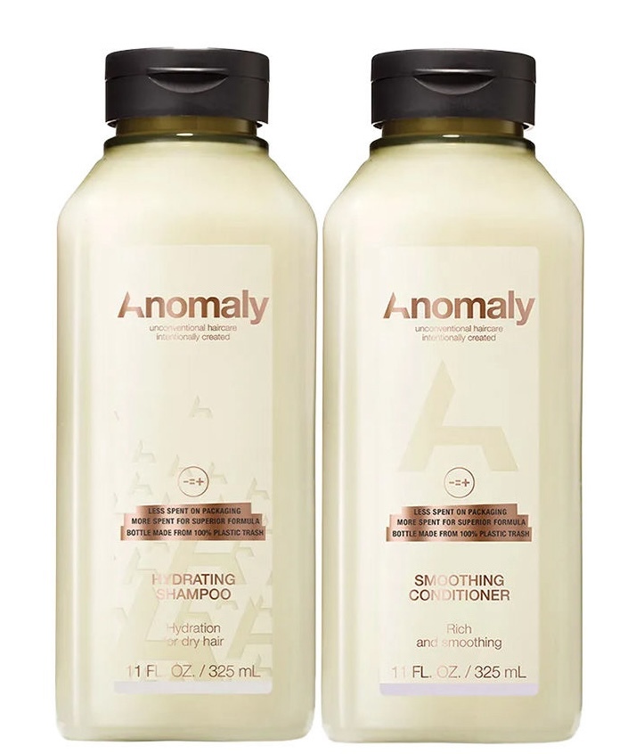
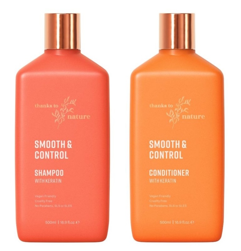
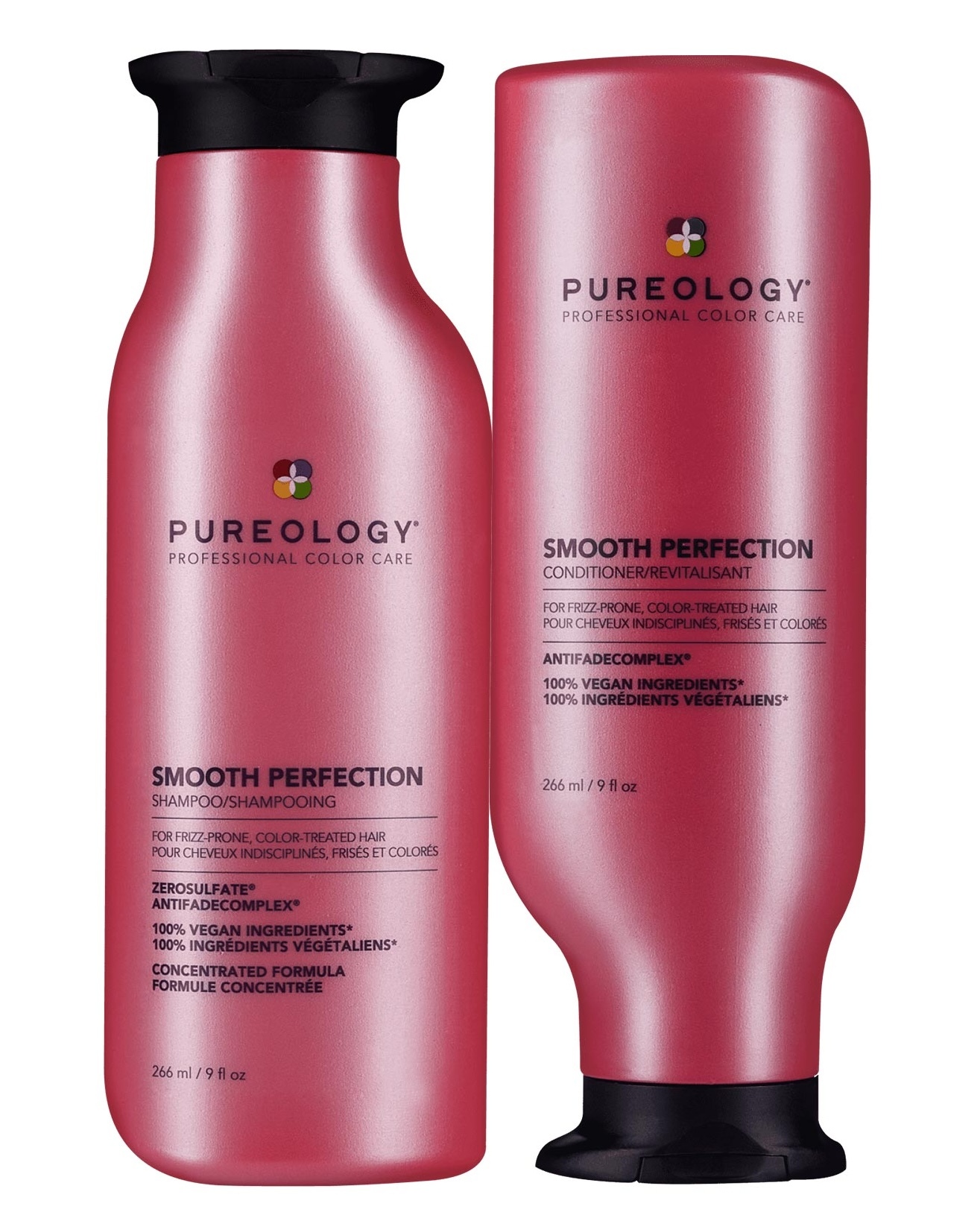
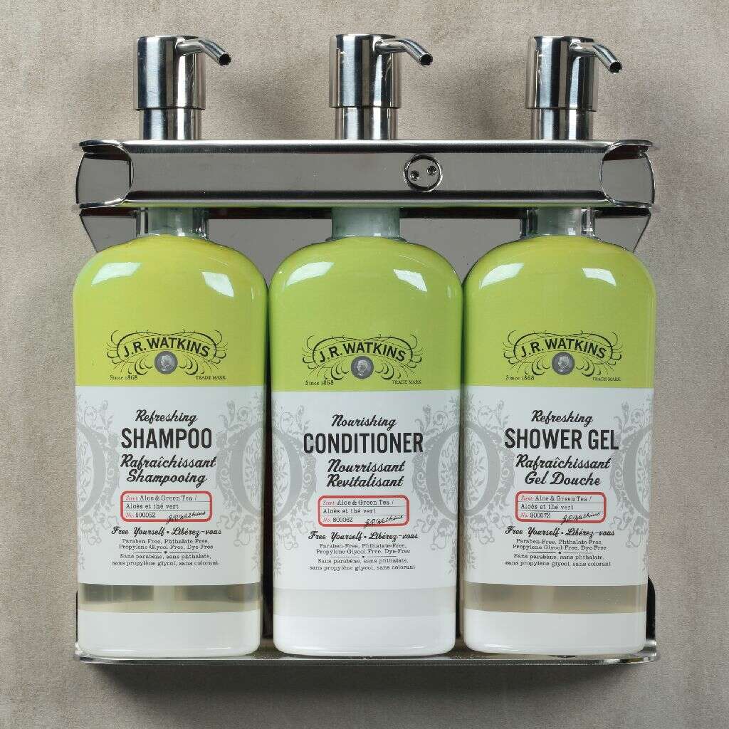
Invariably the bottles are nearly identical and the only way to tell which is shampoo and which is conditioner is to scan for one line of tiny type SOMEWHERE on the bottle. It defies logic and is (somehow) universally accepted in that industry.
There are hundreds of examples of this fundamentally poor design, just stroll down the isle at any drug store.
And the type isn't just tiny. It's often low-contrast, all-caps, and otherwise (creatively?) visually subdued. Pretty much the same treatment designers use for legalese at the bottom of an advertisement, which is designed NOT to be read!
Some brands try to differentiate the bottles with color or shape, but you still have to find the tiny text to understand which color and which shape identifies each bottle and somehow care enough to remember the next day.
So what's going on here?
I honestly don't know. It's so obviously wrong to any consumer and every first year design student that there has to be more to it. The proper visual hierarchy should be [ "Shampoo" | "Conditioner" ] > Brand > Everything else. And even brand-first would be acceptable if [ "Shampoo" | "Conditioner" ] was clear and obvious.
One could make a case that these bottles are designed for the store shelves and not for the end user in the shower. This example of a product designed for hotels and likely sold B2B would support that. It's pretty clear if you can read (Don't get me started on kids products!).
But that can't be it. Even if they're designed for merchandising reasons isn't figuring out which is which a problem for everyone—from the people who stock the shelves to the dummy like me who takes 10 minutes scrutinizing every bottle and double checking to make sure I got it right?
Think about it. It's hard to figure this out in the store under bright, artificial lights. But it's pure nonsense to think someone can do it the conditions of daily use. Imagine the shower. You're wet, there's water (and soap?) in your eyes, the bottle is wet, your hands are wet, it's steamy, probably early in the morning, you're not wearing your glasses or contacts... now all you have to do is spot the tiny, white, all-caps text printed over a pattern on a shiny, metallic bottle. Oh and after a few weeks the printing starts coming off anyway.
Maybe that's it? Does the hair care industry thrive on people accidentally buying two bottles of shampoo? Or wasting conditioner because they grabbed the wrong bottle (again!)?
I'd love to hear from a designer in this industry who can explain.