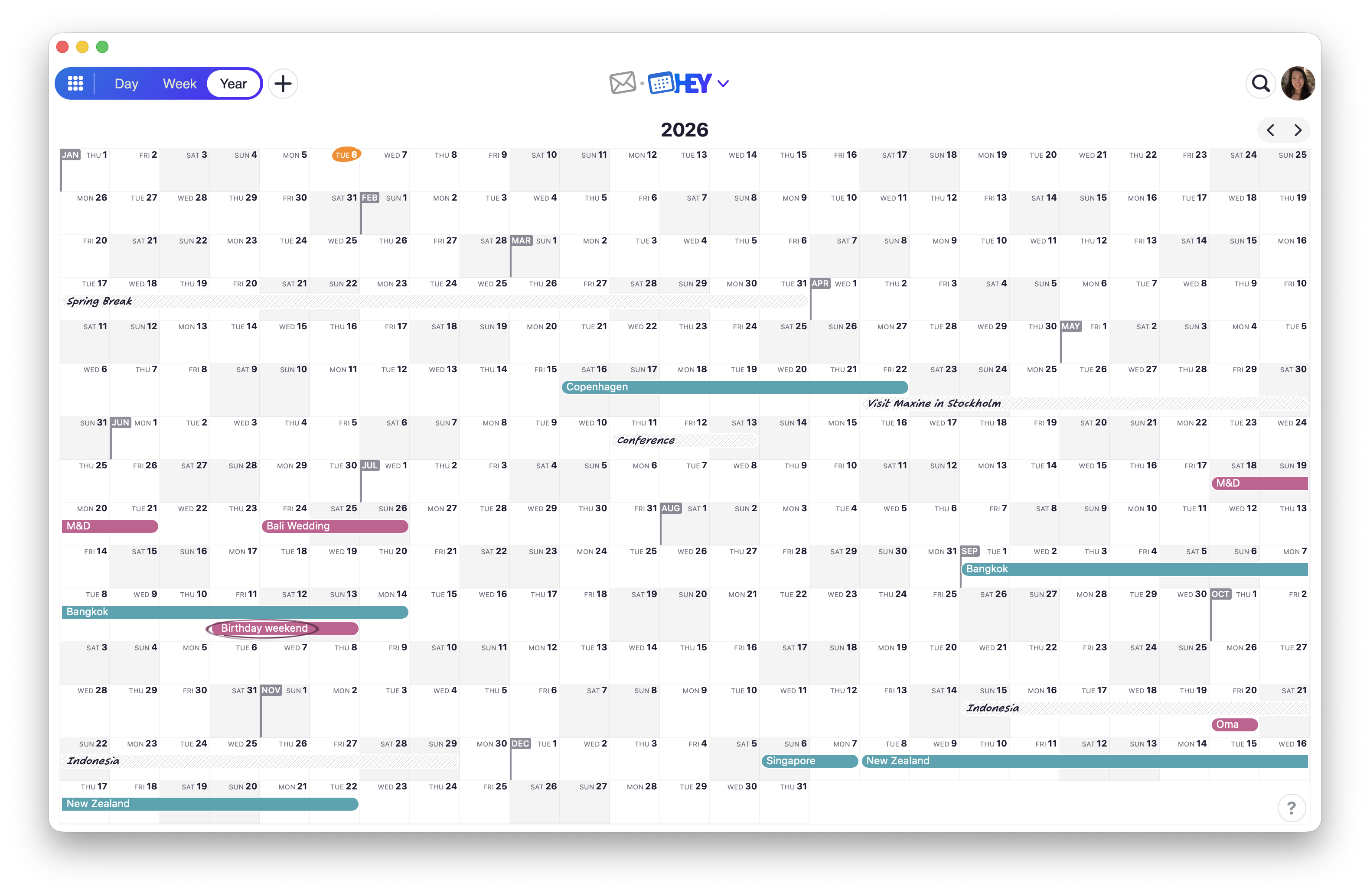
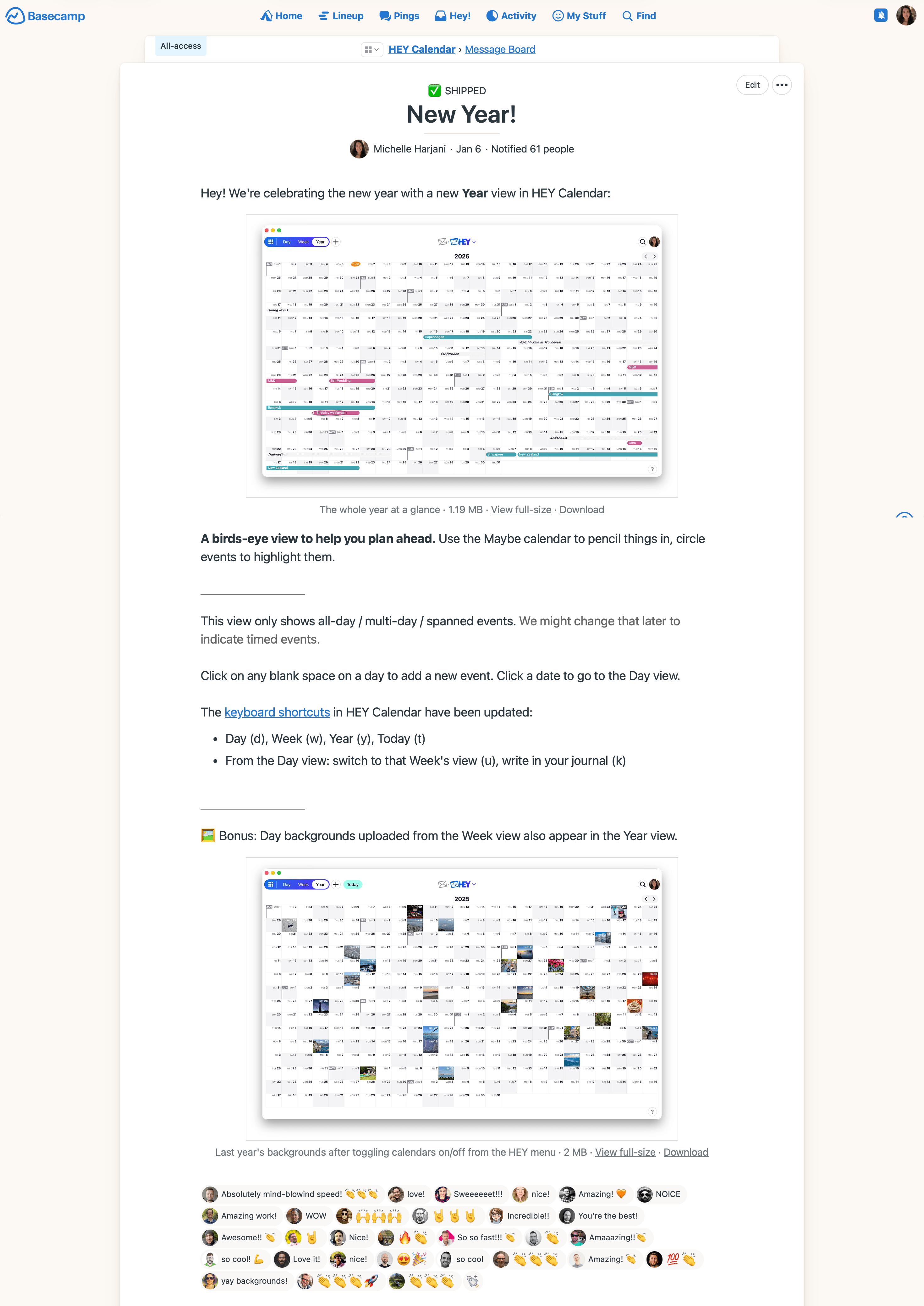
HEY Calendar has had the Day and Week views since launch, but no way to see the full year at once. It’s early January—the perfect time to plan ahead. Add your work trip in May, the conference you may attend in June, a wedding in July. See it all at a glance.
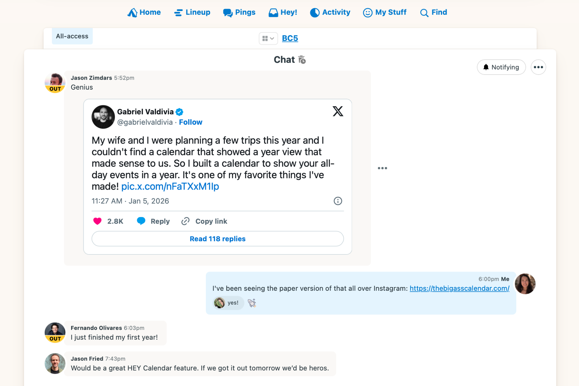
The inspiration came from a tweet and the big calendar that went viral on Instagram. The challenge was to ship it in 24 hours.
This is how it went.
————— Mon 9:34pm – Set aside what I was working on and wanted to see how far I could take this.
Let’s start with the foundation.
Added a link in the calendar nav to route to the Year view. The calendar grid in the Week view caps at 7 columns; in the Year view I changed it to dynamically increase the columns as your viewport widens.
With an empty grid of dates set up, I added spanned events to the calendar. Got the events to appear in the right days and multi-day events to span accordingly. Got multiple events to stack neatly as opposed to overlapping in a day. Used what we have in the Day view and Week view for the spanned events layout—didn’t need to build this from scratch.
Added arrow keys to jump back/forward a year, added links to the Day view when you click the date, added links to open the event popup when you click an empty day.
Styled the calendar with shaded weekend days and the first day of the month flags, both inspired by recent work I did in BC5.
Added a bunch of events locally in multiple calendars for testing, added the missing Maybe calendar styles to "pencil in" events, added circle event styles.
At this point, it was functional! Let’s polish it up.
Fixed the jump menu when you’re in the Year view, which was busted. Now when you choose a date, the date gets highlighted with a yellow background and fades away.
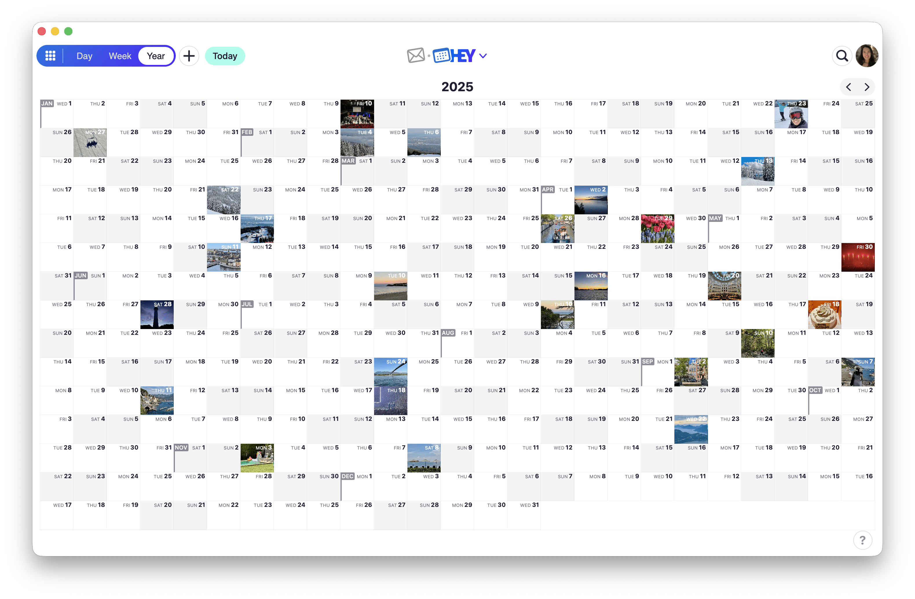
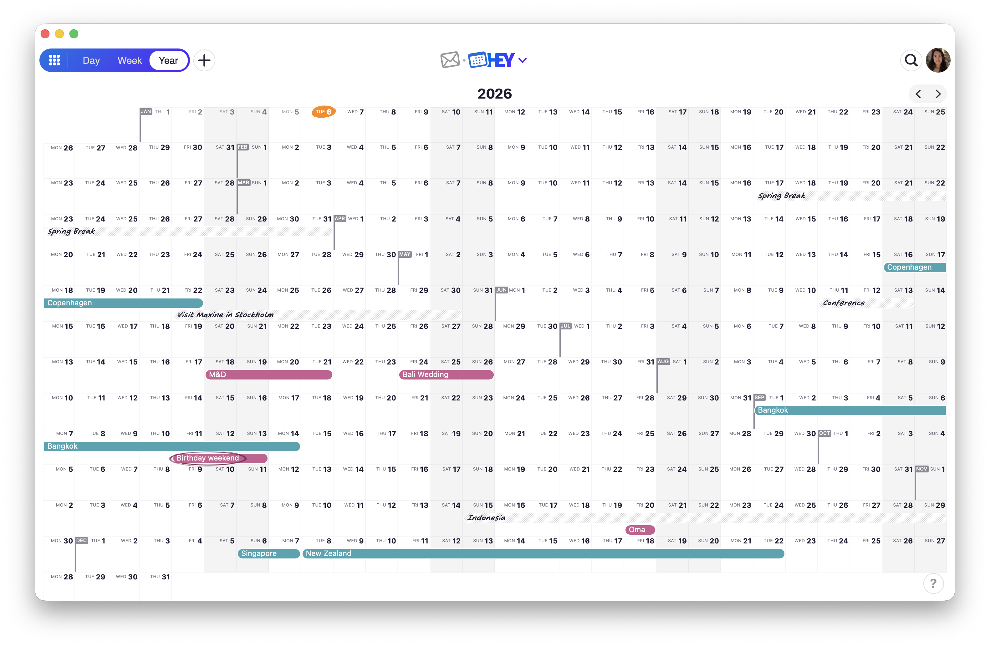
Added day backgrounds in the Year view. It’s a neat HEY Calendar feature to personalize the days with images on your calendar. Kept the scope tight to just reflect the image you uploaded from the Week view.
Because spanned events are what appear on the Year view, when you add a new event from the Year view, "all-day" is toggled on automatically.
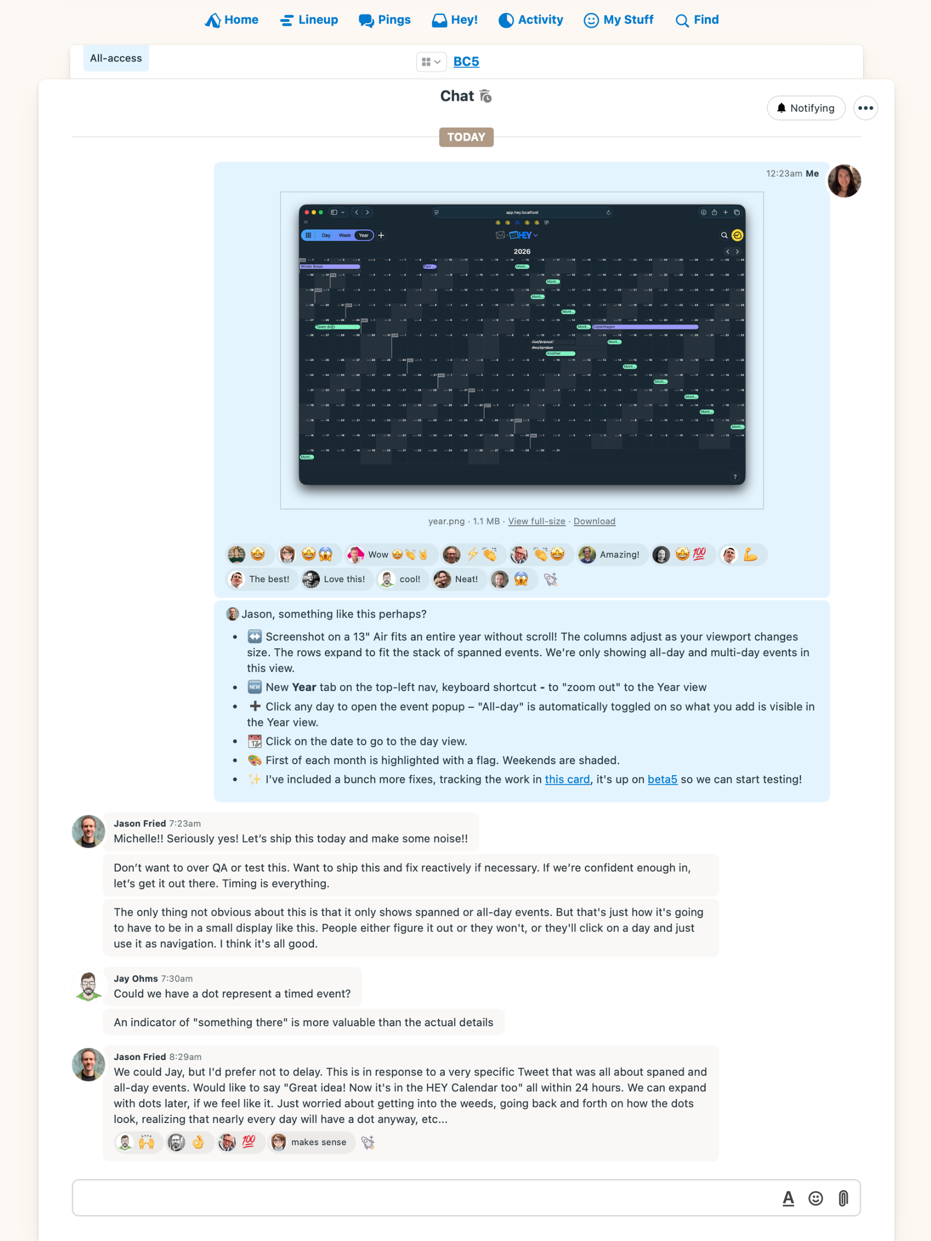
————— Tue 12:22am – Shared a screenshot in the project chat and deployed to beta for testing. In beta, I got to use my real calendar data. I could quickly add travel plans and events coming later this year. I liked what I had so far.
Found and fixed a couple issues before wrapping up for the night:
When editing an existing event, it needed a manual refresh for the change to reflect. Fixed by splitting refresh() into refresh() and render() so turbo:morph content updates always re-render. Claude.
I didn’t like how all-day event titles for public holidays were truncated with ellipsis so you’d see "..." all over. Changed it to clip the text to see more characters.
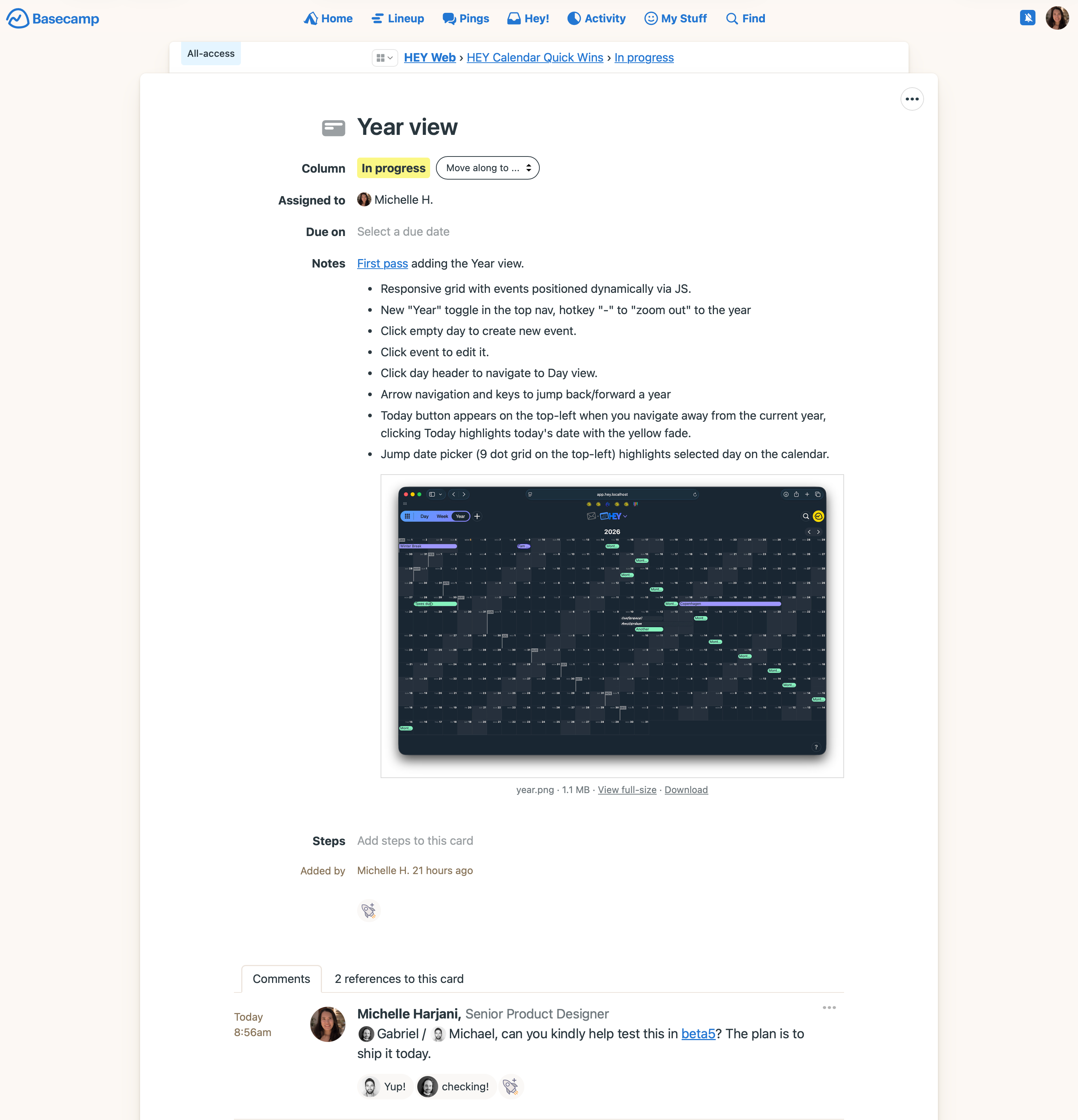
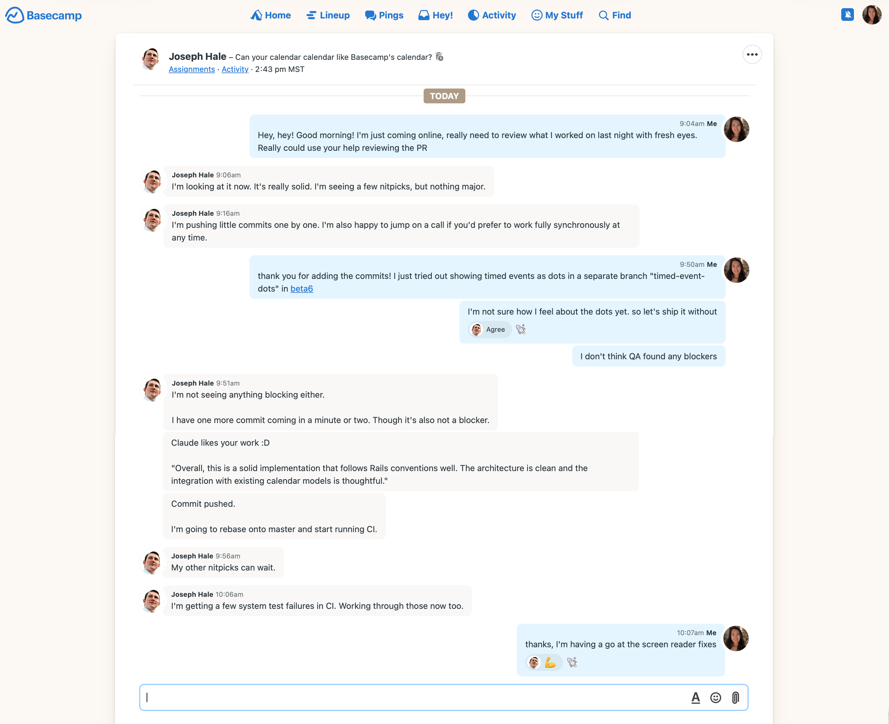
————— 8:56am – Started my day catching up on notifications. Saw the team’s boosts and excitement for the feature. Gave QA a heads up it’s in beta for testing. Pinged Joseph to review the pull request. He cleaned up some code and fixed unrelated failing tests while I worked on an exploration and some fixes.
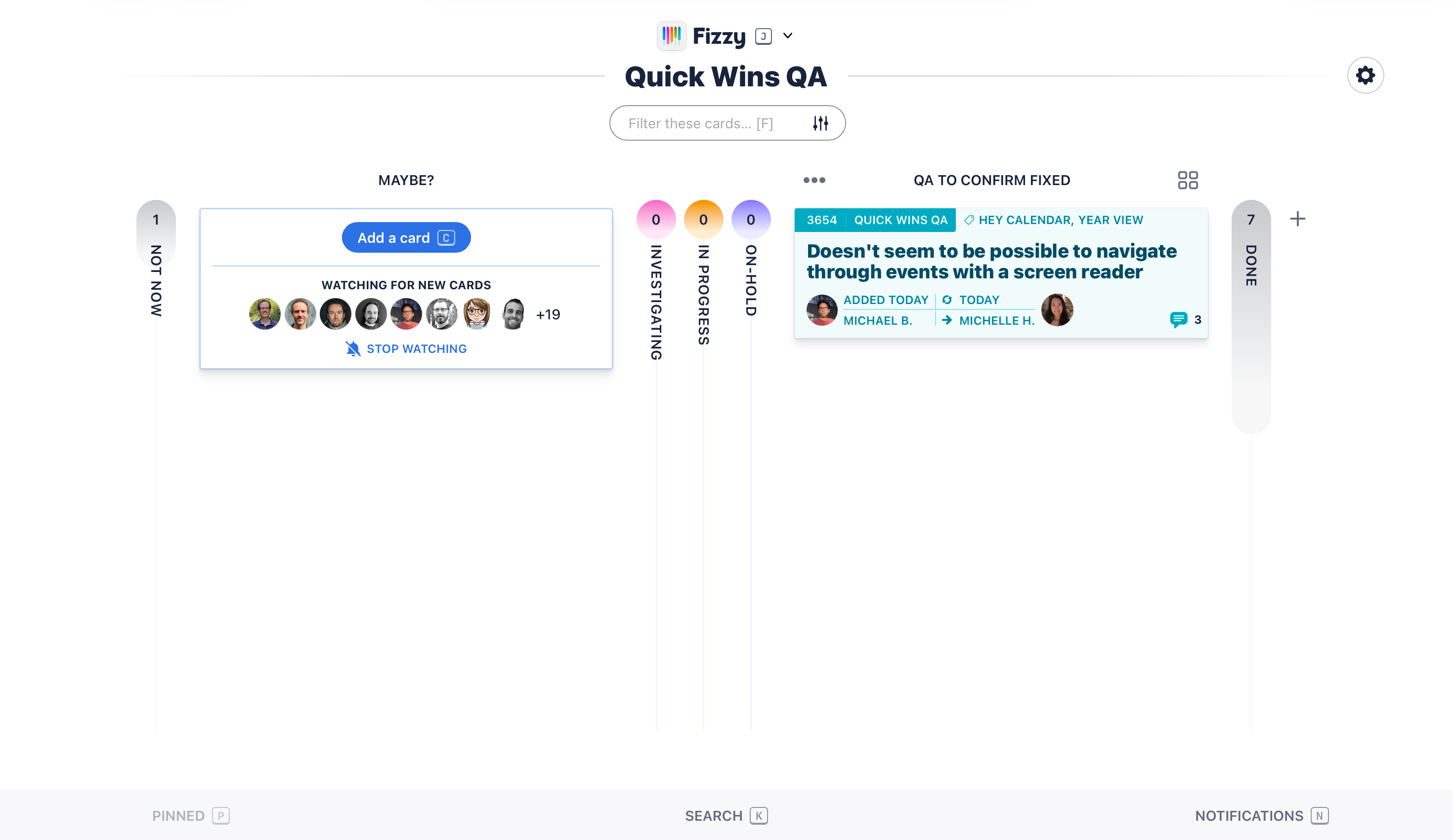
10:07am – Addressed the bugs and QA feedback that was added in Fizzy:
Make Today more obvious: Knew I’d come back to this—layer on improvements as you go. Orange text last night, orange blob background today.
Screen reader navigation: Added screen reader classes and aria-owns for the accessibility tree, matching the Week view’s setup.
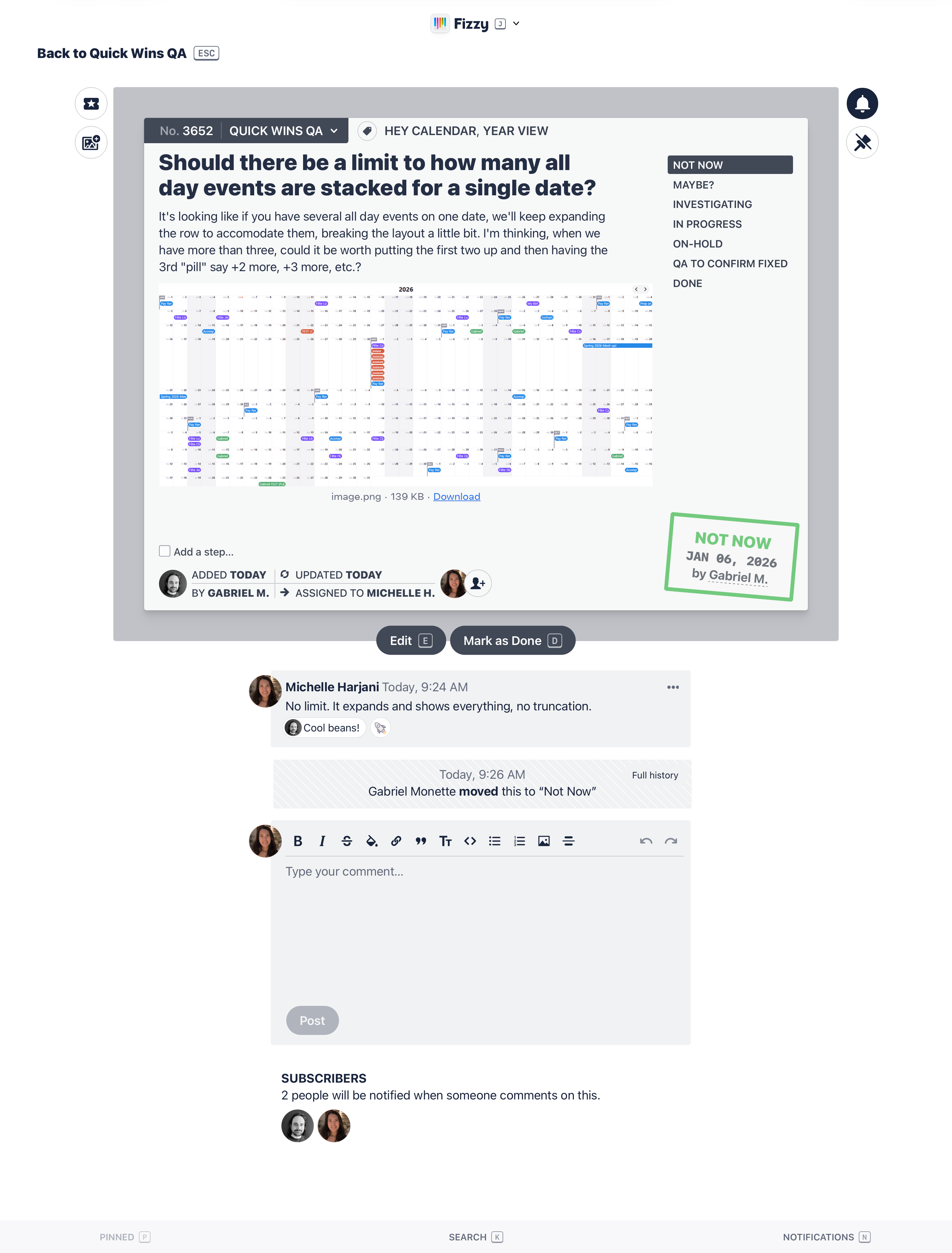
Limit stacked events? No. Better show everything than hide it behind '+2 more'. The rows expand when you add events—that’s OK.
Let’s draw the line on V1:
The Year view only shows spanned events (all-day, multi-day, timed multi-day events). Ignore timed same-day events for now—go to the Day/Week view for those.
Knew I had to fix how it looks on larger viewports—Zacharias shared a screenshot from his monitor where the grid only takes up 8 rows with a lot of empty space below. Changing the layout wasn’t going to be quick. Decided to address it post-launch.
Initially used - as the keyboard shortcut to "zoom out" into the Year. The obvious choice was y—but we were already using that, needed to switch a couple shortcuts around. Better to change it now than confuse people after launch.
There’s a lot of trust and freedom in getting to decide what ships and when.
————— 12:04pm – Ready to ship. Started preparing screenshots and writing the internal announcement.
1:02pm – Deployed the Year view to production and announced internally. Lunch time.
1:29pm – Jason announced it on X. Kept an eye on customer feedback while working on improvements.
4:59pm – Fixed the dynamic sizing and added responsive columns for weeks. Respected the first day of the week setting. Dimmed past days and past events. Tested a lot across various viewports.
Check out the before and after:
5:32pm – Merged the PR and deployed. Notified the team with a comment on the announcement message.
Ended the day with the quick win announced on hey.com/new and also updated our /keyboard-shortcuts page to reflect the changes.
I love work days like this with uninterrupted focus time to design and build, fuelled by a good playlist and a flat white.
————— A note on the timestamps: Sunset here is ~4:30pm so I went out to enjoy the sunshine and close my rings, then came back online after dinner.