When you start building a new product, things are pretty simple. You launch something with a, probably well thought, small set of features. As the product matures, new shiny things come to the table. Or new customer requests and user feedback is pouring in, and the team is taking action.
And all of a sudden, things start to blow. You try to squeeze that little new option or functionality, over a well (as you thought) established UI. Or the code base has grown so much, that you start “hacking” and “patching” your design, to fulfill new requirements.
I am sure you’ve faced similar user experiences, when using old products and services. Ton’s of functionality, that is hard to navigate and discover. Googling or reading the docs to figure out how to survive through a complexity of options, buttons, and UI elements. On the other hand, you get a sense of “breathing” experience, when you are using products over newly launched startups, designed simple on a clean slate.
So, the questions we are trying to answer here are: How can we design a UI that scales? How can we simplify the complex? How can we secure design discipline as the UI matures?
May I have the menu, please?
It’s a night’s out. You and your significant other, are visiting that restaurant you’ve been stalking for quite some time. You take a seat and the waiter is passing you over the menu.
What do you do?
Our brain is not designed to read on the details. It is designed to scan for keywords. At a first glance, you probably read the menu categories: Appetizers, Salads, Pasta, Meat, Fish, Drinks.
On the second pass, you start reading through the category of interest: you have an appetite for Pasta tonight. And once you figure out an interesting dish, e.g., a Carbonara, you may try to read the small letters, the ingredients of the plate to understand more: Bacon, Egg, Cream, Pepper, and Parmesan. Aha, I like that.
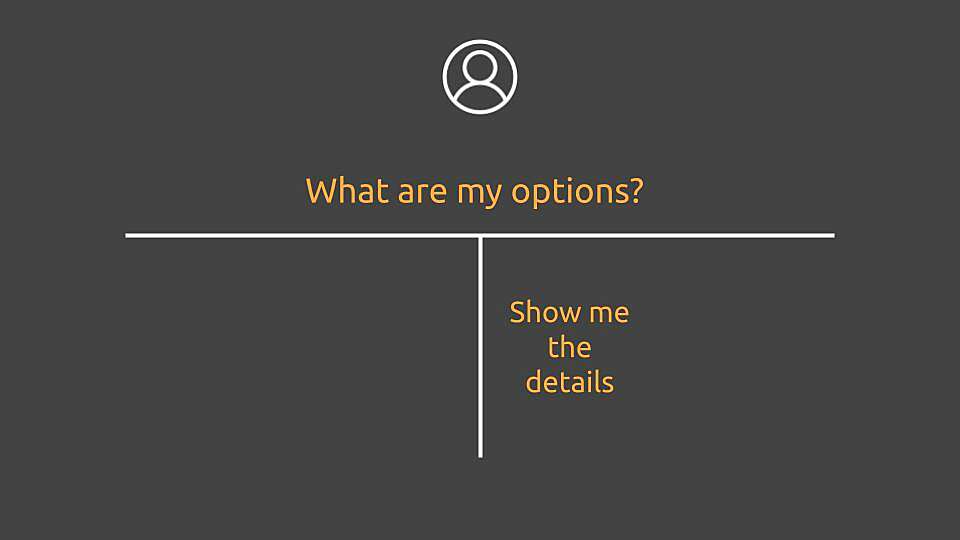
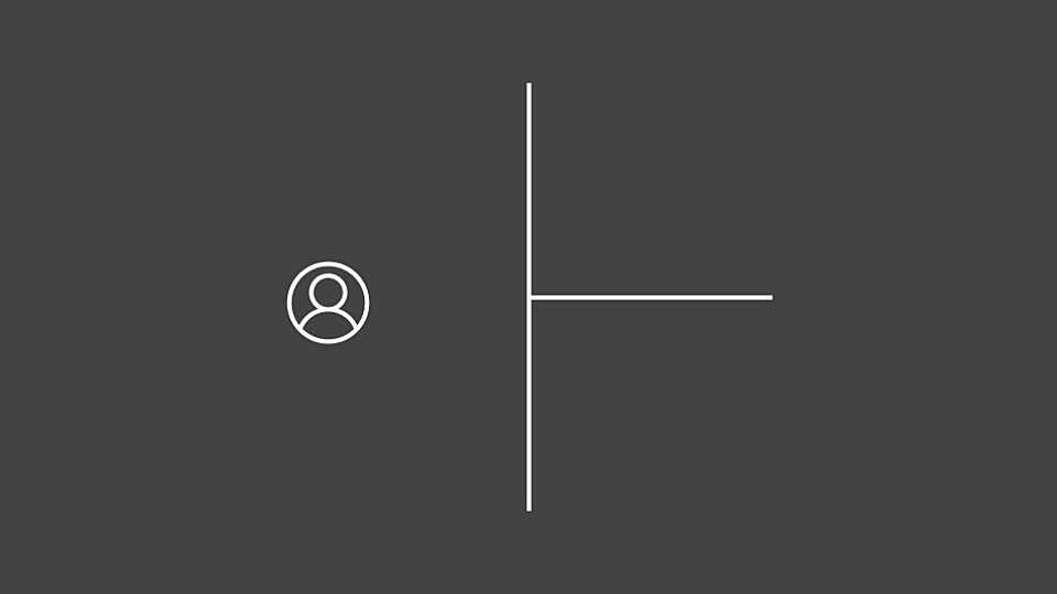
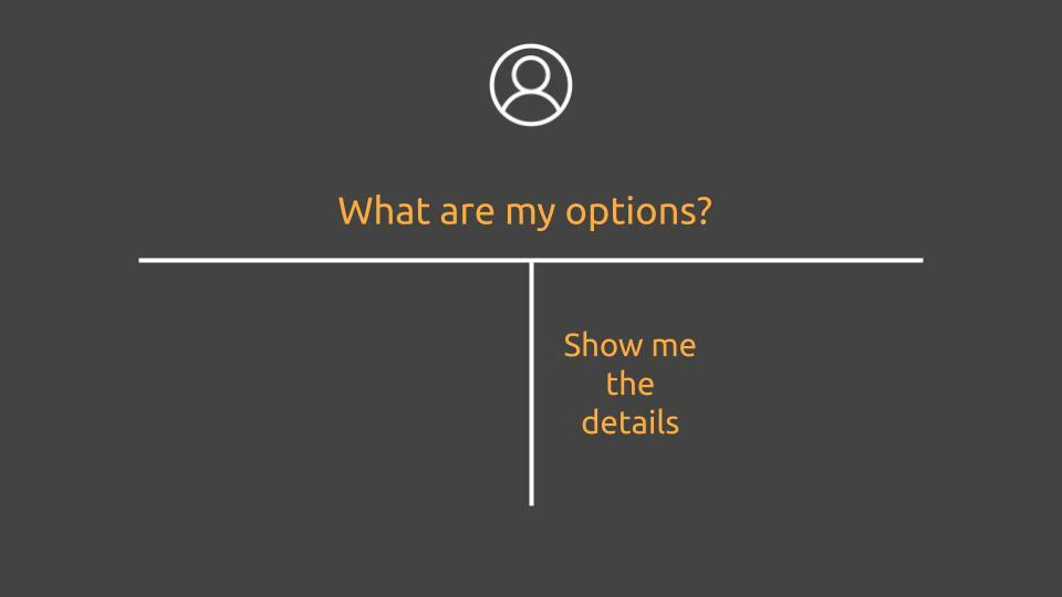
T-shape design
Following the menu metaphor, let’s design a system with a similar core principle: Quickly show me what’s on the menu, let me deep dive into the details.
How can we apply this in web design, building a UI that scales, as things get complex over time? Let’s rotate the T-shape 90 degrees counter-clockwise.
Using the rotated T-shape, we can start adding elements by structuring information in several levels of detail:
Level-0: Core categories (or folders of categories) Level-1: Category details and basic interaction Level-2+: Information dive-in
Level-0 is the typical sidebar you see in many websites. Level-1, is when you click on a sidebar element, and you display basic content. Could be a dashboard, settings page, a subscription page etc. Level-2 and beyond, is when you start interacting with those elements. And the place where bloat starts to happen. In our case, solved using drawers, flying-in from the right side of the page.
This is an approach, many websites do. And Google Tag Manager is one product that uses the “dive-in” approach pretty well. As a matter of fact, the designer is calling it “overlay fly-in”. And, in my opinion, does the job great.
Agile development
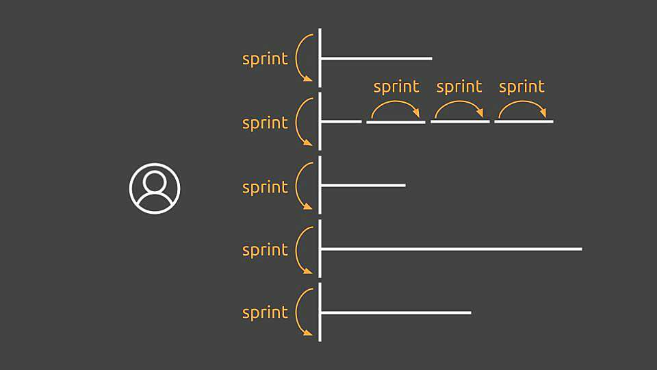
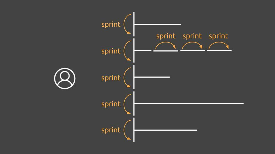
One of my favorite aspects of T-shape design, is how it tremendously helps the agile way of developing and adding new features.
A new feature can span either vertically as a new category, or as a new fine grain detail, using the drawer overlay approach.
This way, a team can start adding new functionality over sprints and deliver increments by keeping discipline in place.
When things start to get complex on the vertical side of things, various categories can also be grouped over a specific persona, e.g a Settings category could unfold into settings for various aspects of the product. Or a Developers category could hold various options related to developer persona, such as API keys, Security, Webhooks etc.
To give you an example, let's say we are creating a project management tool. We bootstrap the product using a few options to test the waters out and start having some traction, using basic categories and functionality.
Sprint 0: Product first launch Level-0: Projects Level-1: Add project CTA, shows a list of projects, click to work on a project Level-0: My account Level-1: Update credentials, logout
Sprint 1: As a user I would like to invite my team Level-0: Users (NEW) Level-1: Show existing users, show pending invitations, remove users (NEW) Level-2: Invite user overlay, remove user confirmation (NEW)
Sprint 2: As a user I would like to secure my account using MFA Level-0: My account Level-1: Update credentials, logout, setup MFA (NEW) Level-2: MFA setup overlay (NEW)
And the development keeps going as more sprint goals come to the table...
So, do you have any similar experience or idea? I would love to hear your opinion!