I saw the book cover for Lightbreakers by Aja Gabel and something about it stopped me. The cover had these circle patterns layered across photos of people, plants, and birds. Some circles sat behind the photos. Others floated above them. The title and author name had circles woven through them too.
I decided to recreate it. Not to copy it exactly, but to understand what made it work.
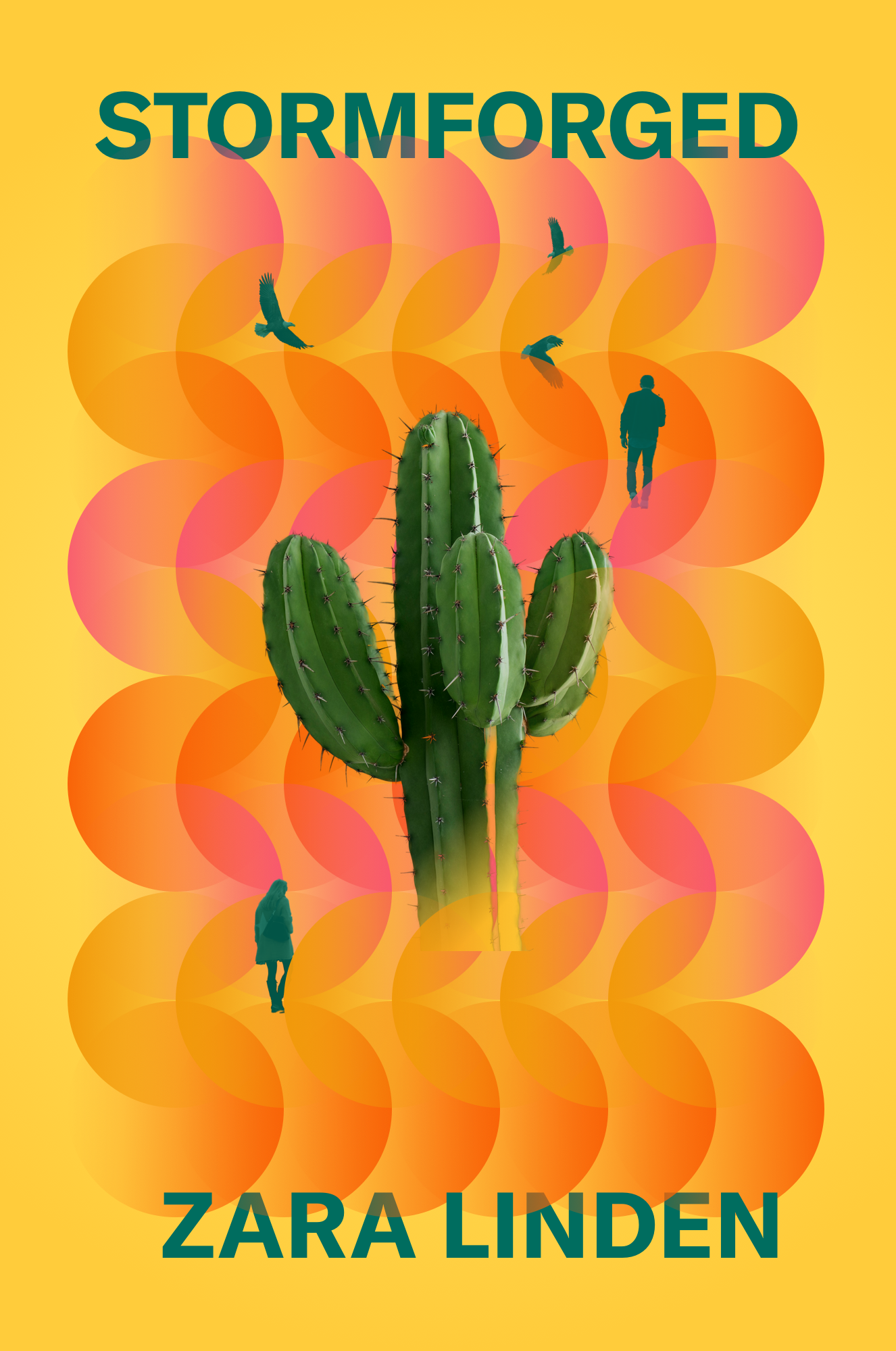
I started with a blank Sketch frame and copied the yellow color from the original cover. Then I began building the circle pattern. The circles on the Lightbreakers cover had a linear gradient applied to them. Some started fully opaque and faded to transparent. Others did the opposite. I created rows of circles, adjusting the gradient position for each row. Some rows started with fully transparent gradients. Others ended with them. The gradient direction shifted depending on the row's position in the pattern. This took time, but the gradient variation gave the pattern life.
Next came the photos. I found a cactus on Unsplash, removed the background. Then I started moving circles from the pattern to sit above the cactus, especially at the footer where the cactus met the ground. This is where the magic happened. When circles sat behind the cactus, the cactus felt pasted on top. Flat. When circles sat above the cactus, suddenly the cactus felt embedded in the scene. It had depth.
I repeated this with photos of a man and woman walking, and with eagles. I applied a green color fill to the people, adjusted the opacity to match the original cover's feel, and again layered circles above and below them. Each time, the same principle: elements with other elements layered above them feel more three-dimensional.
Our brain interprets overlapping elements as depth cues. When one object covers another, we instinctively understand that the covering object is closer to us.
Through this experiment, I found that placing circles above the footer of the cactus grounded it in the scene. Circles layered above the walking people made them feel part of the composition rather than pasted on top. Weaving circles through the title and author name integrated the typography with the visual elements.
Now I think differently. When I want depth in a design, I look for opportunities to break the plane. Which elements can I layer above others? Where can I create visual overlap that suggests dimension? This applies beyond book covers.
By working through someone else's design decisions, I understood principles I never would have grasped from a tutorial. When you copy work you admire, you're forced to make the same decisions the original designer made. You learn why those decisions work. Then you can apply it to your own work.
Next time you're working on a design that feels flat, ask yourself which elements could overlap to create depth. Where can you break the clean separation between layers? What would happen if you placed some decorative elements above your photos instead of below them?
I've shared my Sketch file from this experiment at assets.antihq.com/experiments/stormforged.sketch. Download it, deconstruct it, and see how the layers interact.