Stitching together a portfolio site for Herschel—in a few hours
My son, Herschel, has been into making clothes for himself and his friends for a few years now. So rather than send him off to the woods for summer camp this year (which we’ve done a couple times now), we figured it was time for him to try something more applied and aligned with his interests. After doing a bit of research, we settled on the SCAD Summer Seminars program.
We signed him up for workshops in pattern making and sketching for fashion design and submitted the initial registration fee a few months ago, but I completely forgot about the portfolio submission until I saw the email Friday that it was due Monday. The portfolio is optional but it might get us a discount on the program fee and it’s good practice if he ends up going into this or another creative field. He’s been dragging his feet on putting together a portfolio, but now we had the impetus and a sense of urgency.
How to get a portfolio site up in a few hours
There were a few key pieces of content we would need: one was a 300-word statement about why he wanted to attend and how he thought it would help him; the other was photos and descriptions of his work. Hersch would start drafting these while I got the basic site with some placeholder content up and running. For the tech stack, it was an easy decision to use my Plain Vanilla GitHub Pages template, which leverages the Jekyll static site generator. Standing up a new site is as easy as clicking the “Use this template” button on the GitHub repo.
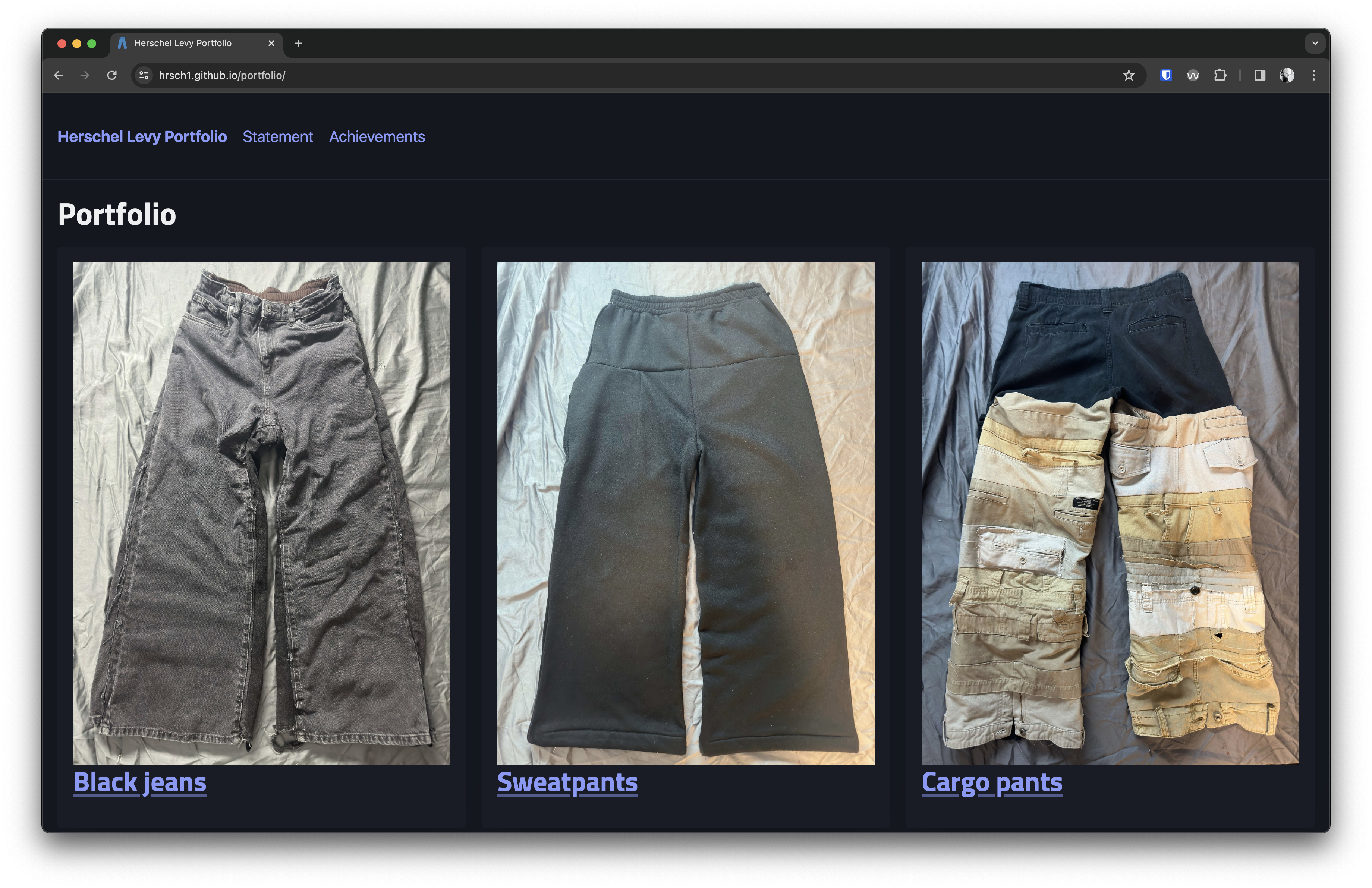
Screenshot of live portfolio site
Switching to Pico, “the minimalist CSS framework for semantic HTML”
The current iteration of the template uses GitHub’s Primer CSS framework, which I understand is no longer maintained in its previous form. I was considering switching over to Bootstrap, but as I was working on my podcast player project, I came across Pico, which really aligns with the goal of this template—effortlessly turning structured content into a great-looking site out-of-the-box without much thought or effort. It even handles light and dark modes auto-magically, which is a must-have these days.
The nice thing about Pico is that if you don’t want to deal with CSS or adding classes to your content at all, you don’t have to, and it works pretty well. If you do want to customize, it’s easy to add on to without understanding all the intricacies of a complex framework. It all feels very logical. The only default styles I tweaked were adding a border between the navigation and the content area and reducing the maximum width of the content container for larger screens. (The default results in body text that is too wide.) I also added a custom font from Google for the headings.
The one area where I feel like Pico falls short is in handling responsive navigation. The website promises “responsive everything” but the navigation does not give you the typical collapsing behavior we’ve come to expect on mobile devices. There was some discussion about it in the repo, but it looks like that would take some more involved custom work than I had time for in this case. So I settled for making the navigation scroll horizontally when needed (instead of wrapping weirdly and scrunching up). It sounds bad, but with modern apps, horizontal scrolling has become much more conventional and understood, so it seemed like a reasonable compromise.
Getting by with a little help from the internet
Once we did an editing pass of the content and got the pages linked up, it was time to add some little touches that help improve the overall experience. The first issue to tackle was image optimization. For a simple, limited-purpose site, I’m usually not too worried about image sizes, but the files Hersch sent me were egregiously large—like over 10MB. After doing an initial resizing with Preview (to get them under 5MB), I found the site TinyPNG, which will do further optimization for free. With this, I got them down to around 1MB. Still big but passable.
The other thing I wanted to tweak was the favicon. I have a basic ICO file included with the template, but I know Hersch wouldn’t be crazy about the ice cream cone showing up in the tab for his site. A method I like to use for the favicon is grabbing an SVG from the Twemoji open-source emoji library. (It looks like the corporate-endorsed project was killed when Twitter went private, but it lives on in jdecked’s repo.) You can run one of these files through the RealFaviconGenerator (the new SVG version) and get a pretty lightweight code snippet to add to your HTML template, along with the converted image files. Since Herschel’s portfolio consists entirely of custom pants, I went with jeans. 👖
Improving the template for future use
Everything went pretty smoothly getting the site up. You can check out Herschel’s portfolio here (or the repo on GitHub if you’re inclined). Of course, after going through this exercise, I have ideas for further improving the template. After using Pico for a couple projects now, I feel good about switching over to it for the default CSS framework. One issue I keep running into is dealing with site URLs when creating a new project. Right now the template is optimized for single-page sites, but once I start adding other pages and linking images, I can never remember exactly how and when to use the {{ site.baseurl }} variable in my links. I think I’ll add a couple of sample pages I can remove if I don’t need them, but include examples for how to do links right. Other than that, I’m thinking it’s time to rebrand the template from Plain Vanilla GitHub Pages to something shorter and more fun—maybe something like Soft Serve Websites. 🍦