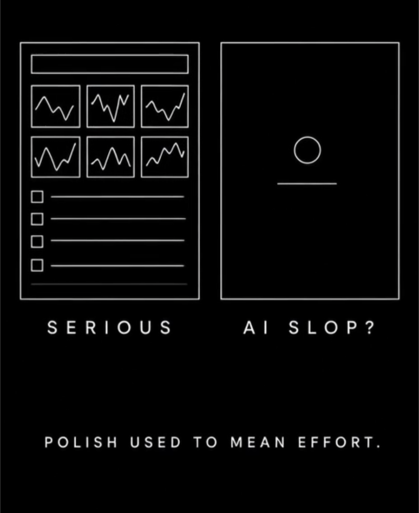
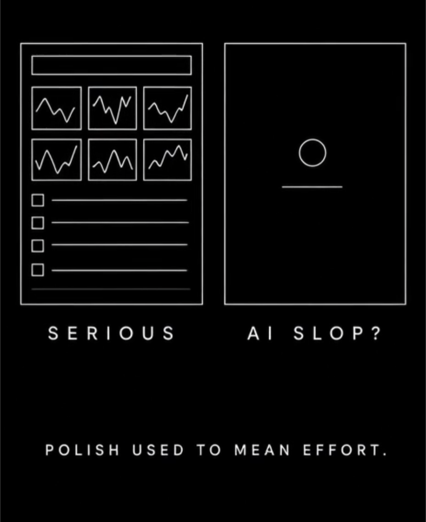
There is an awkward moment I am experiencing around me from people around me. The underhanded comment of calling everything "AI slop".
They have an expectation of:
Show up to a symposium with a slide crammed with six overlapping plots, three dense data tables, fourteen bullet points, and citations rendered in 7-point font.
For this, looks painful, exhausted, and familiar. Therefore, we assume it must be rigorous.
Now, suddenly, when you create visuals which are beautiful, which present a single, carefully composed visual metaphor, an incisive narrative claim, and a clean line of reasoning with a bit of imagination and creativity...
Watch what happens in the audience: “This looks like AI.” Or worse: “It’s just AI slop.”
Generative slop is real. We are swimming in generic, synthetic wallpaper.... intellectually hollow text and decorative visuals generated. That is not in dispute. We are living in a parabolic scope of this kind of content, should you as a human not decide to read it yourself and subject your eyeballs to this with careful scrutiny.
What is happening, though, is much more insidious: we are confusing the breakdown of a visual labor signal with a decline in scientific thinking.
What I am not doing anymore
Let’s be entirely transparent about my modern workflow:
I am never sitting down to manually hand-craft slide decks from scratch ever again. The era of spending forty hours nudging text boxes by three pixels and drawing vector arrows by hand is over. Atleast for me!
Instead, I will have agents spin up dozens or hundreds of slide iterations across completely different visual styles. Why? Because I treat decks as living laboratories for storytelling. I want to test how an audience engages with an abstract visual versus my interpretation of what they need and what are clean slides. I want to see which metaphor is "Pri and her excitement" before I walk into the room.
That process comes with friction, and it exposes how I actually work:
The micro-polish happens at the very end. There will be mismatched page numbers, rogue alignments, and rough edges in early drafts. Not because a machine was careless, but because fixing pagination before the core scientific narrative is validated by feedback is an absurd waste of time. That isn’t “sloppy AI generation”... that is an iterative working philosophy.
I stack interconnected concepts on a single slide. Systems pharmacology and complex biology don’t operate in neat, isolated silos. If people prefer the orthodox dogma of “strictly one idea per slide,” they are welcome to build their own decks.
I don’t write prose on slides; I present ideas. You will see fragments, core kinetic terms, or a bold phrase like “results validated” meant to anchor what I am saying, not duplicate it. A slide is not a Teleprompter for an audience that refuses to listen.
If a stylistic choice doesn't match someone’s personal template of what a slide “should” look like, that is a clash of taste, not a failure of intelligence.
Stop projecting your discomfort with my workflow onto the convenient boogeyman of “AI slop.”
The Brownie moment in the lab
Historically, presenting an elegant visual narrative required either advanced Illustrator skills, a dedicated medical illustrator, or weekends burned manually tuning layouts. Polish was expensive. The visual story sounded like proof of work and thought.
That relationship is finished.
A researcher can now test twenty visual metaphors over a morning espresso. A domain expert who has spent a decade conceptualizing an intricate biological mechanism... yet couldn't draw a legible cartoon to save their life... can suddenly translate that mental model into an evocative schematic in three minutes.
That is an unprecedented democratization of scientific expression.
Because humans panic when they lose their traditional heuristics for effort, a lazy cultural shortcut has emerged to replace it:
Too legible? AI.
Narrative cool sentences instead of raw bullet points? AI.
Custom, editorial-grade schematic? AI.
"The message is now easier to capture" but the slides were "done with AI and need verification/polishing" and had inconsistent styles, grammar issues..... AI
And the reflexive verdict: slop. Calling an intuitive, thought through , creative well-crafted slide “AI slop” is the pretty good reflex.
I have a different opinion on it. Intellectual ownership is the only metric that matters.
Let’s be precise about what real slop actually is.
Slop is not an aesthetic. Slop is the total absence of intellectual ownership.
It is a paragraph of smooth, syntactically perfect scientific jargon that commits to nothing. How do you decide what that means? Please ask to clarify? Instead of assume that someone used AI like a chicken running headless to create these jargons.
It is a pathways diagram full of confident, multi-colored arrows where no defensible causal relationship exists.
It is a hallucinated reference tucked into a bibliography. Prove it please; like you do for your junior colleagues.
It is an executive summary whose presenter freezes when you ask what the axes actually represent.
That failure has nothing to do with the tools used.
A slide can be pure slop whether it was hallucinated by a frontier model, copied from an unread 2012 review paper, or pasted together by an exhausted postdoc at 2 a.m. (and here this is a human doing it btw, because they are tired.)
If you want to know whether a piece of communication has substance, stop policing the aesthetics and style. Start asking what is the story?
Interrogate the claims:
Why is this visual here, and what precise hypothesis does it test?
Where did the underlying data originate?
What explicit assumptions are baked into this representation?
What observation would falsify this model?
Can you defend every single word on this slide?
If the presenter can answer those with clarity and depth, the fact that an AI helped draft the image is completely beside the point.
If they cannot, the slide is slop.... even if they spent forty hours hand-drawing every vector in GraphPad Prism. The point is that AI or not AI, slop is slop when not understood..
Scientific conventions were created to solve real problems. Standardized layouts allow peer reviewers to parse complex datasets quickly. Standard error bars, uniform methods sections, and formal notations provide traceability.
Those are indispensable tools.
Over time, conventions stop functioning as functional tools and harden into social costumes.
“This structure helps colleagues evaluate the evidence” quietly degenerates into “This style of text is what serious science looks like. Or such boxes of diagrams is real communication.”
For twenty years, the life sciences community has lamented that researchers are poor storytellers. We host workshops begging scientists to stop reading their bullet points, to step back from the raw data dump, and to explain why the finding matters.
The barrier between a researcher's imagination and their ability to visualize it has collapsed. Thanks to AI! And the moment scientists begin communicating with clarity, metaphor, and visual narrative, the room crosses its arms and whispers that it looks too synthetic. 🤷🤷
Scrutiny over aesthetic policing
Because plausible-looking bullshit has never been cheaper to produce, our peer scrutiny must be sharper than ever. But that scrutiny must focus on the evidence, the logic, and the mechanics of the claim- not on policing whether a slide adheres to a mid-2000s PowerPoint aesthetic.
Mediocre communication is cheaper to manufacture. Previously impossible forms of expression are newly available to people who already had the ideas and lacked the tools to show how they saw them.
The future of scientific communication should not require us all to tell stories in exactly the same way. And it should not treat the disappearance of an old labor signal as proof that the thinking disappeared with it.
We should learn to tell the difference. 🙃
Art by grok imagine and a little hand drawn magic. Now I am also settling on a skill on the generative goal of the image.
I wonder- a lot. So, I write my wonder here. What to expect? The chaos and curiosity that my being brings. As living a human life is not bound by definitions in the macros- the posts here will be spontaneous and identity-less! I like to give and create art. So if you buy an act of creating I will use it for things that I am passionate to give for. Obviously, a little support on my art will make me feel visible.
"Change. Change. Change. Change … change. Change. Chaaange. When you say words a lot they don't mean anything. Or maybe they don't mean anything anyway, and we just think they do."