Issue 15. 2021-08-16
我想暂停一下这种 curation 式的订阅邮件——内容上做一些调整。虽然本就是出自于私心的态度仅仅式记录自己的阅读列表,但「引用+评述」的形式让我直面到了原创性的缺失。
具体如何做出调整我还在思考,但应该会在近期完成这些调整。
- Australia Dominates Again in the Women’s 4x100 Freestyle Relay - The New York Times (nytimes.com) 一场奥运游泳比赛中,如何获取瞬时的速度呢?光凭借肉眼是很难做到的。NYT 的解决方法是:大量的照片,再做后期处理。
The Times recorded the position of every swimmer in a sequence of several hundred photographs to determine the speed of each athlete throughout the race. Speeds were calculated by combining the positions of the athletes with timestamp information from the images.
- Tokyo Summer Olympics Medal Tracker: Medal Count by Country (bloomberg.com)
- Can Tokyo Olympic Champions Beat Past Olympic Champions? - The New York Times (nytimes.com) 同样来自 NYT,将近些年来的奥运「竞速」类比赛冠军放置在同一个泳池/赛道内比较,颇为有趣。
- Usain Bolt and the Fastest Men in the World Since 1896 – on the Same Track - The New York Times (nytimes.com) 然而影响最为深刻的莫过于 2016 年的这张静态图,比较了百年来奥运男子百米短跑冠军的成绩差异。衡量尺度则是当其中成绩最好者 (Usain Bolt, 2012) 撞线时,其他参赛选手的位移位置。两个字:震惊。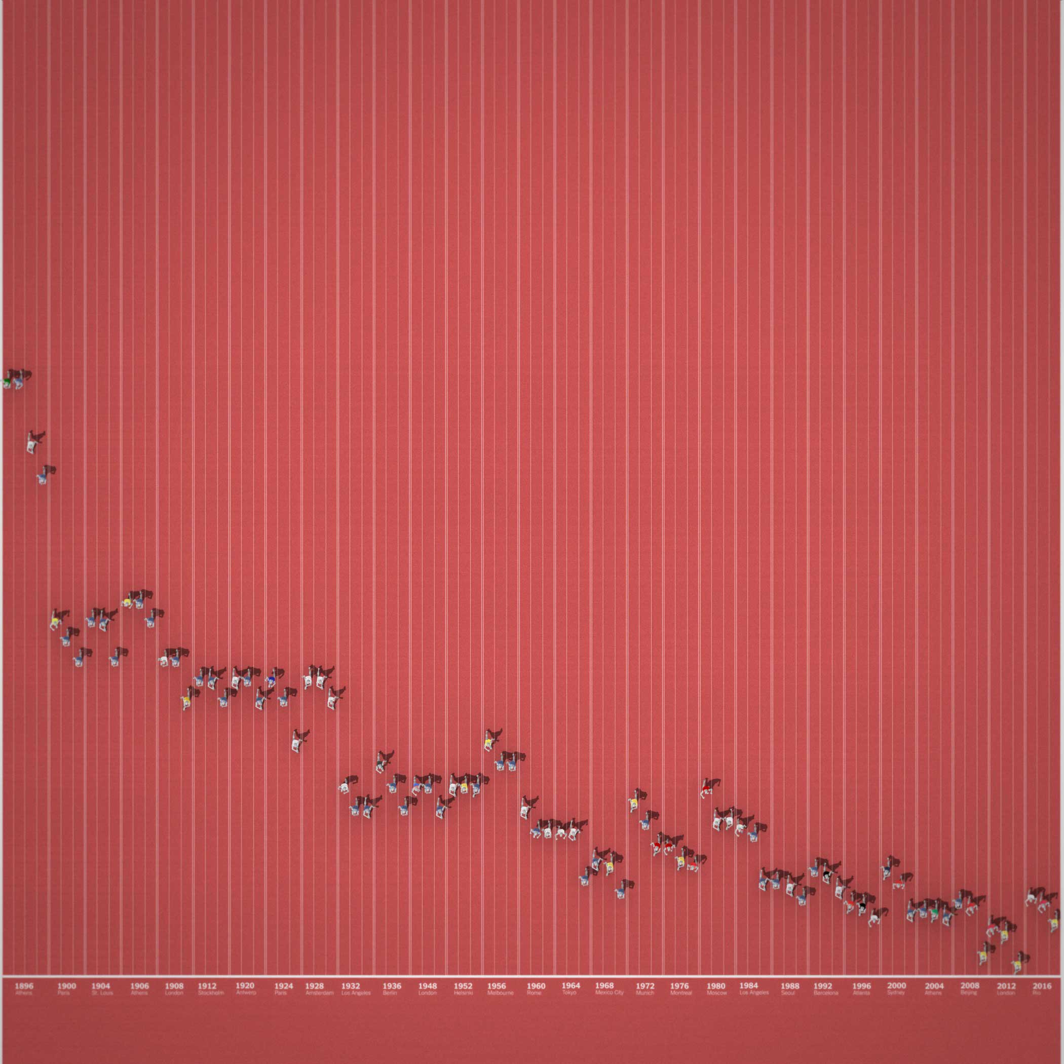
- Data Vis Dispatch, August 3 - Datawrapper Blog Datawrapper 本月的博文中也收录了一些其他值得瞩目的奥运可视化项目。
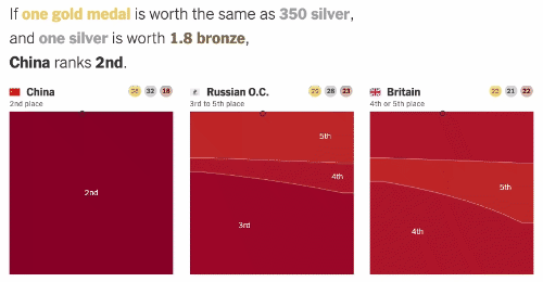
- Tokyo Olympics: Who Leads the Medal Count? - The New York Times (nytimes.com) 但我仍然想单独把 NYT 的这个有意思的文章单独拎出来。文中可以让读者任意调节一枚金、银、铜牌之间的价值换算关系,从而计算出该代表国家在奖牌榜中的排名。
- Not to mention - by Owen Phillips - The F5 (substack.com) Owen Phillips 比较了今年获得 NBA 一、二、三阵投票的 32 名球员在 Twitter 上被人提及的频次。由此引发关于 Giannis 是否被「低估」的讨论。当然,正如文中所说,无论是什么原因,新科 FMVP 一定毫不关心。
- Grading The Mock Drafts - by Owen Phillips - The F5 (substack.com) 比一比各家媒体今年 NBA 模拟选秀的准确率。告诉我们一个道理:除了极少数排名靠前的新秀能猜对以外,后面的「预测」就是瞎蒙。另外,今年 Raptors 选择 Scottie Barnes 几乎所有人都没能料到。
- GitHub OCTO | Visualizing a codebase 可视化 GitHub 代码仓库,直观了解仓库中的文件结构。虽说「能够了解不同 repo 中相似度」这一功能不言自明,但实际使用场景存疑。文中也提到了通过 GitHub Actions 给自己的 repo 玩玩看的方法。
- Big (open) data in sports - by JP Hwang - The Visual In the Noise (substack.com) 「大」数据谁都会说,但嘴上说说无法获取就好比你总跟一个一线顶流明星称兄道弟但却从未能证实。引用文中的一些内容:
In terms of raw, granular, data from which we might draw our own conclusions, there isn’t much available save but a few exceptions. And even those are often severely limited.
All of this is a little disappointing and precisely why this is a huge opportunity for many.- 比如 PBP Stats Tracking 包含 NBA 比赛每回合数据,内容翔实,非常推荐。近期打算开始订阅尝试一下。
- The Docker Handbook – 2021 Edition (freecodecamp.org) 与数据无直接关联,但最近忽然想把 Docker 再捡起来用一下,于是就找到了这篇教程。
- [2103.08525] The Public Life of Data: Investigating Reactions to Visualizations on Reddit (arxiv.org) 这篇的内容非常有趣!都知道 reddit 上有一个 subreddit 叫做「r/dataisbeautiful」,用户在其中分享自己原创 (OC) 的或者转发的可视化成果。那么这篇则是分析了用户的反馈和可视化内容之间的关系。换句话说,我们多少可以通过研究鉴别出哪些 visualization is beautiful.
- An Introduction to Statistical Learning (statlearning.com) 备受好评的统计+机器学习入门课本更新了第二版,作者们依旧提供免费的电子版供大家下载。
- Stars And Scrubs - by Owen Phillips - The F5 (substack.com) 从 NBA 合同工资的角度看球员职业生涯发展,非常有意思的角度。他关注的是一批工资刚好在 max (即球队工资帽 25%) 以下 5个百分点以内的球员。
- Fantano doesn’t like to dance: a classification model on Needle Drop’s reviews | Daniel Brito
- Race and ethnicity across the US (cnn.com)
- What colour is London? - rostrum.blog 不难想象,取点,算平均。但延伸一下,是否可以回答:伦敦有多少棵树?
- MapLab: How Many Chain Restaurants Are in Your City? - Bloomberg
- In defense of simple charts - Datawrapper Blog
- "Simple charts are not boring when they show interesting data." 在追求花哨的同时很容易忘记可视化是由数据本身驱动的。
- "Simple charts are not boring when they’re well-designed." 字体、用色、排版、注释同样重要。
- "Simple charts are not boring when they're mixed up."
- "Often, diverse chart types are not a tradeoff between aesthetics and readability, but a gain for both."
- "Simple charts are attractive because they're easy to understand."