Duet Design System is a collection of components. Unfortunately, their components are not entirely open-source, except for the Date Picker. It's a bummer, I know, their components are SO GOOD! And they're built around Web Components, which makes it all even better.
Anyway, let's focus on the Date Picker. While browsing a Hotwired app, I noticed they were using this date picker so I decided to give it a shot.
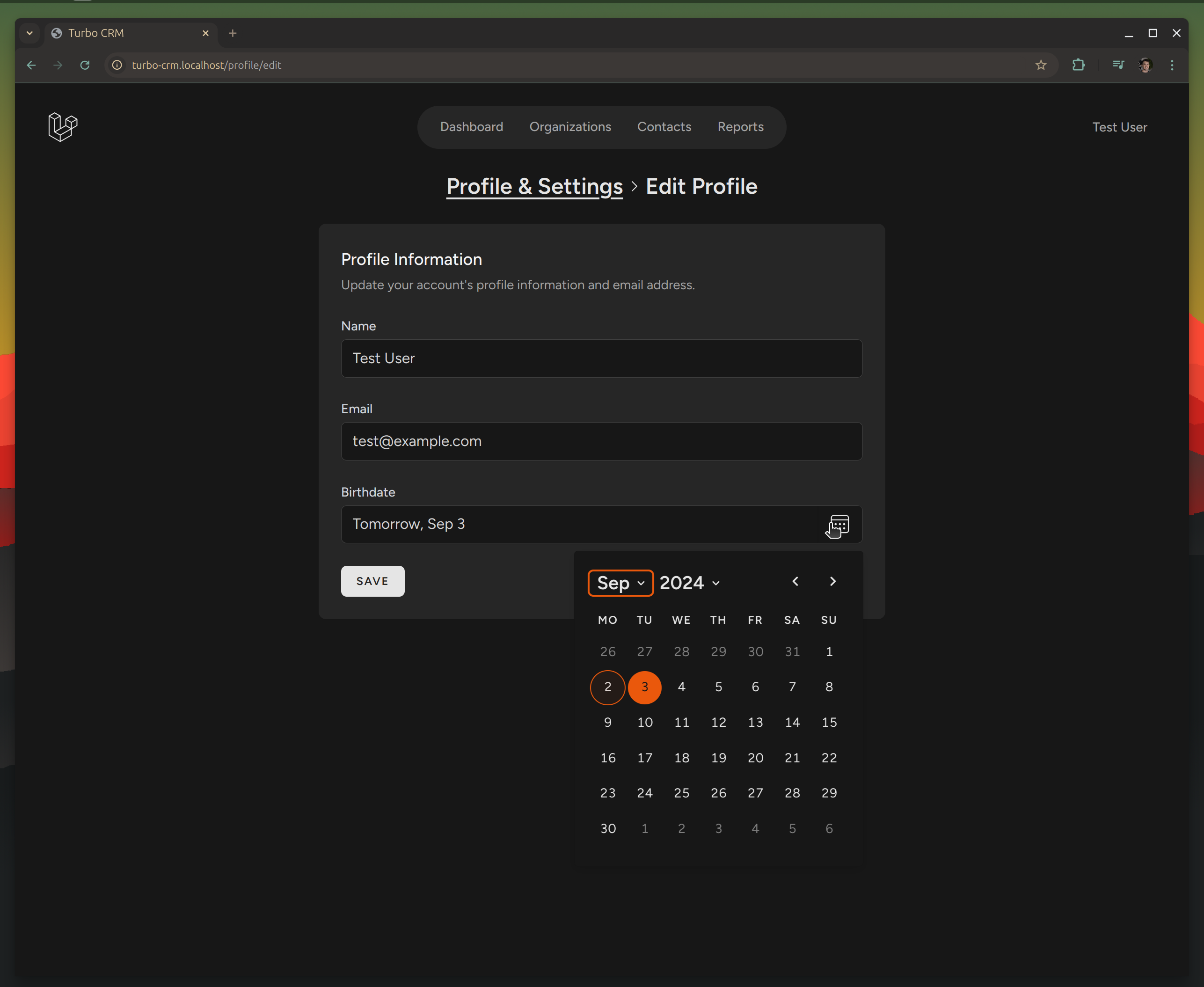
I was able to get it working in my app, matching my styles and all that:
Let's see how to make this work.
Installation
Since I'm using Importmap Laravel, we can pin the Duet component like so:
Now, we can use the new element anywhere in our app like so:
<duet-date-picker/>
With this, you'll get the same element as in their docs. However, the implementation I saw was wrapping it in another custom element to augment its behavior. To build a similar version, I've added a new element called `<date-input>`:
classDateFormatter{constructor(date){this.date=date}getformattedDate(){return`${this.formattedWeekday}, ${this.formattedMonthAndYear}`}// PrivategetformattedMonthAndYear(){return`${this.formattedMonth}${this.formattedYear}`}getformattedWeekday(){if(this.isToday)return"Today"if(this.isTomorrow)return"Tomorrow"returnthis.weekdayFormatter.format(this.date)}getisToday(){returnthis.date.toDateString()==newDate().toDateString()}getisTomorrow(){returnthis.date.toDateString()==newDate(newDate().setDate(newDate().getDate()+1)).toDateString()}getweekdayFormatter(){returnnewIntl.DateTimeFormat("en",{weekday:"short",})}getformattedMonth(){returnthis.monthFormatter.format(this.date)}getmonthFormatter(){returnnewIntl.DateTimeFormat("en",{day:"numeric",month:"short",})}getformattedYear(){if(this.date.getFullYear()==this.currentYear)return""return`, ${this.date.getFullYear()}`}getcurrentYear(){returnnewDate().getFullYear()}}classDateInputElementextendsHTMLElement{#duetPicker#originalDateasyncconnectedCallback(){this.querySelectorAll("duet-date-picker").forEach((element)=>element.remove())this.#duetPicker=this.#createDuetPicker()this.addEventListener("duetFocus",this.#duetPickerFocused)this.setAttribute("initialized","")this.#originalDate=this.date}disconnectedCallback(){this.#duetPicker.remove()this.removeAttribute("initialized")}open(){this.#duetPicker.show()}reset(){this.date=this.#originalDate}getname(){returnthis.getAttribute("name")}getvalue(){returnthis.getAttribute("value")||""}setvalue(value){if(value!=null){this.#duetPicker.value=valuethis.setAttribute("value",value)}else{this.#duetPicker.value=nullthis.removeAttribute("value")}}getdate(){returnthis.value?this.#duetPicker.dateAdapter.parse(this.value):null}setdate(date){constoriginalDate=this.date// Force the value to clear...if(!date)this.input.value=""if(originalDate?.getTime()!=date?.getTime()&&this.#isValidDate(date)){this.#duetPicker.setValue(date)}// Forces a refresh...this.input.value=this.#formatDate(originalDate)}asyncfocus(){awaitnextFrame()this.input.focus()this.input.select()returnPromise.resolve()}getinput(){returnthis.#duetPicker.datePickerInput}getisOpen(){returnthis.#duetPicker.open}getdisabled(){returnthis.hasAttribute("disabled")}setdisabled(value){constnewDisabled=!!valuethis.#duetPicker.disabled=newDisabledthis.toggleAttribute("disabled",newDisabled)}getmaxDate(){returnthis.getAttribute("data-max-date")}setmaxDate(value){this.#duetPicker.max=valuethis.setAttribute("data-max-date",value)}getminDate(){returnthis.getAttribute("data-min-date")}setminDate(value){this.#duetPicker.min=valuethis.setAttribute("data-min-date",value)}#formatDate=(date)=>{returnnewDateFormatter(date).formattedDate}#isValidDate(date){return(!this.minDate||date>=this.#parseDate(this.minDate))&&(!this.maxDate||date<=this.#parseDate(this.maxDate))}#parseDate(dateString){constdateParts=dateString.split("-")returnnewDate(parseInt(dateParts[0]),parseInt(dateParts[1])-1,parseInt(dateParts[2]),)}#createDuetPicker(){constattributes={}attributes.value=this.value||""if(this.id)attributes.identifier=`${this.id}_picker`if(this.disabled)attributes.disabled="disabled"if(this.required)attributes.required="required"if(this.maxDate)attributes.max=this.maxDateif(this.minDate)attributes.min=this.minDateif(this.name)attributes.name=this.nameconstduetPicker=newElement("duet-date-picker",attributes)duetPicker.dateAdapter.format=this.#formatDateduetPicker.localization.placeholder="Choose date..."this.appendChild(duetPicker)returnduetPicker}#duetPickerFocused=async()=>{awaitthis.focus()this.input.addEventListener("keydown",this.#inputkeyDownPressed)this.input.readOnly=true}#inputkeyDownPressed=(event)=>{switch(event.key){case"Delete":case"Backspace":this.value=""break;case"":case"ArrowDown":this.open()breakcase"Enter":event.preventDefault()event.stopPropagation()break}}}asyncfunctionnextFrame(){returnnewPromise(requestAnimationFrame)}functionnewElement(tagName,attributes){constelement=document.createElement(tagName)for(constnameinattributes){constvalue=attributes[name];element.setAttribute(name,value)}returnelement}if(customElements.get("date-input")===undefined){customElements.define("date-input",DateInputElement)}
Now, we can use it like:
<date-input/>
Here's how I use the input in my form inside a Blade partial:
We're wrapping it in our custom element to augment it with things like:
We're replacing the DateFormatter which creates a more human-friendly date that will be what the input displays. Under the hood, the Duet Date Picker still sends an ISO-8601 value (YYYY-MM-DD) to the backend, but we display something like "Today, Sep 2", "Tomorrow, Sep 3", or "Wed, Sep 6, 2023" for older dates and things like that
The text input is read-only, users can only interact with the Date Picker button on the side of the input. To open with the keyboard, we're augmenting it to open the date picker when pressing the spacebar or the down arrow keys
---
This implementation was based on how they're using it on HEY, I saw it using View Source, and decided to try to implement it in my app. Thanks to the Duet DS team for making this component open-source and the HEY team for allowing View Source!