Spatial Clustering: Love Letters (Part 2: OSRM & Weighted Clustering)
Part 1 Summary
Last time, I motivated this spatial clustering scenario as an optimization problem based on the movie Her. As the executives of Handwritten Greeting Cards (the company the protagonist works for), we are proposing a new delivery method wherein cards are sent electronically to vans in which they are printed and delivered to the recipient. In essence, we're ditching traditional delivery means in favor of a Uber/Lyft style approach to reduce the time between a card being written and it being received as much as possible.
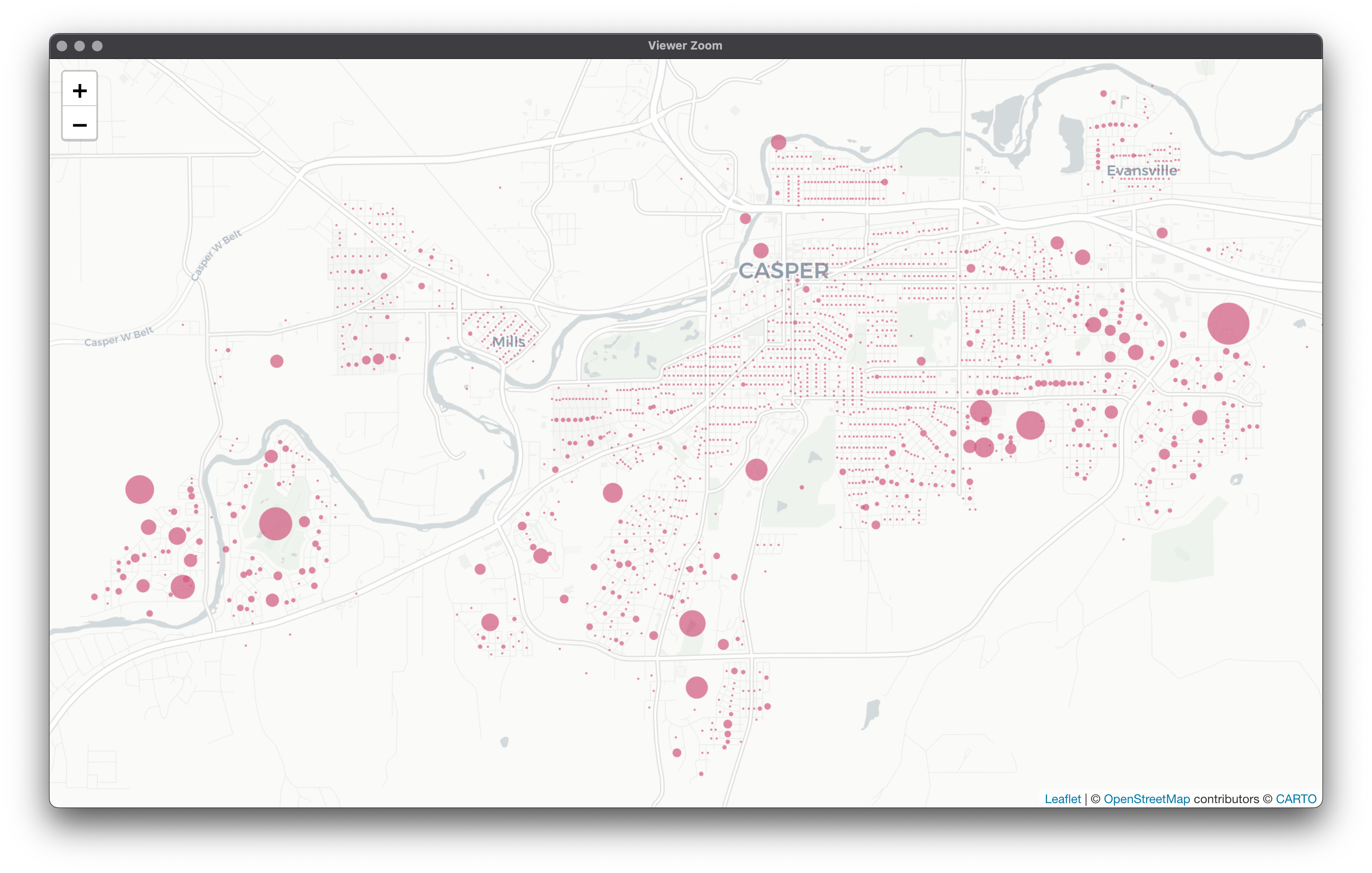
Using 2020 Decennial Redistricting data, we were able to narrow our scope down to census blocks in the Casper, Wyoming area and fabricate estimates for the number of cards each block would receive based on population count and time of year (higher volumes are expected around holidays, etc.). At the end of this, we were able to visualize using leaflet:
As stated at the end of the last post, what we really want to know is the following:
How many vans should we allocate for Casper, WY?
Where should these vans be placed?
One potential method of investigating these questions is spatial clustering. Specifically, we might want to look at weighted spatial clustering since we not only want to cluster on Euclidean distances but also our generated predicted number of calls as well (our weights). In fact, we may not even want to use Euclidean distance at all…
Open Source Routing Machine (OSRM) Motivation:
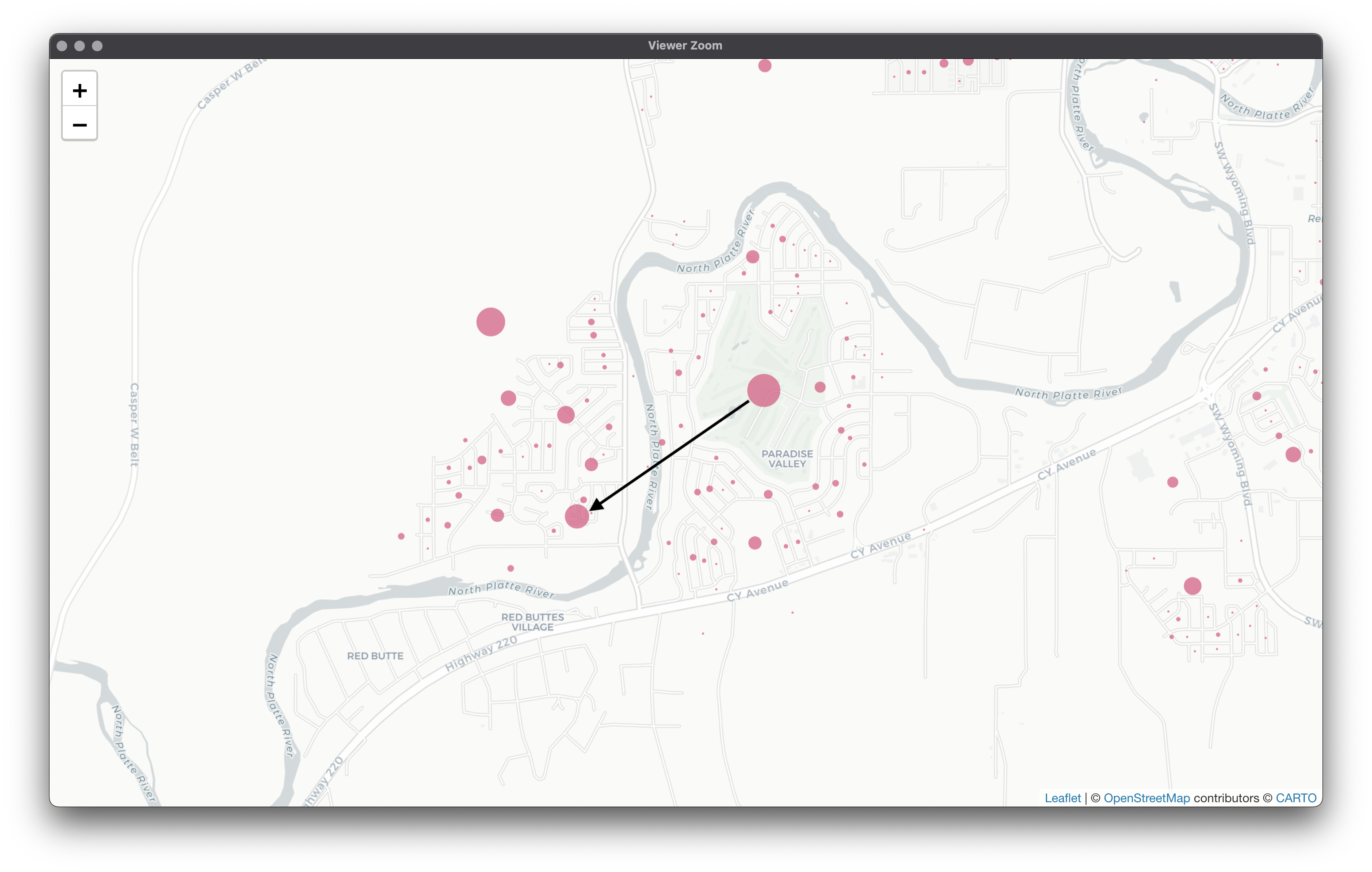
Instead of using "as the crow flies" ways of calculating distance, we might do better to use actual travel times to add realism. OSRM uses detailed road networks to calculate drive times from a given point to another. This will be very useful to us as our vans are going to be constrained to driving on roads (short of any mishaps). Take this example: If we were to calculate Euclidean distance, we would be completely missing the fact that our van would be driving through a river! Here’s what a more realistic journey might look like: Thus, the motivation to use OSRM should be obvious. In essence, we will be taking latitude and longitude coordinate pairs and creating a distance matrix of travel times. If this line of thought works out, this is just a way of shifting a distance matrix yielded by coordinate pairs into a different, more realistic space based on actual road networks. We can then use said distance matrix as input into a clustering algorithm if all goes to plan. Neat!
OSRM Setup:
As many of the best things in life, some assembly is required here. I'll be covering how to set this up on MacOS here, but have done so on Windows as well. Most steps are the same but there are a few minor differences, if you're on Windows I recommend following this Github Gist (you'll probably have to install Ubuntu or another Linux distro from the Windows Store). Here are the two things you'll need:
I put the wyoming-latest.osm.pdf file in a OSRM folder inside my Documents folder (if you do the same and are on MacOS, all you'll need to do is edit the username below). From there, open up Terminal and run the following:
docker pull osrm/osrm-backend
docker run -t -v "/Users/yourusername/Documents/OSRM:/data" osrm/osrm-backend osrm-extract -p /opt/car.lua /data/wyoming-latest.osm.pbf
docker run -t -v "/Users/yourusername/Documents/OSRM:/data" osrm/osrm-backend osrm-partition /data/wyoming-latest.osrm
docker run -t -v "/Users/yourusername/Documents/OSRM:/data" osrm/osrm-backend osrm-customize /data/wyoming-latest.osrm
If all went well, you'll see 3 exited containers in the Docker GUI: You can go ahead and remove all 3 - after the backend has been pulled and the commands have been run, you'll never have to re-run.
If you're on MacOS, go to System Preferences -> Sharing and make sure Airplay Receiver is turned off!
Finally, open up the osrm server with the following (adjust the number after --max-table-size to suit your needs, 1,000,000 in our case is plenty):
You should see new Docker container in the Docker GUI as well as the following in your terminal window:
[info] starting up engines, v5.26.0
[info] Threads: 4
[info] IP address: 0.0.0.0
[info] IP port: 5000
[info] http 1.1 compression handled by zlib version 1.2.8
[info] Listening on: 0.0.0.0:5000
[info] running and waiting for requests
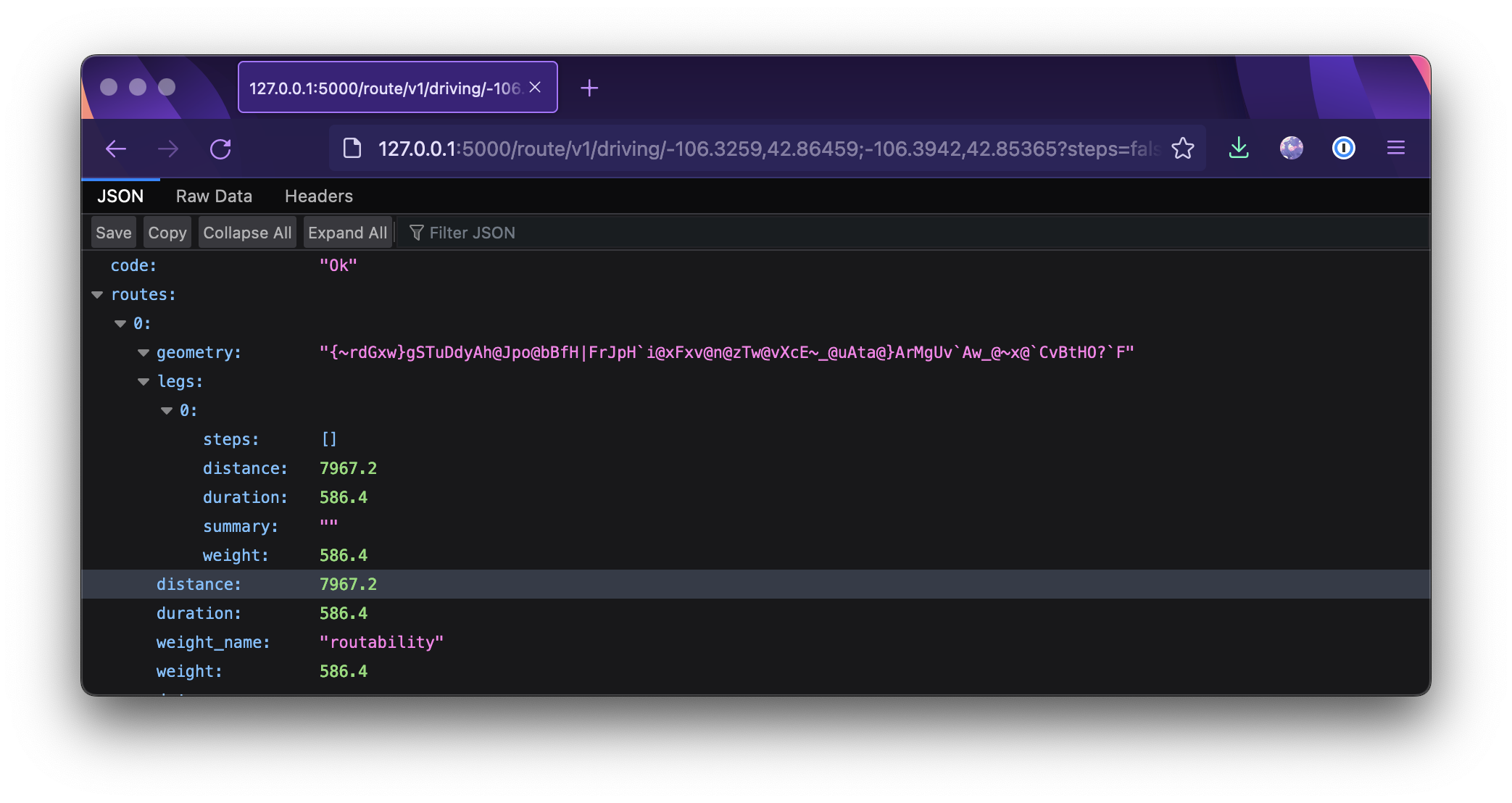
Great news! The worst of it is over (if you're me)! Whenever you need to launch the osrm server, you can simply open up docker and launch the container from the GUI. One final test to be sure things are all in order - open up your internet browser and paste the following into address bar:
In Chrome, you'll see this awesome text blob: In Firefox, you'll see a JSON browser: This means we're all set OSRM wise! A bit of a pain, but luckily after the initial setup all you have to do open Docker and hit play from there on out. A quick note, we grabbed only the Wyoming osm.pbf file but Geofabrik has detailed road networks for the the whole world! You can download entire continents at a time or subsets like we've done here and set up in the same way as above.
Euclidean & Travel Time Distance Matrices in R:
Ah, back to more familiar territories. Follow along with the 3 - osrm_pam.R script in the love_letters Github Repository! Starting out with some of the usual suspects here, then adding library(osrm) to grab that time travel matrix, library(geodist) to create euclidean distance matrices, and library(WeightedCluster) for clustering:
Let's import our cleaned data from last time to get the coordinate pairs. We'll also need to tell the osrm package where it should ping. For the way I have OSRM set up, 127.0.0.1:5000 works on both MacOS and Windows but your mileage may vary.
# import data
cens = readRDS("R_Objects/cens_cleaned.rds")

# osrm address setup
options(osrm.server = "http://127.0.0.1:5000/", osrm.profile = "car")
Now for the distance matrices. Pretty straightforward here barring any OSRM issues:
The last bit is checking that both distance matrices have the same dimensions. In this case, they should be 1997 x 1997.
Clustering with wcKMedoids:
Now for the fun stuff! We can use wcKMedoids to cluster, using either the Euclidean distance matrix or our travel time distance matrix. Here, there's a switch so you can try both. For now, I'm leaving the number of clusters as k = 3 but feel free to change that!
We can extract clustering assignments from this object with using $clustering:
test_assignment = test_clust$clustering
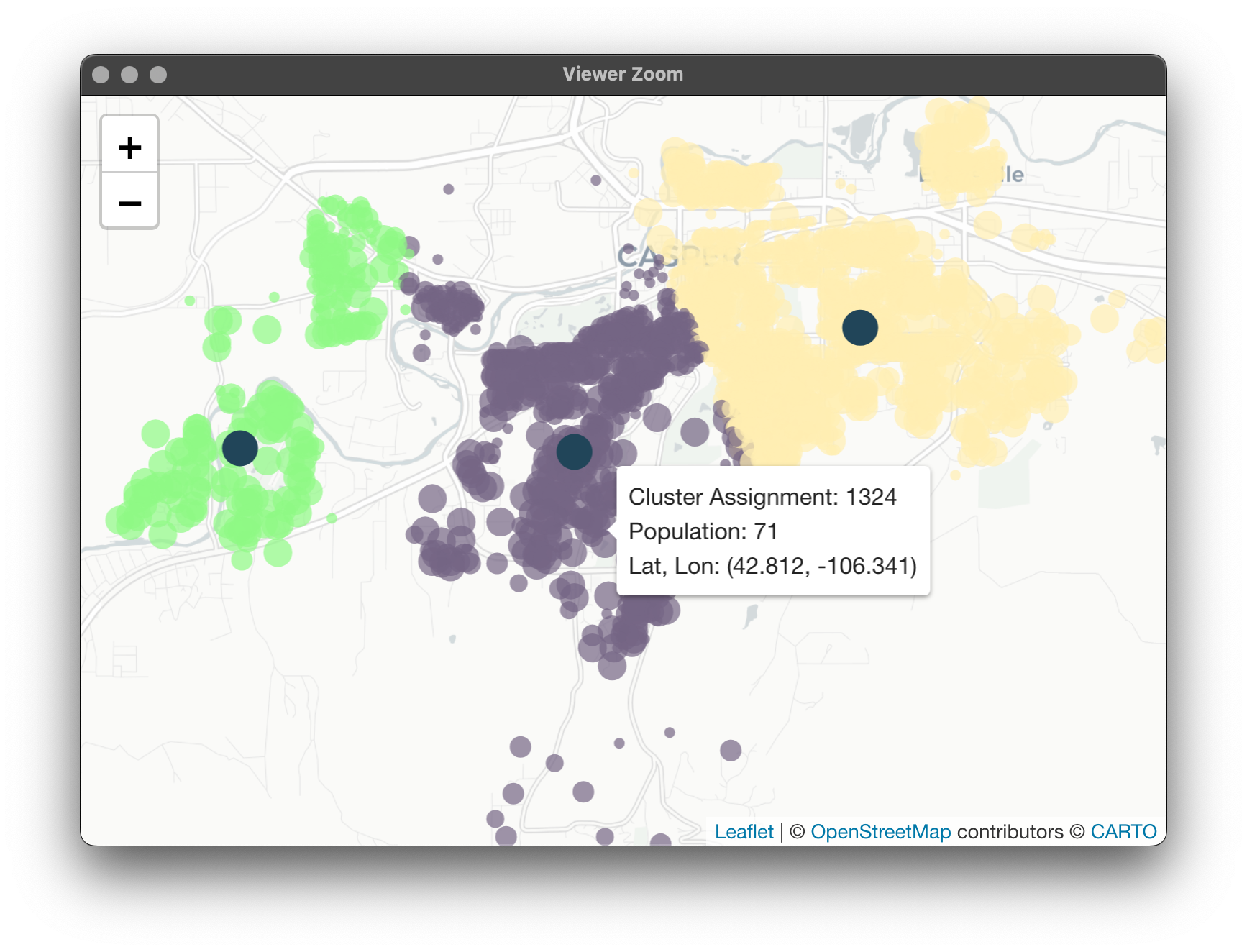
This is just a vector with a medoid assignment for every one of our 1997 census blocks. Let's map to make sure our results make sense. To start, we'll need to get these assignments back to our census block data table. I'm making a copy here as to not modify the original.
# leaflet test data
test_cens = copy(cens)
test_cens[, Clust := test_assignment]
test_cens[, Medoid := ifelse(Clust == ID, 1, 0)]
That last line flags the medoids so we can mark them accordingly, a quick check to make sure it worked:
I don't know about you, but when it comes to clustering I definitely need a visual of some sort. Leaflet is one of my favorite ways to interact with spatial data as it lets you really "feel" the data and play around with it. What we'll be doing this time is a little more intense than our last bout with leaflet, but I think you'll agree it's worth it.
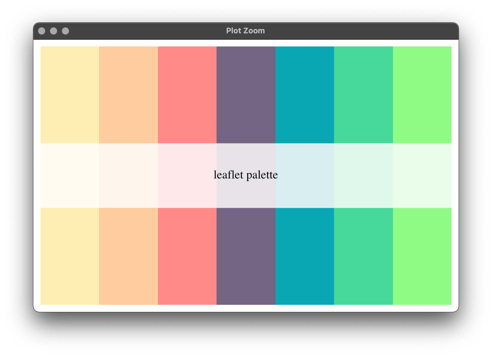
To start, let's make a color palette that might be good for factors. Essentially, we want all census blocks belonging to cluster X to have a color delegated to cluster X. All I'm doing here is take a character vector of hex codes and previewing them:
Behold, the satisfaction of a custom color palette! Now let's send our palette over to Leaflet's colorFactor function which, in essence, creates another function that can be applied specifically to our data. After we do that (saving it to our data.table), then we can "pick out" our medoids and give them a different color:
All's well with the colors now. Next, moving onto some changes in radius size. You might recall we had variable radius size in the first post, but here we need some extra customization. Same idea as with the colors, writing a function and applying it to our data.table as a new column. Again, applying Medoid specific arguments at the end. I'm also tagging on an opacity argument here since it's a one-liner:
In Leaflet, you can also have little pop-ups when hovering over an observation. Let's have our census blocks tell us a few things: what cluster they're assigned to, its population, and its coordinates. Again, writing a function and applying it to our data, saving as a new column:
Finally, let's make our Leaflet! This bit is a little longer because I had to separate the data into normal census blocks and medoids purely so that the medoids are on the top layer. Else, notice that all the arguments are identical between the addCircleMarkers() calls except for the data:
Now we have a fun, interactive Leaflet to investigate our cluster solutions!
Generalizing to Quickly Compare:
In order to get a better feel for the differences in cluster solutions, we might want to generalize as to avoid going all the way back up to the wcKMedoids() call, changing the distance matrix and k, and then rerunning all of that.
Let's start by removing all the items starting with "test_" from our environment and flushing our memory. Since R stores objects in memory, this might be helpful depending on your machine. After the below, My memory consumption went down from 1 Gb to 500 Mb.
We should also save our distance matrices and the travel time matrix, adding ID to that one:
# save distance matrices
saveRDS(euc_dist, "R_Objects/euc_dist.rds")
saveRDS(time_dist, "R_Objects/time_dist.rds")
time_mat[, ID := cens$ID]
saveRDS(time_mat, "R_Objects/time_mat.rds")
Now, let's hop over to the 4 - cluster investigation.R script. All the libraries are the same, with the removal of osrm and geodist, and adding future.apply for parallelization. For future.apply, we'll need to plan a multisession. Finally, we also need to import our goodies from before:
To generalize the clustering process we'll create a cluster function requiring census data, which distance matrix to use, the number of vans we want to allocate, and the travel time matrix. That last piece is new, it'll be helpful when summarizing as we can use it to find a given census block's travel time from it's assigned van without interfacing with OSRM.
Much is the same as before, except with some added metrics and changing the way we present the cluster numbers. Before, clusters were assigned by index, so in our leaflet it would say the cluster assigned is 519, for example. Above, we've simply amended this so each cluster corresponds to a number between 1 and the number vans used. So, instead of clusters 519, 698, and 1200, we'll have clusters 1, 2, and 3.
Else, we've added assigned travel time, average travel time per cluster, and the total population per cluster. Here's the whole function:
# generalized cluster assignment
cluster = function(census_data, distance_matrix, n_vans, time_mat) {
  # copy data
  data = copy(census_data)
  setkey(data, ID)

  # wcKMedoids
  clust = wcKMedoids(
    diss = distance_matrix,
    k = n_vans,
    weights = data$Avg_Call,
    method = "PAMonce")
  assignment = data.table(clust = clust$clustering)
  assignment[, ID := 1:.N]
  setkey(assignment, ID)

  # get travel times to from assigned medoid
  time_cols = c(unique(assignment$clust), "ID")
  time = time_mat[ , ..time_cols]
  setkey(time, ID)
  time = time[assignment]

  which_time = function(dt) {
    col = as.character(dt$clust)
    return(as.numeric(dt[, ..col]))
  }

  time[, Travel_Time := which_time(.SD), by = ID]
  time = time[, .(ID, Travel_Time)]
  setkey(time, ID)

  # cluster assignments as N's instead of index
  clustkey = data.table(Clust = 1:n_vans,
                        clust = sort(unique(assignment$clust)))
  setkey(clustkey, clust)
  setkey(assignment, clust)
  assignment = clustkey[assignment]
  assignment[, clust := NULL]
  setkey(assignment, ID)

  # append cluster assignment data
  data = data[assignment]
  setkey(data, ID)
  data = data[time]
  data[, Medoid := ifelse(ID %in% clustkey$clust, 1, 0)]
  data[, N_Clust := n_vans]

  # average metrics per cluster
  average = data[, .(Travel_Time_Average = mean(Travel_Time),
                     Total_Population = sum(Population)), by = Clust]
  setkey(average, Clust)
  setkey(data, Clust)
  data = data[average]
  setkey(data, ID)
}
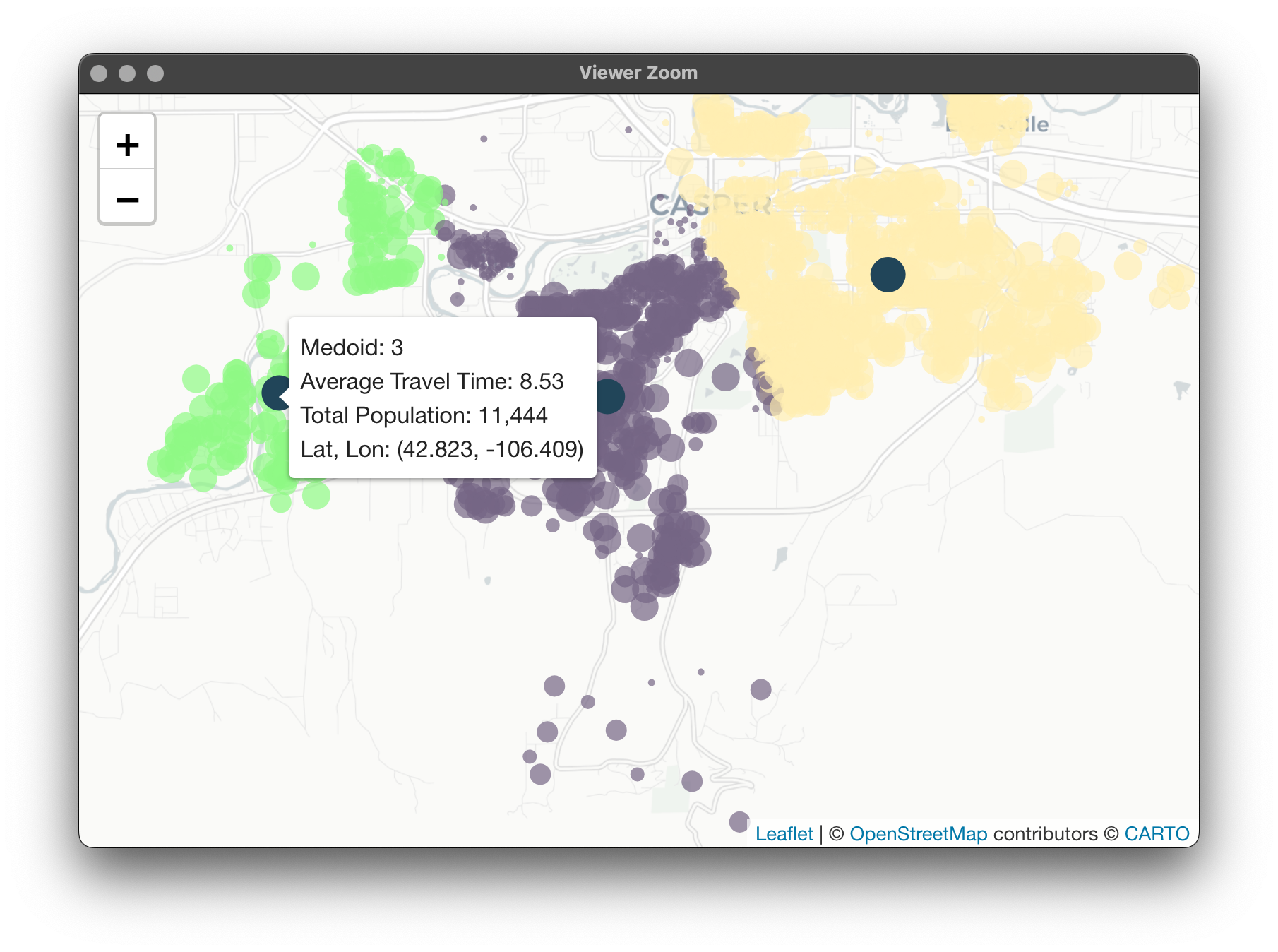
With this built, we can now apply this function over a range of the number of vans by method. Our above function will result in one data table per run. Most important, each of these tables has a N_Clust column which tell us which table we're looking at. This is essential because we can use rbindlist() to create one big data.table with all of the clustering information for every number of vans. This way, we only have to keep track of one object instead of an individual table for each number of vans combination.
We can use future_Map to take advantage of parallelization here. Not too important with our data, but could be depending on how large your application is (speaking from experience here). After running for each distance matrix used (either time_dist or euc_dist) for the number of vans 2 to 10 (wcKMedoids doesn't work with 1 cluster), we can further combine into cluster_dat. This big data.table has 35,946 rows to it but contains clustering information for each method and number of vans. Instead of having 18 different tables running around with 1997 rows each, we now have one big table with 35,946 rows:
Next, we can generalize the leaflet call. Most is the same from last time with a couple exceptions. Our function will take a big clustering data.table (the one we just created) and will map according to a user-specified method and number of vans. This quick subset is done with a simple one-liner.
Other than that, the only changes are some of the radius sizes as well as some logic for the labels differing between a regular observation and a medoid. The medoids, when hovered over, will now offer cluster summary metrics. Here's the function in its entirety:
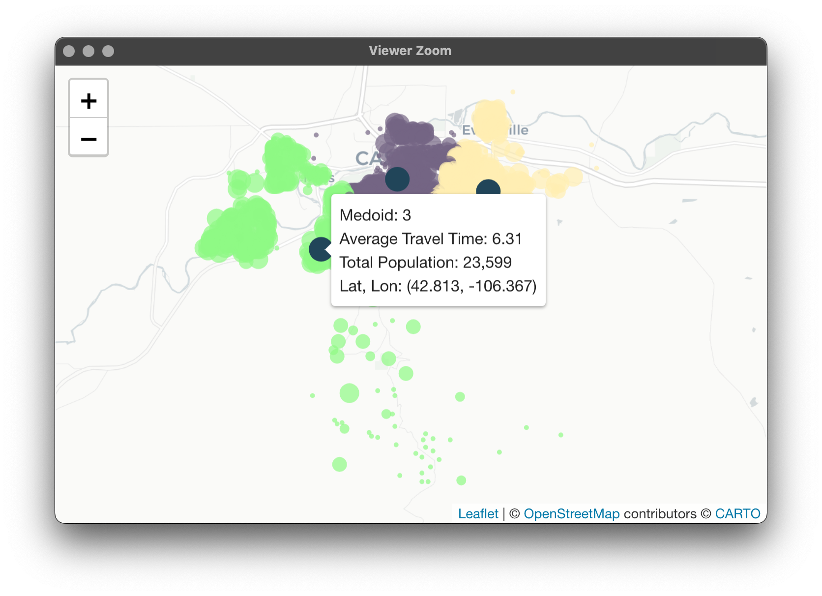
With all of the generalization, at the end we have one object containing all of our clustering information and a cluster_map() function that will pick out what we want to look at and visualize. Let's start with 3 vans using the Euclidean distance matrix:
The shift for van 3 here is really interesting here. Not only is it covering the Casper Mountain area, but the total population it serves was bumped by nearly 10,000 as well as travel time being reduced! Here's the van summaries again:
These results aren't altogether unexpected. Since we're using the travel time distance matrix, it was hypothesized that the average travel times per cluster would be more optimized. What is a more interesting consequence is that the population each van is serving is more balanced as well. Are clusters always balanced in this way when using travel time? Let's try with 6 vans:
We can observe that the population served is no longer balanced in either case. Here's the map for Euclidean: And one for travel time: It's interesting to observe the shifting of the clusters based on the shifting of the distance matrices. I encourage you to play around with this!
Potential Problems - Unequal Workload:
I was pretty taken aback by the difference in optimization between our 2 methods for 3 vans. Not only did using the travel time matrix mark performance gains in terms of average travel time to houses for our vans, but it also showcased something I hadn't considered: a more equal distribution of letter deliveries between our vans. However, this was only in this one instance; generally, none of the clustering solutions yielded workload equality using either matrix.
I think it's easily imaginable that the more unequal the workflow, the worse off our van placements would be from many perspectives. In essence, should we really be placing vans in Mills just because Mills is more unique in terms of distance from other parts of Casper in both Euclidean distance and travel time? I had hoped that using the weights argument in wcKMedoids would avoid that situation but it appears that this is not the case.
While these initial solutions to "where should we place vans?" questions are intriguing (and possibly valid), it would be nice to compare these with an option showcasing equality in workload while also maintaining distinctiveness in terms of spatial separation. Scouring the internet, I was unable to find anything that did this. So, I went ahead and built an algorithm that does exactly that and we'll take a look next time.
Up Next: Restoring Balance to the Force and Simulating Reality
My hope for this post was to showcase the power of using OSRM to get road network information, initial investigations with traditional clustering algorithms (PAM), and exploring leaflet as a cluster visualization tool. We encountered a question that I hadn't considered when thinking about van placements: how do we place vans to equalize workload between them? I hope this question is as interesting to the reader as it is to me!
Most of the code we used here will be the basis for further investigation, specifically the setup of combining multiple clustering solutions into one data table and our leaflet code. We'll recycle some of it when we explore the new algorithm that "balances the force".
Also on the horizon, we'll take a look at adding further realism by implementing discrete event simulation (DES). DES is interesting in this application, we can add things like vans "flexing" coverage. I.E., what happens when a van is currently being used and another delivery is requested? Should we wait for it to reset? Or, should another van that isn't being utilized "flex" over to take care of the new letter delivery? Some more things we can add are things like weather considerations depending on time of year. If you're familiar the Wyoming area, you know driving time can vary drastically in the winter time with icy-roads, etc.
As always, thanks for reading! Hopefully this is more than enough to chew on and experiment with for the time being.