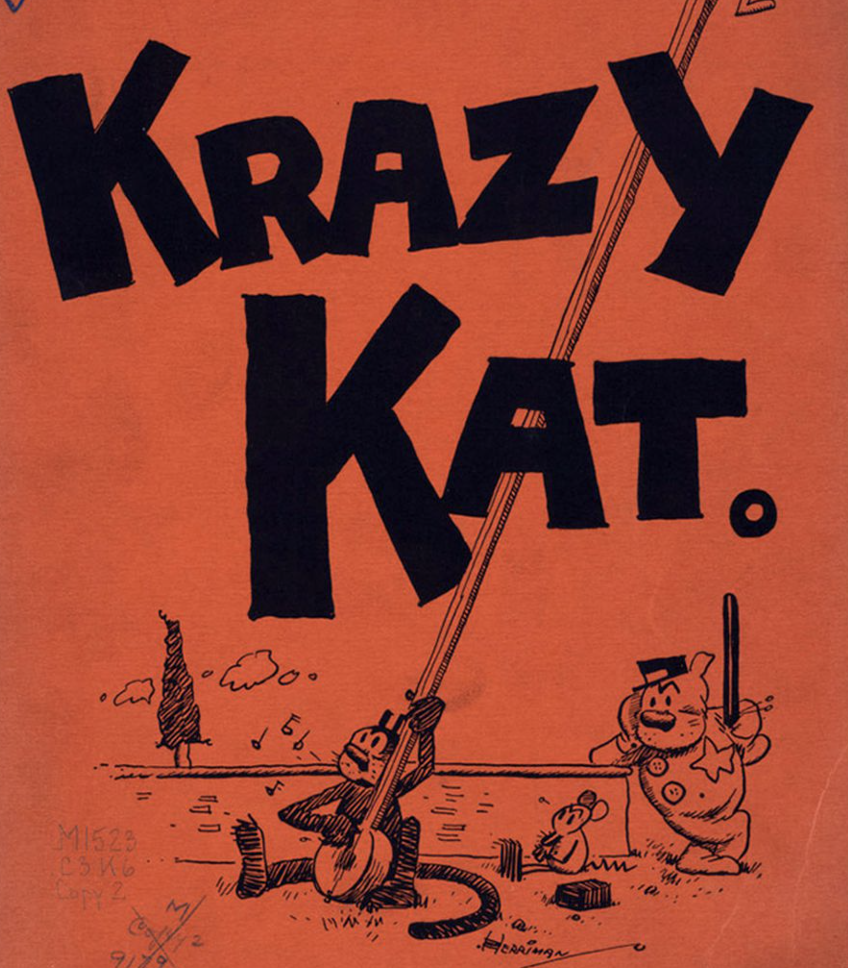
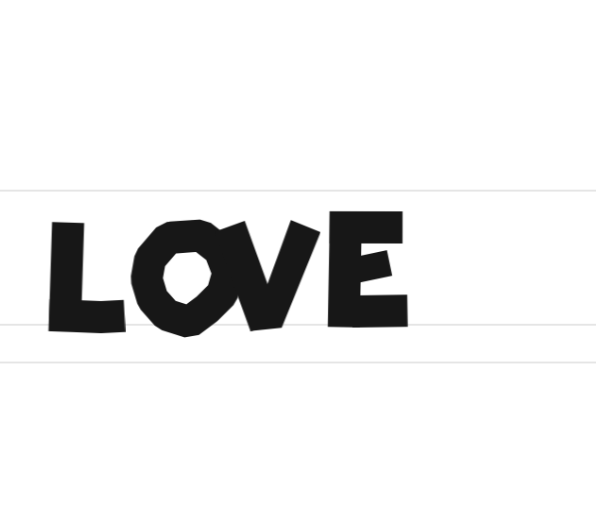
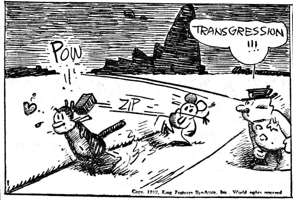
Over the past day or two, I've been creating a typeface. It's a lot of work to make even a half-competent typeface. I've been basing said typeface on old newspaper comics, especially my favorite, "Krazy Kat". The creator of Krazy Kat, George Herriman, hand-lettered in a bunch of distinctive styles, but his disjointed blocky text is my favorite:
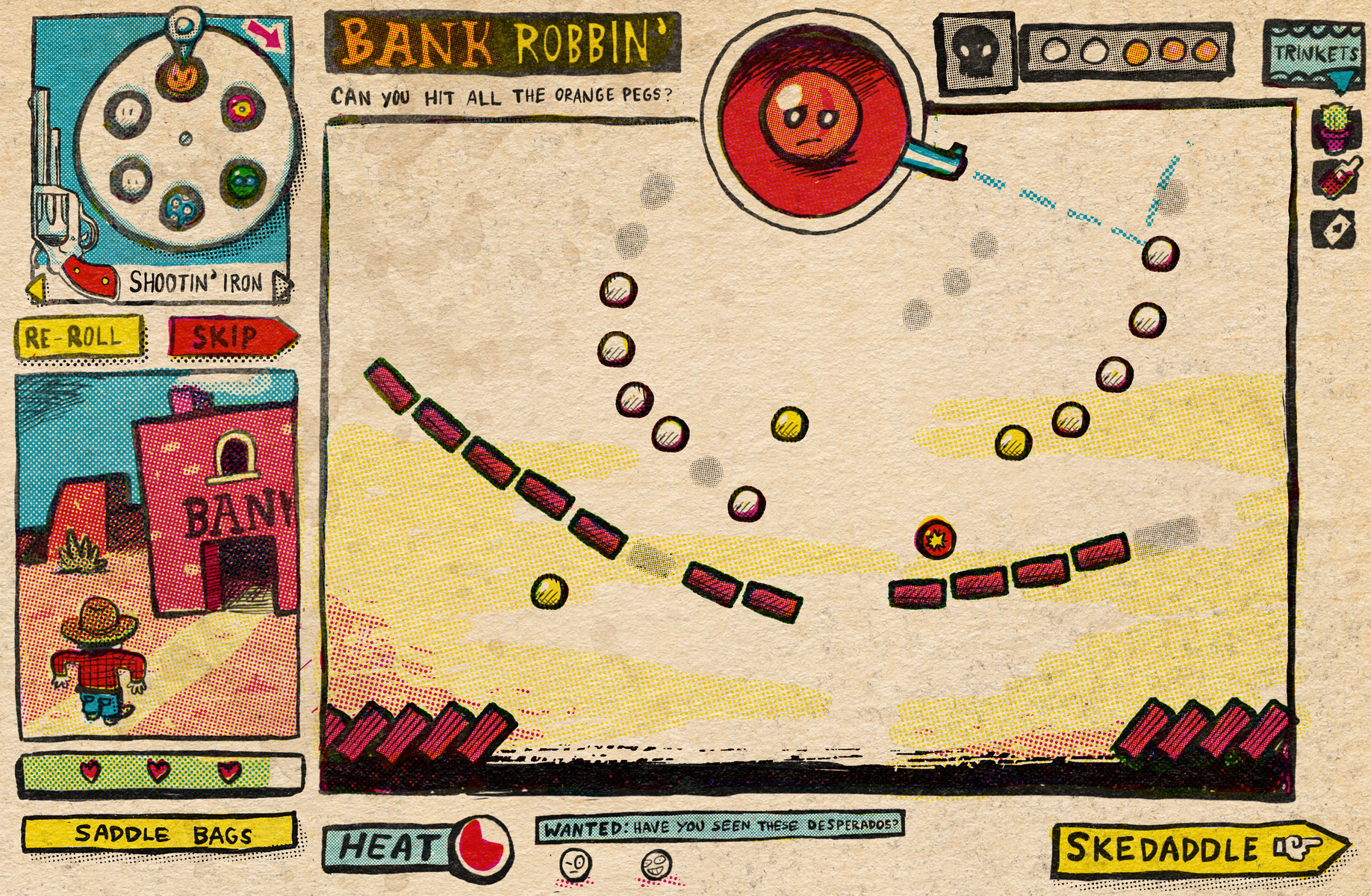
I've been working on this typeface for a video game, a little game jam game that a friend and I are working on. It's a Sunday-comic-style game.
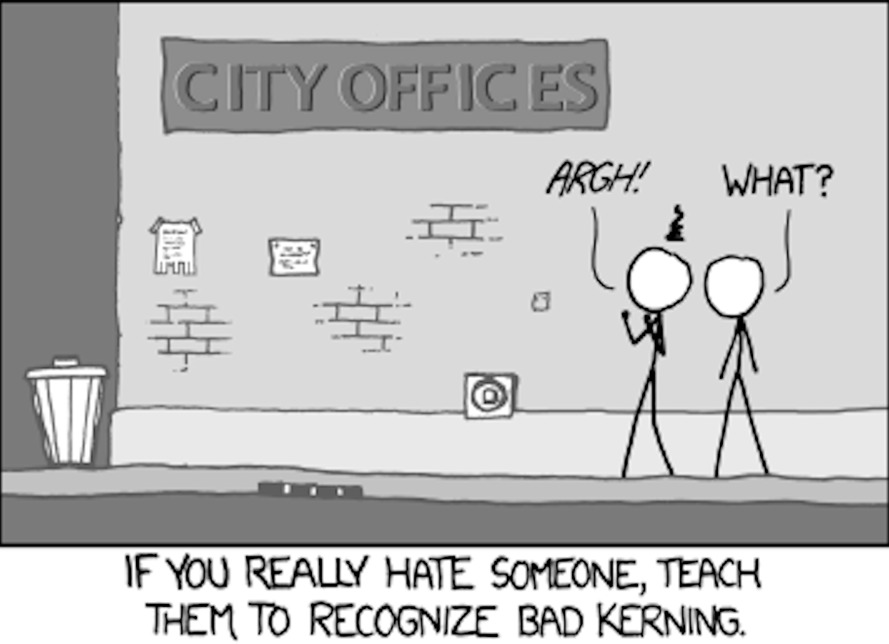
The game is inspired by Peglin, but we wanted a more polished style and wider variety of mechanics. I'll post about the game again in the future, but right now let's get back to typefaces. For me, the struggle and satisfaction of creating typefaces largely comes from one source: kerning. Kerning is adjusting the spacing between letters so words don't have any odd gaps or ugly overlap.
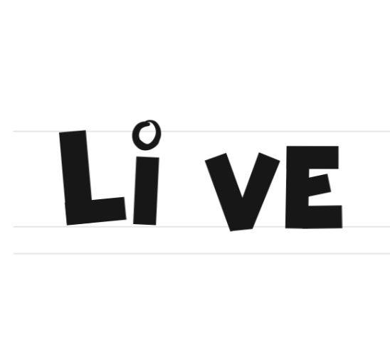
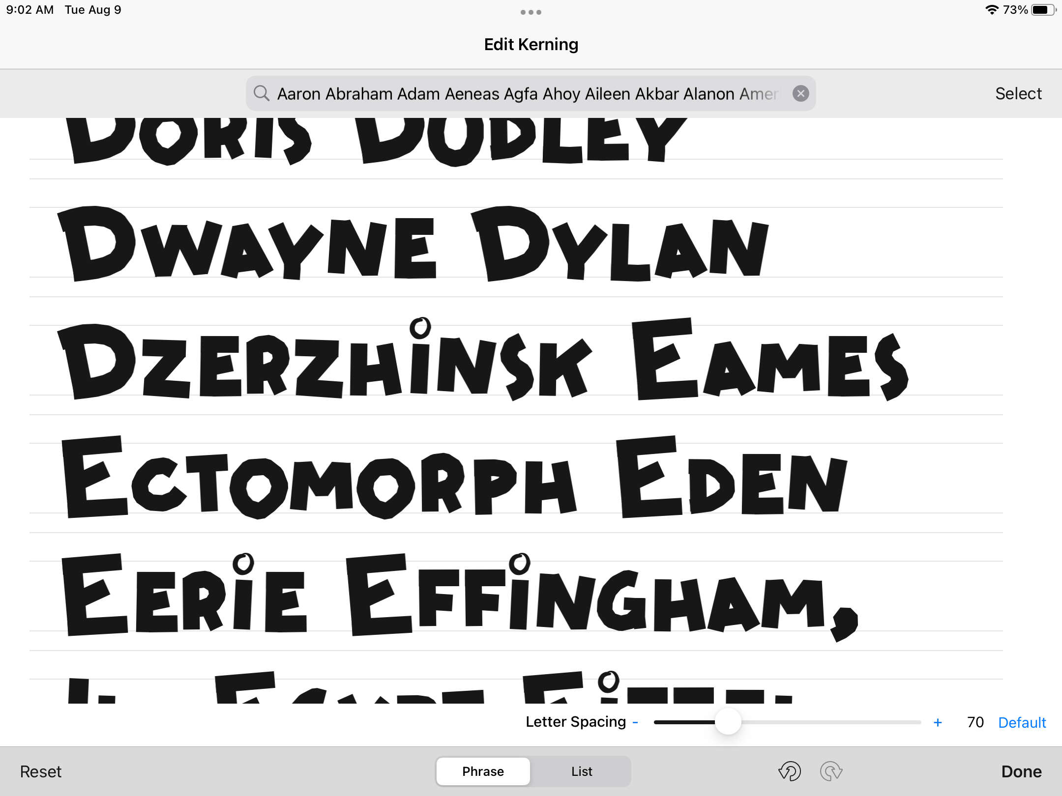
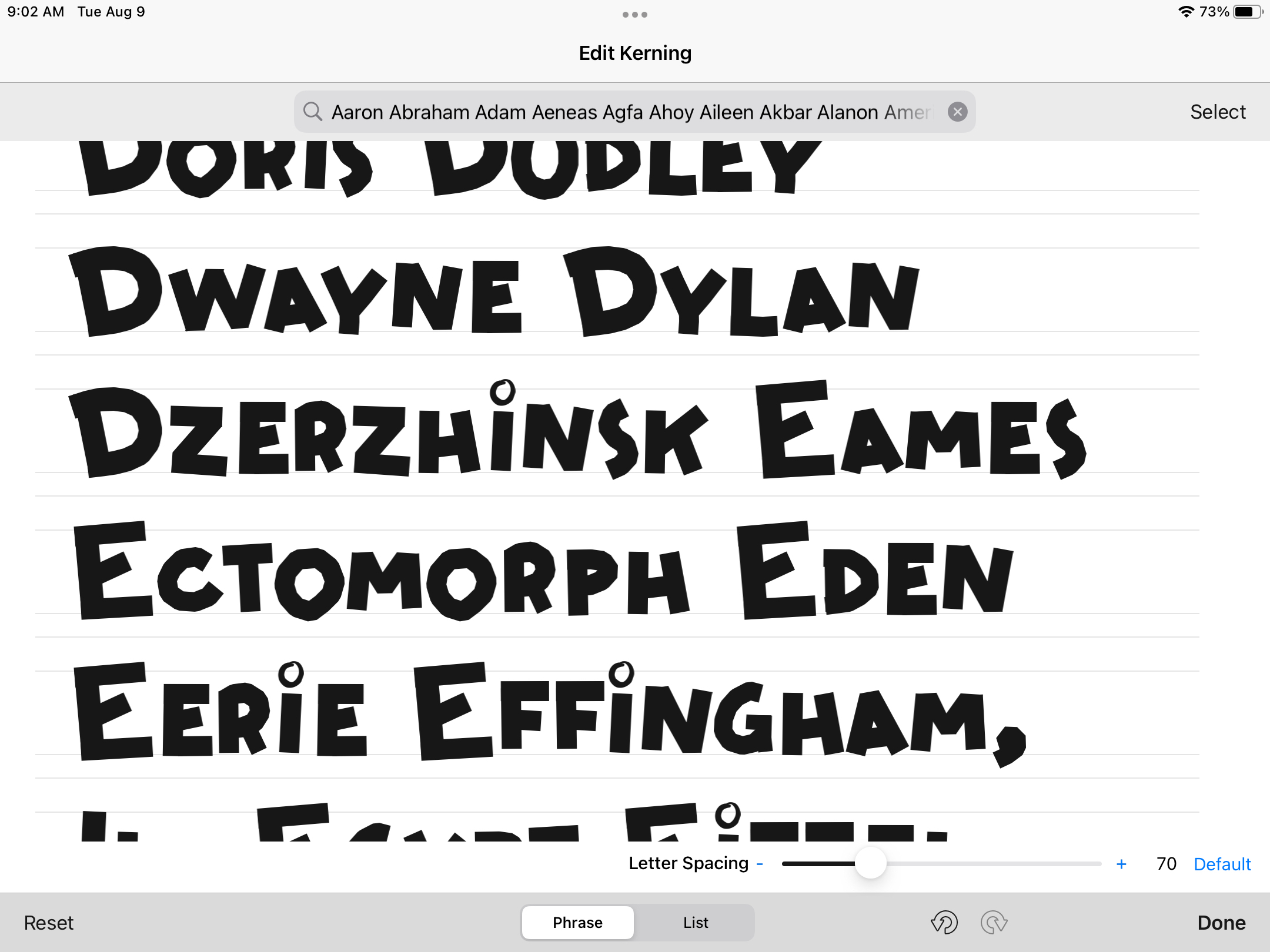
It's a big job if you want to do it properly. It's not as simple as adjusting the space around each letter, you have to adjust the space around each letter in relation to the other letters. So, let's say the spacing on "v" is off:
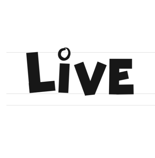
No problem, easy fix, we'll just adjust that spacing to work properly with that skinny "i".
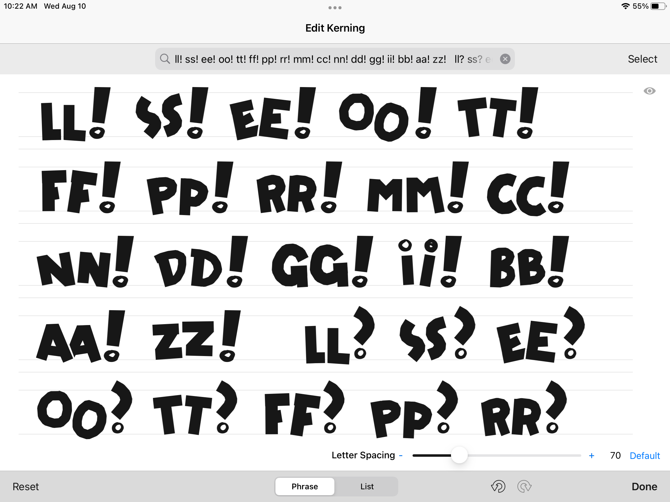
Fine, great, easy fix. But...what about "v" after an "o"? Oh, we have tot adjust that too. If you think about all of the letters that could be next to each other, throw in capitals and numbers, and consider the nightmare of punctuation, you can get a glimpse of how much work this process is. So for a I've been kerning, looking at hundreds of words and letter/punctuation combinations and adjusting them so they look nice. My days have looked like this:
It's so satisfying though. Seeing the typeface slowly come together as I tweak and adjust, experiencing all of the lovely surprises when the shape of one letter combines with another in an unexpected, lovely way. It's great.
There's an infinite amount of tweaking that I could do (especially when you consider ligatures, another deep well), but it's been some of the most engaging work I've done recently. It's not the most consistent and beautiful typeface on record, but it might be worth what you pay for it - it's free and in the public domain. I've called it "Harriman", and you can get the most recent version here:
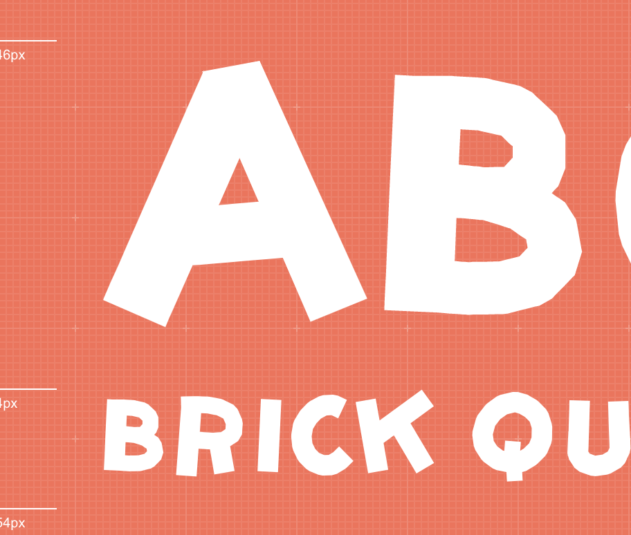
P.S. And to those of you who like Krazy Kat, yes it's a complete baffling coincidence that "Brick" is one of the example words on that page. Wow. Ok. Weird. Anyway, use the typeface for whatever. As my Gran'pa says, it's better than a poke in the eye with a sharp stick. Or a brick to the head. Enjoy.