In the course of designing user interfaces, and processing feedback about designs, one sometimes runs into a "That's distracting" comment about something specific in the design. You may even say it — or feel it — about something you're designing.
What's distracting about it? Maybe something's too colorful. Maybe it's something regarding the layout. Maybe it's the ordering of elements, or the size or proportion of something related to something else. Maybe it's a specific animation. Maybe it's even a sound generated by a specific action, button press, or gesture.
So what do you do? You look, you consider. But when you're staring at the thing that prompted the feedback, it's common to narrow your focus until only the offending element is in view. Essentially, when someone says "it's this thing", it's only natural to look at that thing. It's no different than looking over there when someone points off into the distance. You adjust your gaze to meet their attention. At their direction, you're looking for something at the expense of everything else.
But it's not the thing that matters here, it's the broader context. It's not the focus, it's the zoom. Something can be distracting bad (it makes it hard to focus on what really matters), or distracting good (it calls your attention to something you need to know about right now). And something can also be distracting in theory, and completely not in practice. There are many contexts, and you can't evaluate subjective design feedback without considering the whole context in which it exists.
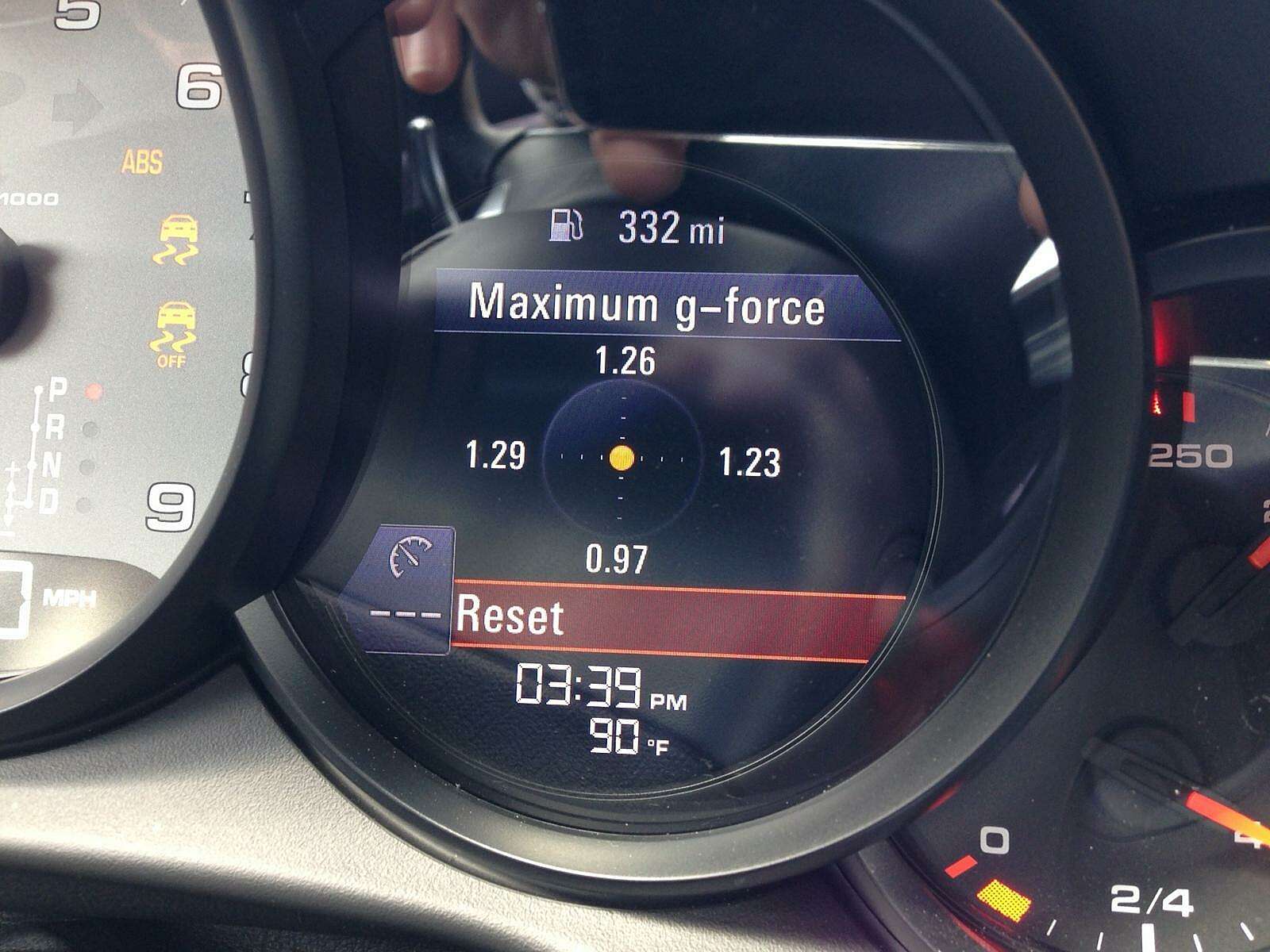
For example, today I was driving on the highway, weaving in and out of traffic trying to make up some time because I was running late (dumb, I know). In my car, one of the digital gauge cluster icons can be changed to a g-force indicator. It's a little dot that animates across a field in real time based on the g's you're pulling. Since I was weaving and changing directions, the dot was slamming from side to side. It looks something like this, except that you have to imagine the dot moving around as you're driving, not fixed in the middle as in this example:

Now, I can imagine a design review session where designers presented this idea and someone said "a dot constantly moving around would be distracting for the driver." If we view this in isolation, they'd have a point. Especially since we imagine the gauge cluster being in front of the driver.
So on paper, yes, it certainly might be distracting. And even in an isolated simulation it could be distracting. And if you were staring at the element in the graphics or animation program where it was initially mocked up and conceived, it would probably be distracting — especially if you're watching a prototype animation endlessly loop. And if it was presented as a static image surrounded by annotated comments, then you could be convinced it was distracting. And if your head is full of review feedback about how distracting it could be, then it certainly may be hard to imagine it in any other way than distracting.
But this gauge, and this animated dot, isn't actually distracting in practice. Turns out, the gauge cluster is in front of you, but it's below your field of vision. It's in your periphery. You aren't tracking it, and you don't notice it unless you look at it. In the context of driving, yes the dot is moving, but your eyes are fixed on motion outside. The road is moving, cars are moving, the landscape is moving, street signs are moving. And those movements are relatively huge compared to that tiny little dot. The big motion is what captures your attention. The dot doesn't distract. In fact, you don't even notice it unless you look. It can't win your attention unless you give it your attention. You are in control, the dot is not.
Now this is an example from the automotive world. But this comes up in software design all the time. Mockups aren't real. Looking at screens or designs in isolation limits your ability to think about the whole system. Reducing elements to their objective qualities (size, color, etc) flattens them and removes the richness of the situation, the moment, the time, and the context in which they exist. The user isn't evaluating, the user is using for a reason, in a given context, with more going on in their world than just that element, that object, and that screen in front of them.
All this is simply a reminder to resist the urge to focus in on isolated feedback. Rather, zoom out and look at the whole. Get real with it. Then consider.