Designing products is one of my favorite things to do — period.
There's a lot to love. The twists and turns, the surprises, the creative explorations, the collaboration, and the moments when things really come together.
But it's the practical choices, the tough decisions, and the tradeoffs that really make the work challenging and interesting. I'm long for that kind of work.
When building products you're occasionally reminded of a peculiar — somewhat magical — irony: That reducing options can create more optionality. And that you can actually do less work and get more out of it.
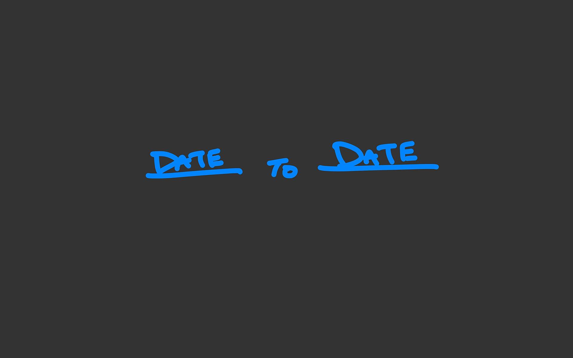
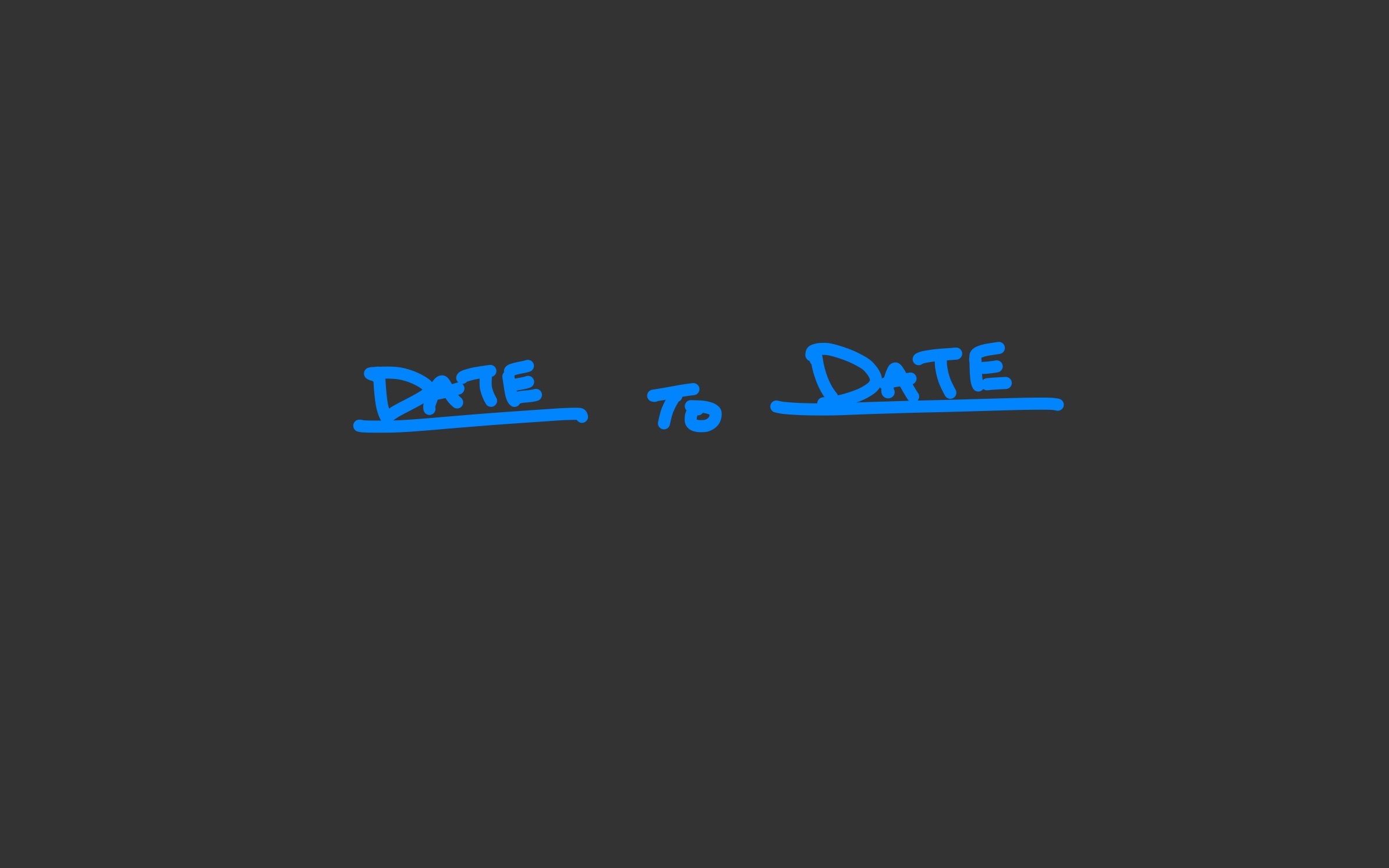
Case in point. We're currently working on adding autoresponders to HEY. Since these are frequently used by people who are going out of town, we began the flow with specifying a start and end date. If anyone emails you between these two dates, we'll auto-respond with some text you've written in advance. This is basically how most autoresponders work.
But one of our rules around here is that we're always aiming to get something working within the first week of working on it. Not mockups, but HTML+CSS hooked up to backend code that works and does something for real. It's a healthy exercise that forces you into discovering the epicenter, and figuring out the essence of the idea where the bulk of the value resides.
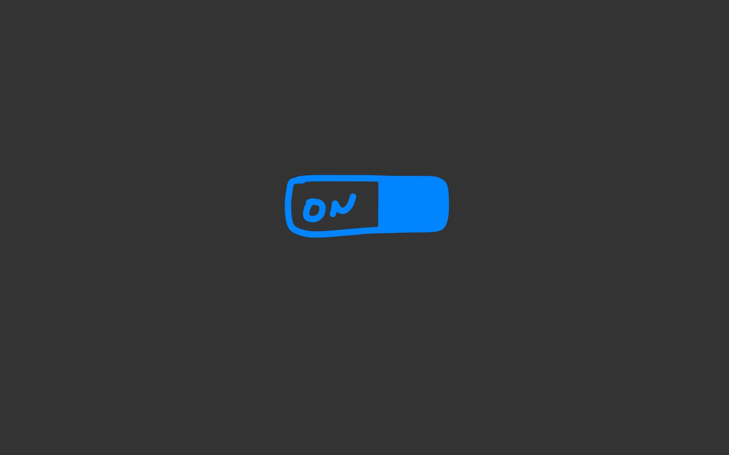
So what does someone need to set up an autoresponder that responds while you're gone for a while? It's not actually a date range, it's simply an on or off switch. Dates turn the autoresponder on or off, but so would a simple, single on/off toggle. Want your autoresponder on? Flip the switch. Want it off when you return? Flip the switch. One toggle switch is all you need to get this working. It's also the fastest way to get this working.
This is when the magic happens. A simple switch eliminates all sorts of work, edge cases, error states, etc. When you set dates, you have to account for potential error states. The start date could be after the end date. Or the date format you enter could be wrong. Or what if you entered the same date for start and end? Or what if you leave one date field blank but fill in the other? There's much to account for, and accounting for all those things requires work, hidden states, contingency design (designing for when things go wrong), additional QA testing, etc.
The on/off binary is better. It's clearer, easier, more flexible, and fewer things can go wrong.
On/off gives you something else too: The freedom to not have to know when you're returning. On = out for as long as you're out. This unlocks another use case: The perpetual autoresponder. Some people prefer an autoresponder whenever someone emails them. They essentially use it as a README — laying down the rules of email engagement. We initially considered a perpetual autoresponder as a separate feature, but when you simplify into on/off, on = away for now or always and forever. You get two for one, it's up to you.
So that's where we're starting. On/off. And it's likely where we're ending. By eliminating options we've simplified the product, reduced the potential for errors or confusion, and we also got a perpetual autoresponder feature for free.
Fewer options, more optionality. Easier to build, easier to use, more flexibility, and faster to ship. Simplifying can give you all sorts of leverage. Addition by subtraction. We'll take it.
About Jason Fried
Hey! I'm Jason, the Co-Founder and CEO at 37signals, makers of Basecamp and HEY. Subscribe below to follow my thinking on business, design, product development, and whatever else is on my mind. Thanks for visiting, thanks for reading.