In some cases, design is what something looks like.
In other cases, design is how something works.
But the most interesting designs to me are when design changes your behavior. Even the smallest details can change how someone interacts with something.
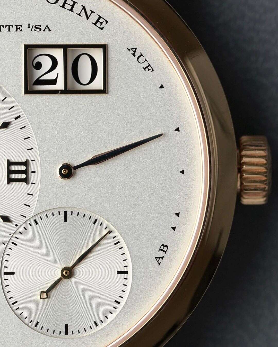
Take the power reserve indicator on the A. Lange & Söhne Lange 1 watch. The power reserve indicator indicates how much "power" (wind) is left. It's pictured below on the right side of the dial. It starts with AUF ("up") and ends with AB ("down"). A fully wound Lange 1 (indicator up at AUF) will give you about 72 hours before the watch fully runs out of power, stops, and must be wound again. It moves down as the watch runs until you're out of power. Wind it again to fill it back up.
Simple enough, right? An indicator and a scale for fully wound through unwound. Just like a car's fuel gauge. You have full through empty, with a few ticks in between to indicate 3/4 or 1/4 tank left, and typically a red zone at the end saying you really need to fill this thing up soon or you're going to be stranded.
However, all is not as it seems on the Lange 1. There's something very clever going on here to change your behavior.
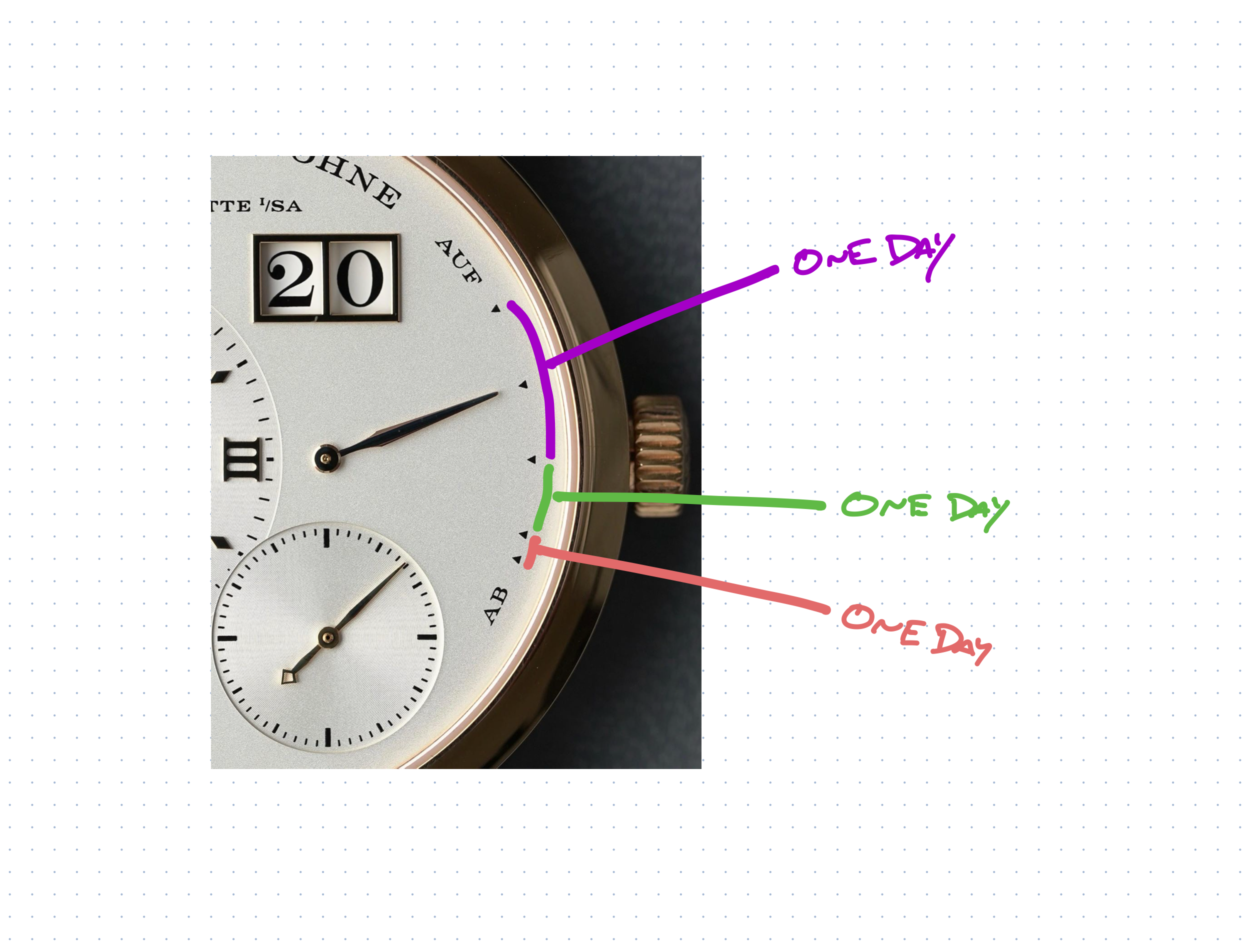
First you'll notice five triangles between AUF and AUB. They aren't equally spaced. At first you might think it looks like each is about a quarter of the scale, and then the last two at the bottom would be like the red zone on your fuel gage.
But no. The indicator follows a non-linear progression downwards. It doesn't sweep from top to bottom evenly over time. It's actually accelerated early.
When fully wound, It takes just a day for the indicator to drop down two markers to the halfway point. From there, it takes a day each to hit the lower two markers. This makes it look like it's unwinding faster than it is because the indicator covers more distance in that first 24 hours. If the spacing were uniform, and the indicator was linear, the owner might not feel the need to wind it until the power reserve was nearly fully depleted. Then you might have a dead watch when you pick it up the next morning. So what's the net effect of this tiny little design detail that the owner may not even understand? Well, it looks like the watch is already half-way out of power after the first day, so it encourages the owner to wind the watch more frequently. To keep it closer to topped off, even when it's not necessary. This helps prevents the watch from running out of power, losing time, and, ultimately, stopping. A stopped watch may be right twice a day, but it's rarely at the times you want.
Small detail, material behavior change. Well considered, well executed, well done.
-Jason
About Jason Fried
Hey! I'm Jason, the Co-Founder and CEO at 37signals, makers of Basecamp and HEY. Subscribe below to follow my thinking on business, design, product development, and whatever else is on my mind. Thanks for visiting, thanks for reading.