Every time a company announces “AI usage dashboards,” people get mad. My timeline on X gets full of surveillance, micromanagement, and bullshit rankings. I get the reaction. Engineers hate anything that smells like performance theater. But with something as disruptive as AI, betting on “organic adoption” is a fantasy. Habits don’t shift on their own. Teams don’t wake up one day and decide to rewrite workflows. And leaders can’t support what they can’t see.
DORA metrics at Adevinta
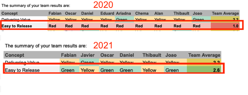
Back in 2021, Adevinta had a company-wide objective that counted against the variable incentive (€€€) people got. There were a lot of complaints.
You can’t measure everything through DORA (person X)
People will just fake the metrics (person Y)
And the list went on. All of this is partially true. And organizations are bound to Goodhart’s Law:
When the target becomes the goal, it ceases to be a good measure.
If we look carefully at the metrics most leaders use in big corps... You can game most of them. And yet, leaders need something they can track. If you can’t track... how do you measure progress?
So what I did back then is exactly what I’m arguing for now: make the work visible. People were frustrated with DORA because they assumed leadership only cared about the numbers. But when we treated the metrics as prompts — not goals — things started to move.
Inside the Runtime team, we started by asking simple questions: why is lead time this high? Why are deployments painful? It didn’t matter if we were an infrastructure team or a product team — the metrics pointed us to the right conversations. We weren’t comparing ourselves to anyone else. We were trying to understand our own workflow.
A small dashboard, created by Thibault, made a big difference. It showed where we were getting stuck. That led to concrete changes: smaller pull requests, thanks to stacked PRs. Easier reviews. Fewer long-running branches. And a shared awareness that code sitting in main but not in production is already drifting. Once the team saw that, they acted on it.
The metrics improved, but only because the team fixed the underlying issues. We didn’t optimize for the number. We used the number to guide our questions. That experience is why I believe dashboards matter. Not to rank people. Not to micromanage. Just to see what’s actually happening so the team can improve it.
Why dashboards work
To be clear: dashboards don’t fix your culture, and they won’t turn mediocre teams into high-performing ones. What they do is make the current reality visible. And visibility is usually the first uncomfortable but necessary step toward change.
Most companies today have a significant gap between access to AI tools and their actual use in a meaningful way. Two engineers can sit in the same team, with the same deadlines, and have radically different workflows. One gets 30 percent faster. The other barely touches the tools. Without visibility, these differences stay invisible, and nothing improves.
A good dashboard doesn’t need to be a leaderboard (although gamification also works). It can be as simple as: which teams are trying things, where they’re stuck, and where the tools actually save time. That’s enough to spark questions, conversations, and curiosity. People copy what works. They ask for help. They share tricks. That’s where culture starts shifting.
And yes, it creates pressure. The healthy kind. It puts these new skills on the same bar as other expectations. What makes people write documentation, fix tests, or share learnings? Not punishment. Clear expectations.
You don’t keep these dashboards forever. Their job is temporary. They help you move from “AI available” to “AI embedded.” Once the new habits stick and teams see the benefits, the dashboard fades into the background.
Dashboards and metrics don’t create culture. But they make the gap clear enough that teams finally close it.
— João
About João Alves
Dad. Husband. Head of Engineering @Adevinta, and building rotahog.com. My main interest is to build and grow SaaS Products and Infrastructure teams. Twitter | LinkedIn | Mastodon