Spot the Slop: A UI Designer’s Guide to Fixing AI Defaults
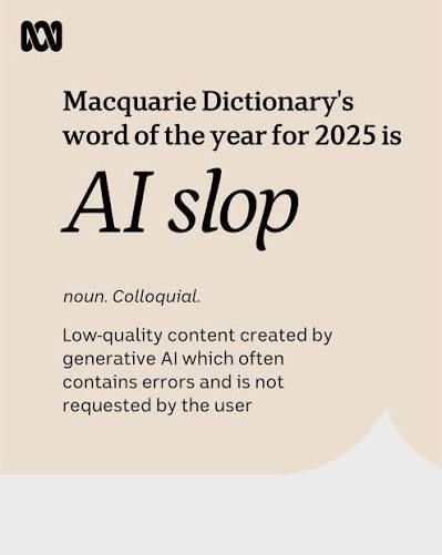
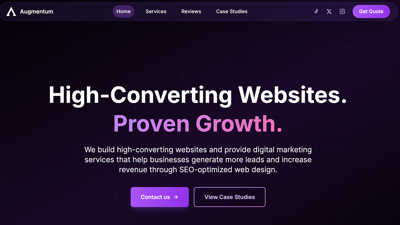
I can spot AI slop (Macquarie Dictionary's 2025 word of the year) in software products in about three seconds now. Someone sends me a a new product, or it shows up in my feed, and before I’ve read a word of the copy I already know how it was made. Inter. A purple-to-blue gradient in the hero. Cards with the same corner radius everywhere. That damn left-edge coloured line + curve on a panel! A headline that says “Build the future of work” and means nothing. It’s not ugly. That’s the strange part. It’s competent. It just doesn’t come from anywhere.
I’ve been calling this AI slop, and I want to be precise about what I mean, because the phrase gets thrown around as an insult when it’s actually a diagnosis. Slop isn’t bad design in the old sense: misaligned buttons, clashing colours, broken layouts. Slop is design with no author. It’s the statistical average of ten thousand interfaces, rendered cleanly and shipped without anyone stopping to ask whether it should look and feel like this.
I’ve shipped some of it myself. So this isn’t a lecture from the outside.
Why it happens
A language model doesn’t design. It predicts the most probable next thing based on everything it’s seen. Ask it for a dashboard and it gives you the weighted average of every dashboard in its training data, which happens to look like shadcn with a gradient, because that’s what most templates look like. There’s a study in Nature that describes “model collapse”: as models train on more generated output, they lose the tails of the distribution and converge toward the mean. Distinctive design lives in those tails. The model systematically loses exactly the thing that made a product worth remembering.
So slop isn’t a bug you prompt your way out of. It’s the default behaviour of a tool that’s brilliant at the middle and blind to the edges. Which means the job of spotting it, and fixing it, falls back to us.
Here’s what I look for:
1. Typography with no opinion
Inter paired with a system fallback and nothing else. It’s a good typeface, designed for screens, reads well small. That’s exactly why it’s the default in every builder, and why its presence tells you no one made a choice. Type is the fastest signal of authorship. Linear runs a custom-modified typeface. Stripe pairs a bespoke serif with a clean sans. Vercel commissioned Geist. You don’t need a custom font, but you need a decision: one display face that carries the product’s personality, one readable body face, applied consistently.
The fix: Change the font before you change anything else. It’s an hour of work and it’s the single highest-leverage move against slop.
2. The purple-to-blue gradient
The model learned that this gradient is the safe choice for a SaaS hero, so it shows up everywhere: backgrounds, CTAs, accents. It’s not offensive. It’s just meaningless, because it’s decoration standing in for a colour system.
The fix: Use colour semantically, not decoratively. A colour should mean something. This is the primary action, this is a warning, this is success. Notion’s palette signals function. If your colours are named gradient-start and gradient-end, that’s the tell. Rename them for what they do.
3. Headlines that could belong to anyone
“Scale without limits.” “Your all-in-one platform.” These read as generic because the model produced them by averaging every headline it’s seen. Specificity is the antidote. Stripe says “Financial infrastructure for the internet.” Linear says “Plan and build products.” You know exactly what they do.
The fix: Rewrite every line in a real person’s voice. Ask: would our founder actually say this out loud? If not, keep going until the answer is yes.
4. Uniform everything
Same padding, same radius, same card height across the whole screen. Real hierarchy comes from intentional variation, where some things matter more and should look like it. When everything gets the same 16px radius and 24px padding, the page goes flat. Nothing leads your eye because everything is shouting at the same volume.
The fix: Break the uniformity on purpose. Make the primary thing bigger, closer, heavier. Let the secondary things recede.
5. The missing states
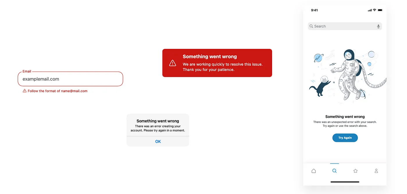
This is the one I care about most, because it’s invisible in a screenshot and fatal in use. AI nails the happy path every time. What it skips is everything around it: the empty state before there’s data, the loading state, the error when the network drops, the moment a field is filled in wrong. These edge cases are where trust is built or broken. A builder opens my project tool and there’s nothing there yet; if that empty state doesn’t tell them what to do next, I’ve already lost them. The model doesn’t build that screen because it optimises for the demo, and the demo always has data.
The fix: Design the unhappy paths deliberately. Write the empty state that makes someone want to fill it. Write the error in human language. These take under an hour each and almost nobody does them.
6. Motion that’s absent or identical
Either nothing moves, or everything fades in with the same timing. Purposeful motion does three things: it communicates a state change, it directs attention, and it carries the product’s character. Stripe’s animations feel precise and mathematical; Duolingo’s feel bouncy. The motion matches the thing. Generic fade-ins match nothing.
The fix: Start with micro-interactions on the primary button and the form inputs. Add scroll animation only where it helps navigation or story. Delete anything that moves purely for decoration.
7. Everything visible at all times
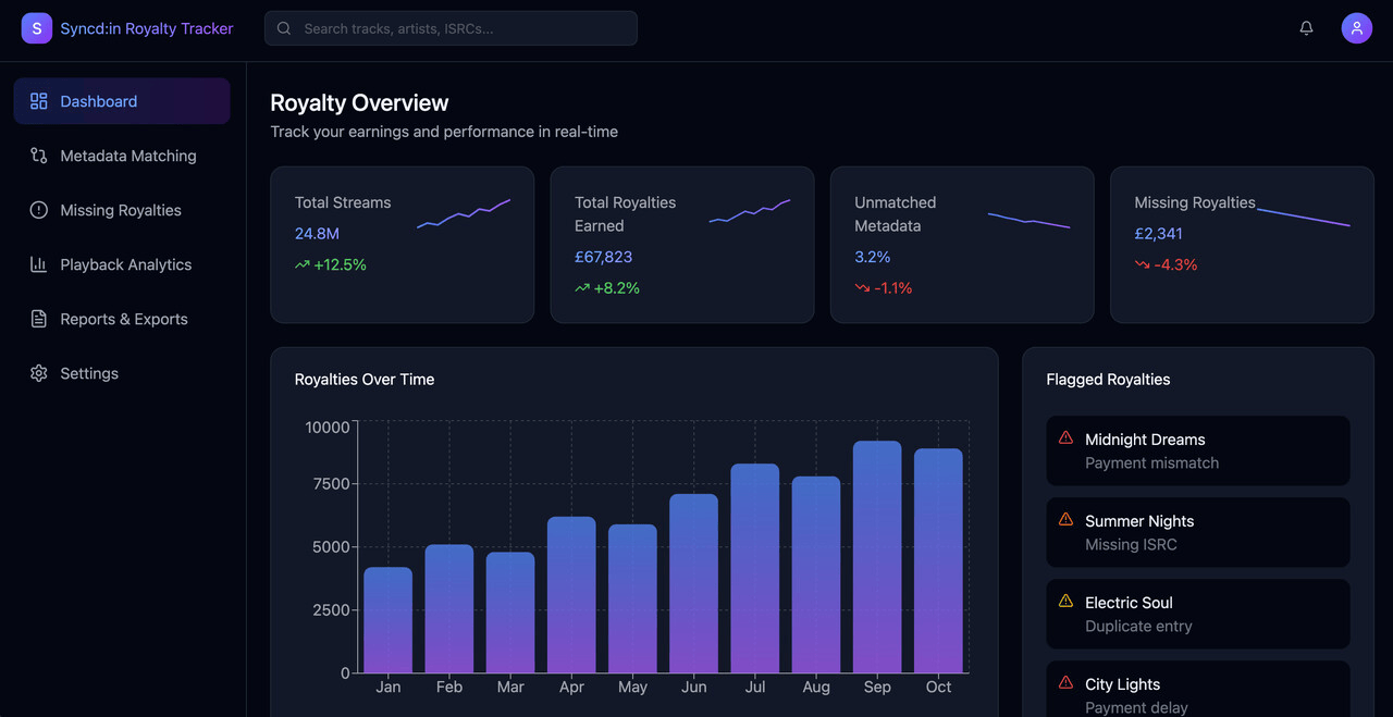
AI generally creates layouts & pages that shows everything, all at once. A good experience shows things when you need them, it anticipates what you're trying to do and matches you when you're trying to do it. AI slop will have a data entry table nested next to a panel to enter data, next to a panel that exports the data - all visible at the same time. It thinks well the user will have to do all of this at some point so lets give them the option to do all of it at all times.
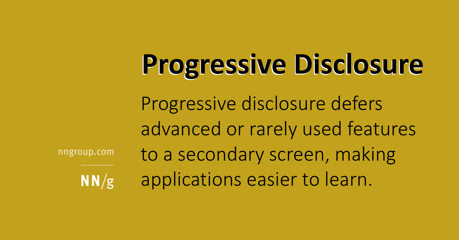
The fix: Start with user stories, service blueprints, and user journey maps. Figure out what the user is trying to do with your product, so you can see what information and control they'll need to see at what step. This is known as the art of progressive disclosure, a core design and context-management pattern that presents only the most essential information upfront, hiding complex or secondary details until the user needs them. Start with the user's journey and you'll always know what needs to be shown or not shown.
The real fix isn’t a checklist
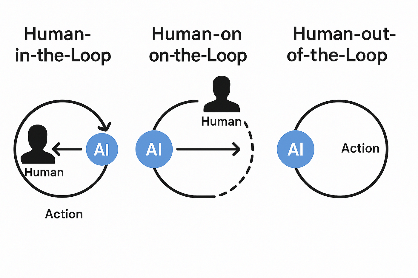
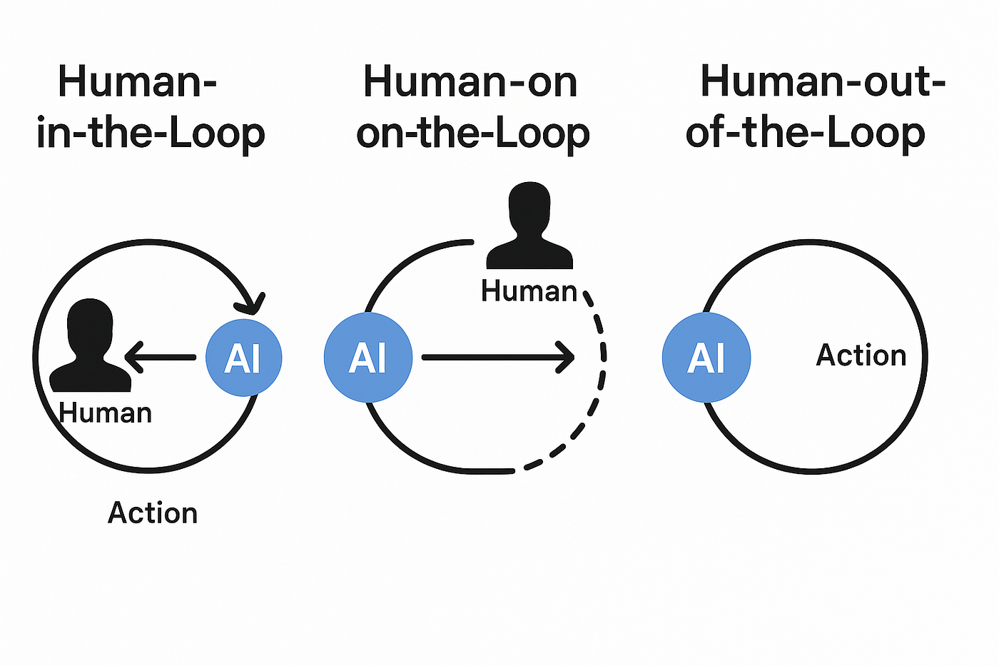
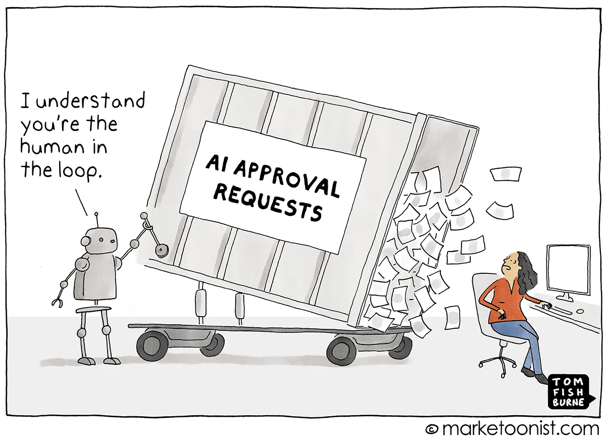
You can run down that list and still ship slop, because the list treats symptoms. The actual cause is that nobody paused. The loop-obsessed way of building right now, where you let the agent run until the tests pass, is optimised for the part that’s already fast. Code generation stopped being the bottleneck a while ago. The bottleneck is the moment of judgment between generating a thing and shipping it. Remove that pause and you get volume. Keep it and you get craft.
My workflow with Claude Code looks nothing like an automated loop. Build a piece. Stop. Actually look at it, where does my eye go, where does it get stuck. Click through it slowly, on a bad connection, on a small screen, when I’m tired. Put it in front of someone who isn’t me and watch them without saying “no, click over there.” That urge to correct them is the data. It’s telling me the interface failed to say what I thought it said.
None of that is generatable. It’s the felt layer, not the technical one, the difference between a song where every note is in tune and a song that’s actually alive. AI can now produce all the ingredients. It still can’t compose the experience, and it can’t tell you when something works but doesn’t sing.
So use the tools. Use them for the scaffolding, the boilerplate, the first draft. They’re extraordinary at it. Then stop and ask the only three questions that matter. Does this feel like it came from somewhere? Does it have a voice? Would I notice if it disappeared?
If the answer is no, the problem was never the technology. It’s that nobody stayed in the room long enough to bring the craft.