Kevin Powell is one of my favorite YouTubers out there. Thanks to him, I've truly fallen in love with the vanilla CSS and have developed a strong preference to do things CSS-first as much as possible and turn towards JavaScript as the last resort. If you aren't familiar with his channel, you're missing out!
Recently, I watched his video about text-decoration. In the video, Kevin describes and showcases all kinds of cool things you can do with related properties, but the biggest twist for me was that we're not limited just to the classic underline, but we can also define line-through and overline!
This discovery immediately sparked an idea in my head:
Can I use this to create a hamburger menu?
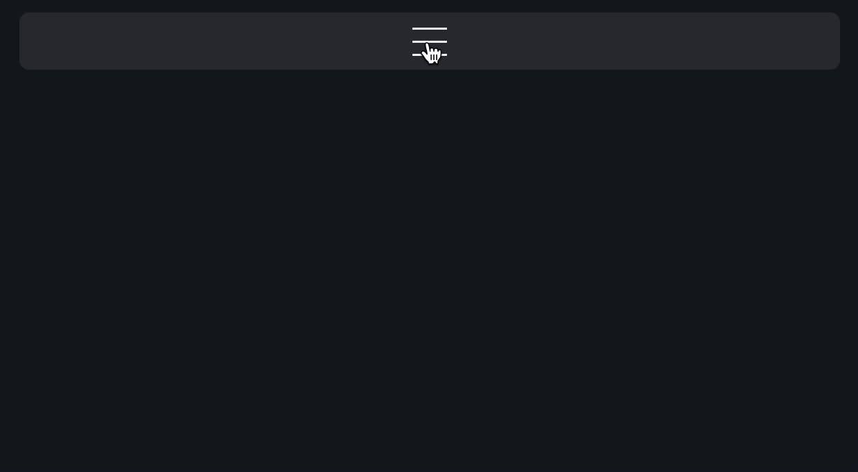
The goal
Main goal is to create a classic hamburger menu button using only CSS. No 3x span within the button, and no pseudo elements such as ::before or ::after. Sounds simple, let's get started!
HTML
First, the markup. We will create a basic nav layout with a toggle button:
<header class="header">
  <button
    aria-controls="primary-nav"
    aria-expanded="false"
    aria-label="Toggle navigation menu"
    class="toggle-button"
    onclick="toggleNav.call(this)"
  ></button>
  <nav hidden id="primary-nav">
    <ul>
      <li>
        <a href="#">Home</a>
      </li>
      <li>
        <a href="#">About</a>
      </li>
      <li>
        <a href="#">Contact</a>
      </li>
    </ul>
  </nav>
</header>
- aria-controls: indicates which element is controlled by the button. In our case it's the nav element, so we provide its id as the value.
- aria-expanded: indicates whether the controlled element is expanded or not. I.e., whether the navigation is toggled.
- aria-label: provides human readable label for the button. Since we don't want to render any text, we need to provide this attribute for assistive technologies in order for them to describe the button to people with disabilities. This attribute also plays a critical role in our quest, more on that later.
JS
JavaScript is also going to be fairly straightforward:
/**
 * @this {HTMLButtonElement}
 */
function toggleNav() {
  const expanded = this.getAttribute("aria-expanded") === "true";
  const nav = this.parentElement.querySelector(
    `#${this.getAttribute("aria-controls")}`
  );

  this.setAttribute("aria-expanded", !expanded);
  nav.hidden = expanded;
}
Here, we just toggle the aria-expanded attribute on the button and the hidden attribute on the nav whenever the button is clicked.
CSS
Now, the fun part. CSS is going to be a bit verbose, but don't worry, we will walk through it. But to get the full code out of the way, here it is:
.toggle-button {
  --thickness: 1.5px;
  --offset: 5px;
  --size: calc(var(--offset) * 5 + var(--thickness) * 2);

  &::after {
    content: attr(aria-label);
    color: transparent;
  }

  text-decoration-skip-ink: none;
  text-decoration-line: underline line-through overline;
  text-decoration-thickness: var(--thickness);
  text-underline-offset: var(--offset);
  width: var(--size);
  aspect-ratio: 1;
  white-space: nowrap;
  overflow: hidden;
  padding: 0;
  border: var(--thickness) solid transparent;
  background-color: transparent;
  cursor: pointer;

  &[aria-expanded="true"] {
    text-decoration-line: line-through;
    text-decoration-style: wavy;
    border-color: currentColor;
    border-radius: 0.25em;
  }

  &:focus-visible {
    outline-width: var(--thickness);
    outline-color: currentColor;
    outline-offset: 6px;
  }
}

.header {
  display: flex;
  flex-direction: column;
  gap: 1rem;
  align-items: center;
  background-color: color-mix(in srgb, currentColor, transparent 90%);
  padding: 0.5rem;
  border-radius: 0.5rem;
}

#primary-nav {
  & > ul {
    list-style: none;
    padding: 0;
    margin: 0;
    display: flex;
    flex-direction: column;
    gap: 1rem;
    text-align: center;

    & a {
      color: currentColor;
      text-decoration: none;
      padding: 0.25em;
      border-radius: 0.25em;

      &:hover {
        background-color: color-mix(
          in srgb,
          currentColor,
          transparent 80%
        );
      }
    }
  }
}
Let's start from the top. We will ignore the .header and #primary-nav styles as they're irrelevant to the main topic of this demo.
.toggle-button {
  --thickness: 1.5px;
  --offset: 5px;
  --size: calc(var(--offset) * 5 + var(--thickness) * 2);
Here, we're just defining custom properties that we will reference later.
- --thickness: this is how thick our menu lines are going to be.
- --offset: this is an offset that we will set on the underline to align it with the rest of the lines. This value probably should be dependent on the thickness, but I couldn't be bothered to figure out the precise formula, so I left the magic 5px as this value seemed to work well for both 1px and 2px thicknesses.
- --size: this defines the overall size of the button. It's dependent on both the thickness and the offset.
.toggle-button {
  /* ... */

  &::after {
    content: attr(aria-label);
    color: transparent;
  }
This part is important. Here, we define an ::after pseudo element that sets its content property to the value of the aria-label attribute of the button. We need this to create text content on which we can render the underline, the line-through, and the overline. Otherwise, we would see nothing displayed.
It's also important to note that the aria-label value needs to be at least 5 characters long string, otherwise the button is going to be to narrow.
To avoid actually showing the ::after's content, we set its color to transparent.
  text-decoration-skip-ink: none;
  text-decoration-line: underline line-through overline;
  text-decoration-thickness: var(--thickness);
  text-underline-offset: var(--offset);
These are the stars of the show:
- text-decoration-skip-ink: this needs to be set to none as by default, any decoration line that crosses something (e.g. text characters) will be "skipped", i.e. parts of the line that cross the object will not be rendered.
- text-decoration-line: here we define all 3 of our lines that we need for our hamburger:
- underline: we all know this one, it goes under the text.
- line-through: aka strikethrough, goes through the text.
- overline: this one I didn't know about, goes above the text.
- text-decoration-thickness: how thick our lines are going to be.
- text-underline-offset: the offset of the underline. The other lines don't seem to have the equivalent property 🤷♀️.
  width: var(--size);
  aspect-ratio: 1;
  white-space: nowrap;
  overflow: hidden;
  padding: 0;
These will ensure that our button remains a square and cuts off any excess width generated by the ::after element's content.
  border: var(--thickness) solid transparent;
  background-color: transparent;
  cursor: pointer;
The border here is purely for aesthetics and it isn't required for the main feature. We use it when the button is toggled:
  &[aria-expanded="true"] {
    text-decoration-line: line-through;
    text-decoration-style: wavy;
    border-color: currentColor;
    border-radius: 0.25em;
  }
And finally, some nicer looking focus styles:
  &:focus-visible {
    outline-width: var(--thickness);
    outline-color: currentColor;
    outline-offset: 6px;
  }
And that's it!
Conclusion
I hope you enjoyed this short post and learned something new, I sure did! Big thanks to Kevin Powell. Make sure to check out his channel and website. His content is gold mine.
Anyways, peace!
Anyways, peace!
Niza ✌️