Spatial Clustering: Love Letters (Part 5/5: Shiny and Conclusion)
Project Recap:
It's finally here, the love letters finale! In case you've forgotten (or are starting here first, tsk-tsk), we're hypothesizing on a new service: Handwritten Greeting Cards (Now!) based on the movie Her.
We want our customers to request a card and have it be composed and delivered in the shortest amount of time possible. Who has time to wait patiently for even one day? As such, our model is that once our writers finish a card, it gets sent to a delivery van that is (hopefully) optimally placed. A printer in the van prints the "handwritten" greeting card and a driver makes their way to the destination. No more dropping letters in a bin at the end of the work day Mr. Twombly! To save on some time, here's a brief summary of what we've done:
Obtained census block level data for Casper, WY with associated population counts.
Measured travel times from each census block to another with OSRM (open source routing machine) and create a corresponding distance matrix.
Using both a Euclidean distance matrix and our found travel time matrix, performed weighted spatial clustering using the WeightedCluster package to find placements for the vans delivering our love letters.
Built an algorithm attempting to equalize the workload of the vans as neither of the previous clustering solutions did so.
Using all three solutions (for 2-10 vans), implemented discrete event simulation to simulate a year of card requests, allowing for realism in terms of vans "flexing", adding weather concerns, and giving our employees some much needed R&R.
Here are the previous posts if you want more detail:
All that's left now is to actually be able to look at our results. At this point we have 27 different clustering solutions and simulations running about, which would be difficult to process just by looking at. We'll need to summarize and present the data - one of the best ways to do so is with an R Shiny application!
Summarizing
For this section, you can follow along with the summarize.R script in the love_letters GitHub repo. To start, let's grab the usual suspects as well as a new one: highcharter. highcharter is wrapper for Highcharts and is my preferred interactive plotting library. We'll also import our simulations and clustering solutions:
Also, let's flesh out things with a subset before we try any kind of generalization. In this case, we'll go with the equalify solution and simulation for 2 vans:
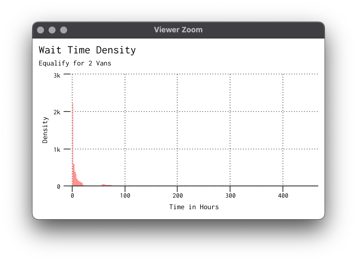
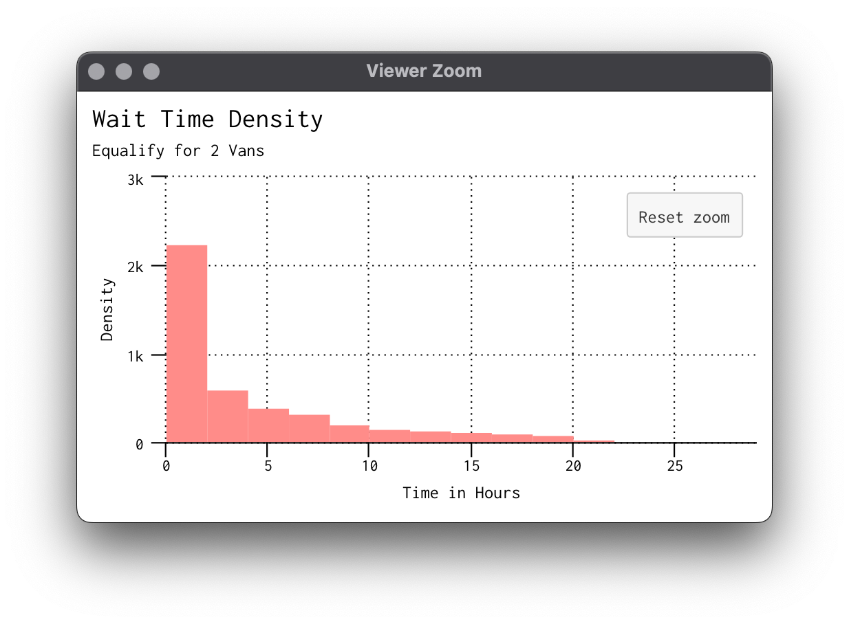
Let's set these summaries up! We're interested in the time it took after the writer sent the card to the van for it to be delivered, not total elapsed time. This is because in our service anyone can request a letter at any point. So, if someone requests at 1am on Sunday and we don't get rid of the delay, our times would be much longer than they actually are. Recall we had to format our dates and times oddly for simmer so here we can convert back to hours and minutes:
# get distribution of wait times
sim_subset[, wait_deliver := delivery_end - write_end]
dist_wait_minutes = sim_subset$wait_deliver * 60 * 24
dist_wait_hours = sim_subset$wait_deliver * 60
dist_wait_days = sim_subset$wait_deliver
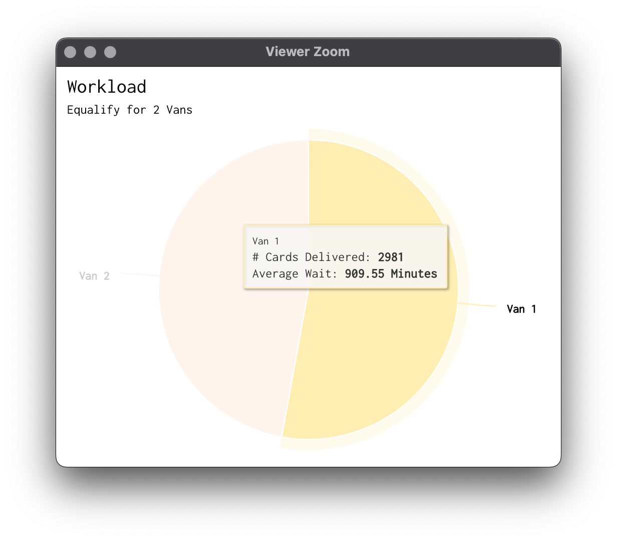
There's our distributions! For the workload, we'll use the wait_deliver variable we created and summarize into minutes by each van and do some reordering:
# workload pie chart data
work = sim_subset[, .(.N, Wait =mean(wait_deliver) * 60 * 24),
                  by = van_selected]
work[, van_selected := paste0("Van ", van_selected)]
work = work[order(van_selected)]
Since those are mainly what we're after, let's setup highcharter.
Highcharter Plots
Similar to how we set up leaflet, I wanted to go a bit beyond the basic highcharter theme. I was a fan of the the Monokai one, so I'm simply imitating that here and changing some things as well as adding our custom palette back into the mix. Notice here I've let the "main" argument be mutable if you want to adapt elsewhere.
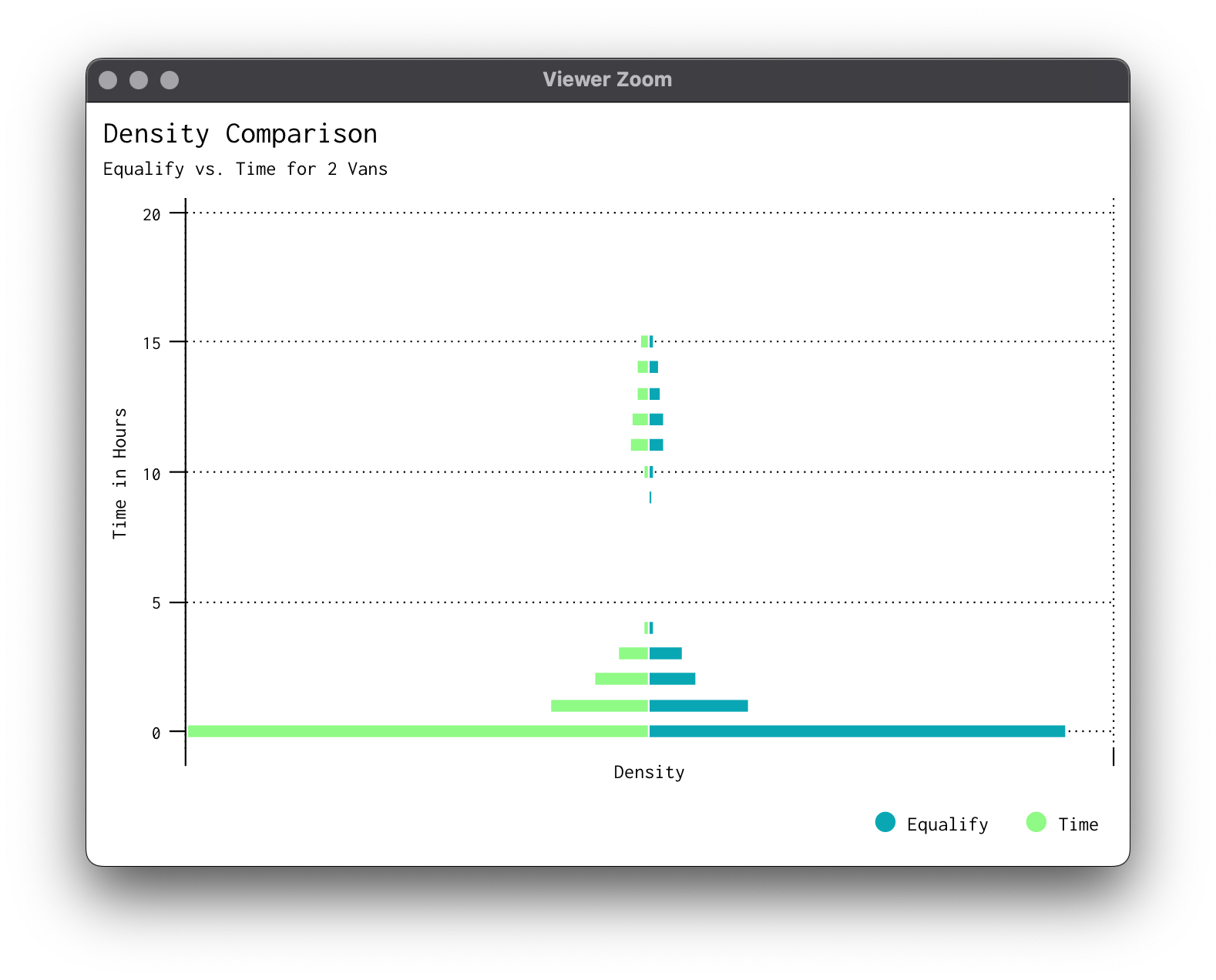
Last one, what about a head-to-head of densities to compare results between solutions? It can be done (with only a couple of tears here and there). We'll have to make another subset and process the histograms beforehand:
Now that we've gotten the main gist of the plots we'll be using, it's time to summarize for every simulation.
Summarizing Function
This is actually really simple since we don't need the highcharts we created, just the data extracts.
# now summarize for all combinations
summarize = function(method, van, dat) {
  subset = dat[Method == method & N_Clust == van]

  # get distribution of wait times
  subset[, wait_total := travelback_end - letter_request]
  subset[, wait_adjusted := travel_end - initial_delay_end]
  subset[, wait_deliver := delivery_end - write_end]
  dist_wait_minutes = subset$wait_deliver * 60 * 24
  dist_wait_hours = subset$wait_deliver * 60
  dist_wait_days = subset$wait_deliver
  density = list(minutes = dist_wait_minutes,
                 hours = dist_wait_hours,
                 days = dist_wait_days)

  # get workload
  work = subset[, .(.N, Wait = mean(delivery_end - write_end) * 60 * 24),
                by = van_selected]
  work[, van_selected := paste0("Van ", van_selected)]
  work = work[order(van_selected)]

  # combine as one object and save
  summary = list(density = density, work = work)
  assign(paste0("sum_",method,"_",van), summary, envir = parent.frame())
}

# summarize
for (van in 2:10) {
  summarize("Time", van, simulation_results)
  summarize("Euc", van, simulation_results)
  summarize("Equal", van, simulation_results)
}
After this method, we'll need to mget all of these different results and rbindlist them together. We'll create a shiny directory within our project and a data folder inside, placing the summaries there:
And, with that, we've processed everything we need for our app!
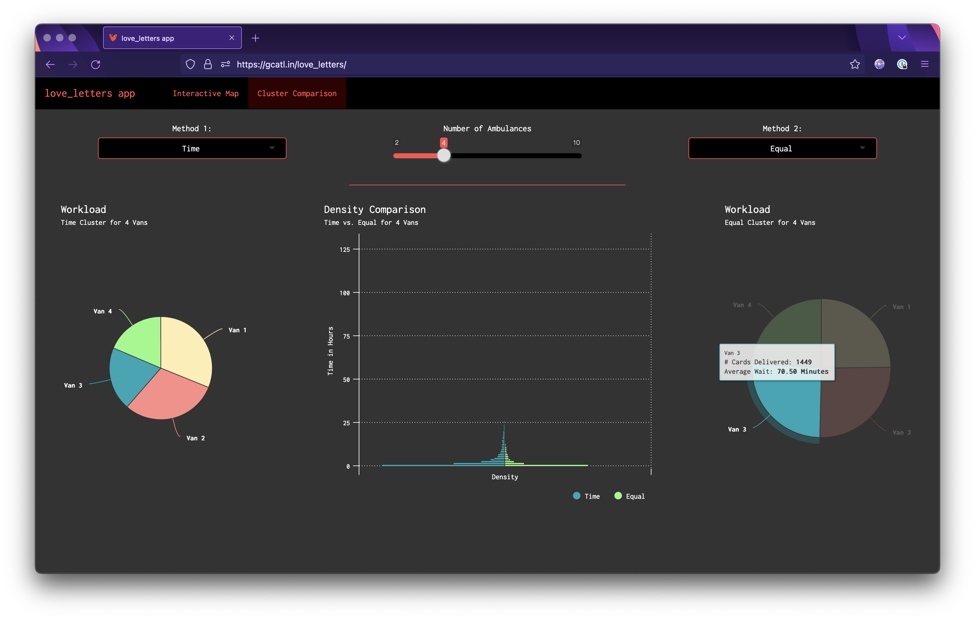
Shiny
To avoid dumping an entire shiny app in this blog post, I'll just make some comments on what's happening where. The app (scripts, data, css) are in the shiny folder in the love_letters repo.
global.R Here I load the libraries, where there's surprisingly only 4 of them! I also import data and our color palette. The global script is also where I keep our cluster_map() function we created to quickly make leaflet maps (modifying a couple things) as well as the love_theme() for highcharts we just made, changing the main color to white.
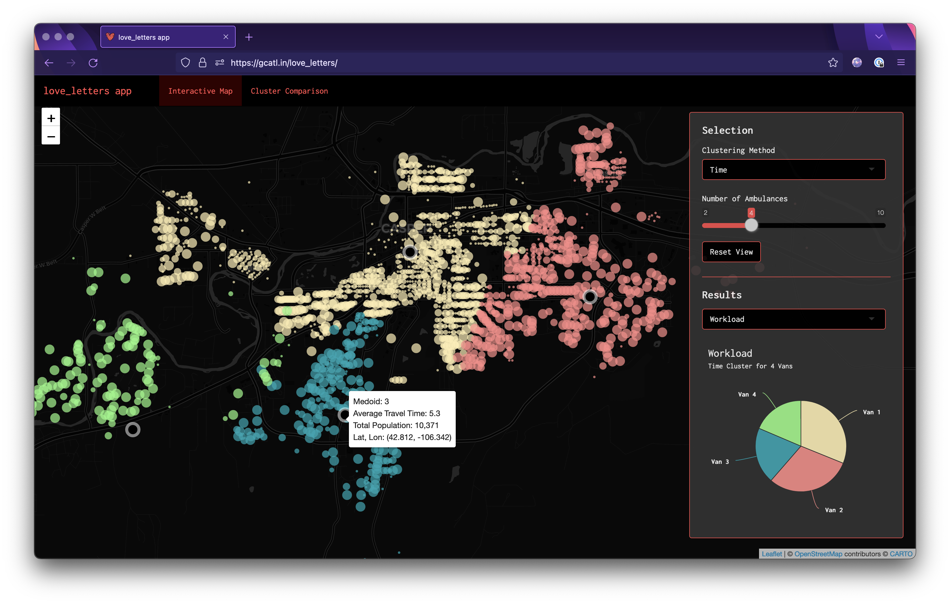
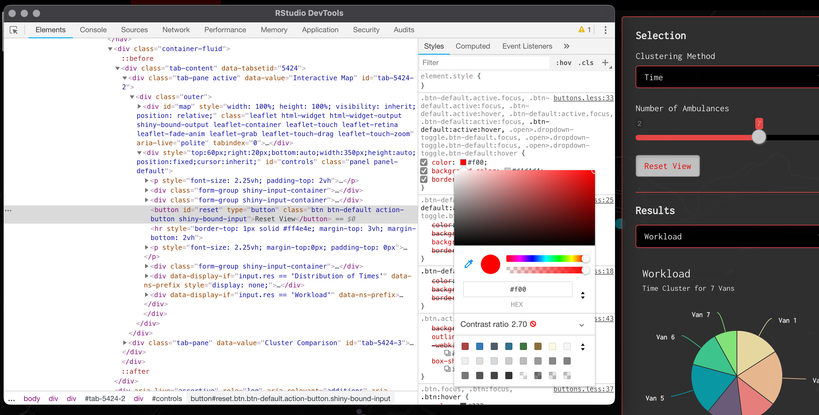
ui.R Just a basic navbarPage setup here with 2 tabs. The map panel has our leaflet map taking up the whole page, with a panel letting the user control the clustering method and number of vans as well as the a toggle to view the corresponding workload pie chart and distribution of times. The second tab let's the user directly compare 2 methods with the same number of vans and has the workload pie charts for both as well as the mirrored density plot.
server.R Not much complex going on here other than some custom logic to ensure color palette consistency and some logic to update the number of vans between the map tab and the comparison tab.
styles.css This file contains all the css I used to make the app look the way it does, with the custom colors and fonts. I've left comments as to what does what.
If you're ever unsure how to change something in shiny, I really recommend right-clicking on the element you want to change and hitting "Inspect". This will allow you to look at the existing css and figure out what you need to put in your css file. You can even edit things on the fly!
Issues My main problem with this navbarPage format is that it's really hard to generalize across screen sizes and the base size is small on many browsers. So, if it looks microscopic to you, you can always zoom into the page in your browser but it would be nice to have the app auto resize. I haven't quite figured out how to do that yet or else I would've here.
Shiny Summary Overall, this is a pretty simple little app but I think it looks pretty good with the custom css and allows the user to really play around with these simulation results in a decently meaningful way. Here's the link again to check it out: https://gcatl.in/love_letters/
The Grand Finale
Rather than really go into extensive detail here, I think it's best to just play around with the app and see what you think! However, I do think it's interesting that:
When put under extreme pressure (only 2 vans), the time method destroys both the equal and euclidean methods in terms of average delivery time for each van.
The euclidean method seems to do the worst out of all 3, though this isn't necessarily surprising since our vans are constrained to road networks.
The equalify method seems to do a decent job of sticking to its name. The workload per van for almost all the number of vans is roughly the same. Sometimes this is to the algorithm's advantage and sometimes it actually hinders performance.
6 vans are necessary to get the average delivery time under 1 hour for all 3 solutions.
Some really weird fragmenting is present in the equal method solutions due to the way we programmed our "dumb" algorithm. It would be interesting to re-write to eliminate some of the artifacts (prime example, look clusters 8 & 9 for 9 vans).
At any rate, I had fun tooling around with app for a good amount of time and I hope the same is true for you!
Functionally, the thought is this app would be used in a meeting to see what everyone is thinking in terms of cost/benefits. Clearly, if you wanted delivery speed approaching the speed of light, you'd have hundreds of vans. But it would be interesting to use this dashboard as a place to have some of those conversations about how much delay we're okay with having, etc.